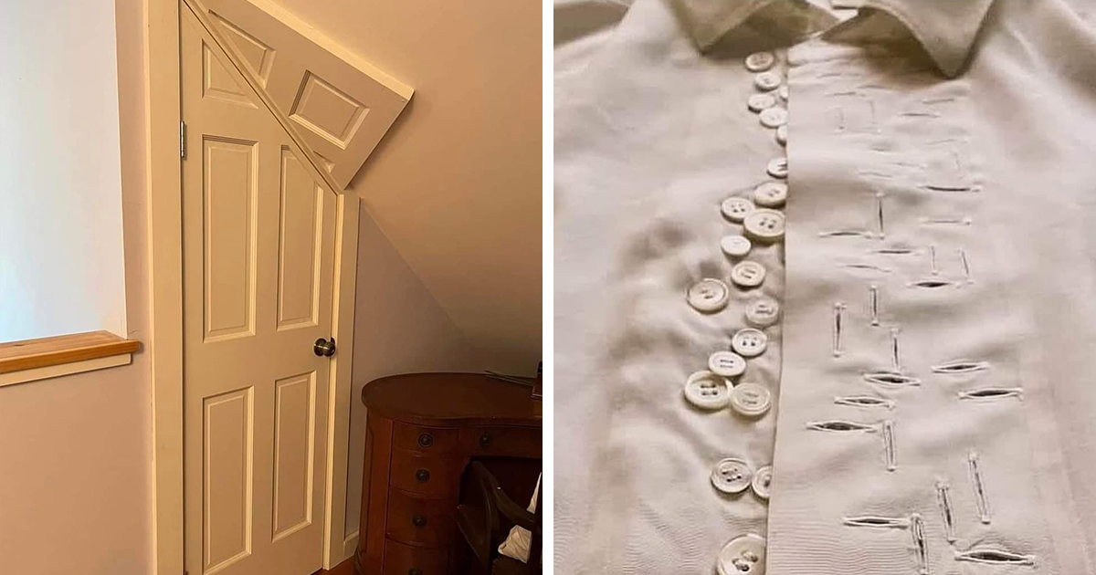
Bad design has a special talent: it can ruin your morning, confuse your grandma, make an elevator feel like a puzzle room, and still somehow become the funniest thing you see all day. That is why collections like “This Page Highlights The Best Of The Worst In Design (60 Pics)” are so addictive. They gather the strange, cursed, chaotic, and unintentionally hilarious objects that make people stop and ask, “Who approved this?”
From unreadable signs to products that look like they were designed during a coffee shortage, the internet loves design fails because they are easy to understand. You do not need a degree in UX design to know that a door handle should not trick you, a bathroom sign should not require detective work, and a chair should not look like it is plotting revenge. Bad design is comedy, but it is also a masterclass in what not to do.
This article explores why terrible design becomes so popular online, what makes a design fail memorable, and what designers, business owners, content creators, and everyday humans can learn from the best of the worst.
Why Bad Design Is So Entertaining
People enjoy bad design for the same reason they enjoy blooper reels: mistakes reveal the hidden machinery behind polished work. A perfect poster may look effortless, but a terrible poster shows every decision that went wrong. Wrong font? Too many colors? Text printed across a model’s face? Suddenly, the invisible rules of design become obvious.
Bad design also creates a tiny social event. One person sees a confusing package label, posts it online, and thousands of people join in to decode it. The comments become part comedy club, part design critique, part group therapy for anyone who has ever pushed a door clearly labeled “pull.”
The Comedy Comes From Broken Expectations
Good design usually disappears. A clear sign guides you without demanding attention. A well-made app lets you finish a task without noticing the interface. A smart package tells you what is inside before you start squinting like a suspicious librarian.
Bad design does the opposite. It interrupts. It makes you stop. It asks your brain to solve a riddle that should not exist. That gap between what should happen and what actually happens is where the humor lives.
What Counts as “The Best of the Worst” in Design?
The phrase “best of the worst” sounds silly, but it is surprisingly accurate. Not every bad design is worth sharing. Some designs are just dull or slightly awkward. The ones that go viral usually fail in a spectacular, memorable, or strangely artistic way.
A truly iconic design fail often has at least one of these ingredients: confusing communication, poor usability, accidental creepiness, visual chaos, misplaced text, uncomfortable proportions, unsafe structure, or a final result that looks completely different from the original intention.
1. Signs That Say Everything Except What They Mean
Signage is supposed to reduce confusion. Yet some signs seem personally committed to increasing it. Think of restroom signs with abstract symbols that require a museum guide, directional arrows that point into walls, or safety signs written in tiny text placed twenty feet away from where danger actually begins.
The problem is often a failure of visual hierarchy. Important information should be larger, clearer, and placed where people need it. When every element screams at the same volume, nothing gets heard. Good signage answers a question quickly. Bad signage starts a group discussion in the hallway.
2. Products That Forgot Humans Have Hands
Product design fails are especially funny because they turn ordinary objects into tiny battles. A mug with a handle too small for fingers. A chair that looks stylish but feels like punishment. Packaging that requires scissors, patience, and maybe a motivational speech.
Great product design respects the body. It considers grip, weight, balance, reach, comfort, and context. Bad product design often looks fine in a photo but collapses in real life. It is the design equivalent of wearing fancy shoes to climb a mountain: dramatic, memorable, and deeply regrettable.
3. Graphic Design That Turns Reading Into a Sport
Graphic design fails are everywhere: posters with unreadable fonts, restaurant menus with text on busy backgrounds, logos that accidentally form unfortunate shapes, and advertisements where the model’s face is covered by the headline. These mistakes happen when style wins a wrestling match against clarity.
Good graphic design uses contrast, alignment, spacing, and hierarchy to guide the eye. Bad graphic design throws everything onto the page and hopes the viewer brought a compass. A beautiful font is useless if nobody can read it. A bold color palette is not bold; it is chaos if every color is fighting for attention.
The Serious Lesson Behind Funny Design Fails
It is easy to laugh at bad design, and honestly, we should. Some designs deserve a gentle roast. But behind the humor is a serious point: design affects behavior. It shapes how people move, shop, read, trust, decide, and feel.
A confusing checkout button can cost a business sales. Low-contrast text can exclude people with vision difficulties. A misleading subscription page can create consumer complaints. A badly placed emergency sign can become more than inconvenient. Design is not decoration sprinkled on top of function; design is how function reaches people.
Usability Is Not Optional
One of the oldest truths in UX is that users should not have to work hard to understand an interface. Clear design prevents errors, supports recovery when mistakes happen, and communicates in plain language. When designers ignore usability, people blame themselves first. They think, “Maybe I’m missing something.” But often the interface is the one wearing clown shoes.
Good design reduces mental effort. It gives people visible choices, predictable controls, helpful labels, and feedback when something happens. Bad design hides the path and then acts surprised when users get lost.
Accessibility Makes Design Better for Everyone
Many design fails are accessibility fails in disguise. Pale gray text on a white background may look “minimal,” but it can be difficult to read. Tiny touch targets may look clean, but they are frustrating on mobile. Color-coded instructions without labels may exclude color-blind users. Decorative complexity can become a barrier.
Accessible design is not a boring checklist. It is thoughtful design. Strong contrast, readable typography, clear structure, descriptive buttons, and predictable navigation help everyone, including people using phones outside in bright sunlight, older adults, tired shoppers, and anyone trying to complete a task before their coffee kicks in.
Why “Ugly” Design Sometimes Works
Here is the plot twist: not all ugly design is ineffective. Some brands intentionally use weird, loud, or awkward visuals to stand out. A strange product may earn attention because it breaks the polished sameness of modern branding. In a feed full of beige minimalism, a ridiculous lamp shaped like a banana in business shoes might win the day.
But there is a difference between intentionally weird and accidentally bad. Intentional ugliness still has strategy. It understands its audience, purpose, and message. Accidental bad design simply forgets one of the basics and hopes nobody notices. Spoiler: the internet always notices.
The Rise of “Cursed” Aesthetics
Online communities love “cursed” design because it feels like discovering an artifact from an alternate universe. A shoe that looks like a fish. A sofa shaped like lips but somehow less comfortable than a park bench. A children’s toy with facial features that belong in a haunted attic. These objects are not just ugly; they are memorable.
In social media culture, memorability has value. People share what surprises them. A perfect chair may get polite approval. A terrifying chair with knees may get reposted for years. That does not mean brands should pursue bad design on purpose, but it does explain why bizarre design travels fast.
Common Mistakes That Create Design Disasters
Most design fails do not happen because someone lacks creativity. They happen because key questions were skipped. Who will use this? Where will they use it? What problem does it solve? What could go wrong? Can people understand it in three seconds? Does it still work when conditions are messy?
Poor Contrast
Low contrast is one of the most common design mistakes. It often appears in trendy layouts where pale text sits on a pale background because someone wanted the page to feel “soft.” Unfortunately, soft can quickly become invisible. Contrast is not just a visual preference; it determines whether people can read, tap, scan, and act.
Confusing Labels
Buttons should describe actions clearly. “Submit” is sometimes acceptable, but “Send request,” “Book appointment,” or “Download guide” is usually better. Bad labels make users hesitate. In physical design, confusing labels can be even worse. Nobody wants to guess which switch controls the lights and which one opens the garage door at midnight.
Ignoring Context
A design that works in a studio may fail in the real world. A glossy floor marker might look elegant until it reflects light and becomes unreadable. A small icon may work on a large monitor but disappear on a phone. A clever package shape may photograph well but refuse to sit upright on a shelf like a normal citizen.
Choosing Style Over Purpose
Style matters. Beauty matters. People often trust attractive designs faster. But style should support purpose, not kidnap it. A restaurant menu can be gorgeous and still fail if customers cannot find prices. A website can be modern and still fail if the navigation hides basic information. A product can look futuristic and still fail if nobody can open it.
What Designers Can Learn From the Worst Design Fails
Bad design collections are more than entertainment. They are free education with jokes included. Each fail is a mini case study showing what happens when a principle is ignored.
Test With Real People
The fastest way to prevent a design disaster is to watch real people use the design before releasing it. Not just teammates. Not just the person who made it. Real users. Give them a task, stay quiet, and observe. If they pause, misread, laugh nervously, or ask, “Wait, what am I supposed to do?” the design is telling you something important.
Design for Mistakes
People click the wrong thing. They miss details. They use products while distracted. They skim. They tap with thumbs. They read signs while walking. Good design expects human behavior instead of pretending humans are perfectly focused robots with unlimited patience.
Error prevention is better than error correction. But when errors happen, the design should help people recover. Clear messages, undo options, confirmations for serious actions, and visible instructions can turn frustration into confidence.
Make the Main Thing Obvious
Every design should have a main thing. A poster might need people to see the event date. A checkout page needs people to complete payment. A product label needs people to understand what they are buying. When the main thing is buried, the design fails even if it looks beautiful.
Design is not about showing everything equally. It is about creating order. The eye needs a path. The brain needs priorities. The user needs mercy.
Why Bad Design Goes Viral
Viral bad design has three advantages: it is visual, instant, and relatable. You can understand a terrible staircase faster than you can read a long complaint. You can share a confusing label without explaining the full history of packaging design. The joke is built into the image.
Bad design also invites participation. Everyone becomes a critic. People suggest fixes, invent captions, compare similar fails, and tell stories about signs, websites, products, or buildings they have encountered. The image becomes a conversation starter.
That is why pages dedicated to ugly design, crappy design, and design fails remain popular. They give people a place to laugh, learn, and collectively wonder how certain ideas escaped the meeting room.
How to Avoid Becoming the Next Viral Design Fail
No designer, marketer, business owner, or DIY enthusiast wants their work to become internet evidence. The good news is that many fails are preventable with a few practical habits.
Use a Simple Design Checklist
Before publishing, printing, building, or shipping anything, ask: Is the purpose clear? Is the most important information easy to find? Is the text readable? Does the design work for people with different abilities? Could someone misinterpret it? Does it still work in the environment where it will be used?
This checklist may sound basic, but basic is powerful. Many viral fails could have been prevented by one person stepping back and saying, “Hold on, that arrow points toward the broom closet.”
Respect White Space
White space is not empty space. It is breathing room. It helps people scan, compare, and understand. Overcrowded design feels stressful because the eye has nowhere to rest. If your poster, package, or web page looks like it is trying to shout through a megaphone while riding a lawn mower, remove something.
Choose Readable Typography
Fonts have personalities, but some personalities should not be trusted with important information. Decorative type can work for short headings, but body text needs clarity. Avoid tiny text, cramped spacing, low contrast, and fonts that make letters look like they are wearing disguises.
Prototype Before You Commit
Whether you are designing a website, a label, a room, a sign, or a physical object, test a rough version first. Print the poster. Tap through the app. Hold the package. Sit in the chair. Walk the route. Real-world testing reveals problems that imagination politely ignores.
Experiences and Observations: What Bad Design Teaches in Real Life
One of the most memorable experiences related to bad design is how quickly it turns ordinary people into experts. Someone may never talk about alignment, contrast, hierarchy, or usability in daily life, but put them in front of a confusing parking sign and suddenly they become a courtroom attorney. “Your honor, this arrow clearly contradicts the text.” And honestly, they are right.
We experience design constantly, even when we do not name it. The grocery cart with the wobbly wheel, the website that hides the customer service number, the microwave with six mystery icons, the shampoo bottle that looks identical to the conditioner bottle until it is too latethese tiny moments become part of our day. Good design quietly helps. Bad design steals attention and charges a frustration tax.
The funniest design fails often come from overthinking. A team tries to be clever instead of clear. A restroom sign becomes a pair of abstract triangles. A menu uses a font so stylish that “soup” looks like “soap.” A hotel light panel has twelve buttons, none of which appear to turn off the lamp currently attacking your eyes at 1:00 a.m. These moments are funny because they feel unnecessarily complicated. The solution was probably simple, but simplicity did not make it to the final meeting.
Another common real-life lesson is that design must match the environment. A sign that looks fine on a computer screen might fail in a busy airport where people are tired, carrying bags, and moving quickly. A mobile button that looks elegant in a mockup might be too small when someone is using one thumb on a crowded bus. A product package that looks premium on a shelf might become annoying if it cannot be opened without tools. Context is not a detail; it is the stage where design performs.
Bad design also reminds us that feedback is a gift, even when it arrives as laughter. If people are confused, the design has spoken. If users keep making the same mistake, the system is probably inviting that mistake. If customers ask the same question repeatedly, the information may not be where they expect it. The smartest teams do not defend every decision. They listen, adjust, and improve.
There is also a weird charm in imperfect design. Some ugly objects become beloved because they have personality. A bizarre lamp, a clumsy chair, or a strange logo can feel more human than another flawless minimalist rectangle. Still, charm works best when the object remains usable. A funny mug is delightful until it spills coffee on your keyboard. Personality should add joy, not create a small domestic emergency.
For content creators and web publishers, the lesson is clear: bad design content works because it combines humor with insight. Readers come for the ridiculous pictures, but they stay because the mistakes feel familiar. A strong article should not simply mock the fails; it should explain why they fail and what better design would do instead. That balance makes the topic more valuable, more shareable, and more useful for search engines and real readers alike.
In the end, the “best of the worst” in design is not just a parade of visual crimes. It is a reminder that design has consequences. It can guide or confuse, delight or irritate, include or exclude. And sometimes, if it truly goes off the rails, it can unite the internet for one glorious moment of collective facepalming.
Conclusion
“This Page Highlights The Best Of The Worst In Design (60 Pics)” is more than a funny title. It captures why people love design fails: they are visual jokes with real lessons hiding underneath. Bad design teaches us about clarity, usability, accessibility, context, and the importance of testing before the world becomes your focus group.
The next time you see a confusing sign, an unreadable poster, or a product that seems designed by a raccoon with a deadline, laugh first. Then look closer. Somewhere inside that disaster is a useful lesson about how design should serve peoplenot the other way around.