Note: This article is an original, publication-ready synthesis based on real Empire State Building history, architectural references, public design information, and the well-known concept series that reimagined the tower in multiple architectural styles.
The Empire State Building is one of those rare structures that does not merely sit in a skyline; it behaves like it owns the lease. Since opening in 1931, the 102-story Art Deco skyscraper has served as a business tower, tourist magnet, movie star, engineering flex, romantic backdrop, lightning rod, and unofficial ruler of “things people photograph immediately after arriving in New York.”
So when artists and designers imagine giving the Empire State Building an architectural makeover, they are not just doodling on a postcard. They are playfully tampering with one of America’s most recognizable silhouettes. It is like putting a powdered wig on the Statue of Liberty or giving Mount Rushmore sunglasses. Risky? Absolutely. Fun? Also absolutely.
The creative concept behind “Artists Give The Empire State Building An Architectural Makeover” asks a delicious question: what if the Empire State Building had not been born in the age of Art Deco? What if it had been shaped by Renaissance symmetry, Gothic drama, Roman monumentality, Japanese tradition, Brutalist muscle, Postmodern wit, Deconstructivist chaos, Art Nouveau curves, or sustainable design thinking?
The result is more than visual entertainment. It is a clever lesson in architectural identity. By changing the building’s style, the artists reveal why the original works so well. The Empire State Building is not famous only because it is tall. It is famous because its height, setbacks, spire, materials, rhythm, and personality all speak the same visual language: confident, vertical, modern, and just theatrical enough to make the clouds feel underdressed.
Why the Empire State Building Is So Hard to Reimagine
Before we hand the tower a wardrobe full of architectural costumes, it helps to understand the original outfit. Designed by Shreve, Lamb & Harmon, the Empire State Building rose during a fierce race for height in late-1920s and early-1930s New York. It was completed in astonishing time, became the world’s tallest building, and quickly turned into a symbol of American ambition during one of the country’s most difficult economic eras.
Architecturally, the building is a textbook example of Art Deco skyscraper design. Its long vertical lines pull the eye upward. Its setbacks give the mass a stepped, streamlined shape. Its limestone and metal detailing provide elegance without turning the facade into a jewelry counter. The spire crowns the whole composition like a confident exclamation point.
That balance is exactly why the makeover idea is so compelling. The Empire State Building’s identity is incredibly stable. You can recognize it in silhouette, in a snow globe, in a movie shot, or in a blurry vacation photo taken from a moving taxi by someone who has had too much airport coffee. Reimagining it in other architectural styles forces us to ask which features are essential and which are flexible.
The Original Concept: Nine Styles, One Famous Tower
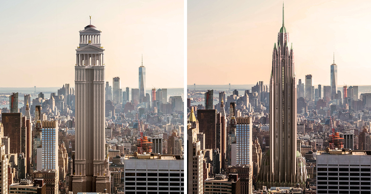
The architectural makeover concept popularized online presented the Empire State Building in nine different design languages: Renaissance, Art Nouveau, Gothic, Postmodern, Deconstructivism, Ancient Roman, Traditional Japanese, Brutalist, and Sustainable architecture. Each version keeps the basic idea of a towering landmark but changes the building’s personality completely.
This is where the project becomes less like “What if we painted it blue?” and more like “What if New York hired history itself as a design consultant?” Every style carries a different worldview. Some emphasize order. Some worship ornament. Some love weight and mass. Some prefer asymmetry and surprise. Some are less interested in looking pretty and more interested in making the planet breathe easier.
In other words, the artists did not merely decorate the Empire State Building. They translated it.
Renaissance Empire State Building: Symmetry With a Skyline Ambition
A Renaissance version of the Empire State Building would trade sleek Art Deco urgency for classical proportion and balance. Renaissance architecture loves harmony, geometry, columns, arches, domes, and a sense that everything has been measured twice by someone wearing a very serious hat.
Applied to the Empire State Building, this style turns the tower into a vertical palace. The facade feels more formal, more layered, and more connected to European civic grandeur. Instead of the original’s streamlined climb, the Renaissance makeover suggests order stacked upon order, as if a Florentine architect looked at Manhattan and said, “Nice city. Needs more symmetry.”
The interesting tension here is scale. Renaissance design traditionally shines in churches, palaces, civic buildings, and carefully proportioned plazas. Stretching that language to skyscraper height creates a strange but fascinating hybrid: humanist ideals wearing elevator shoes.
Art Nouveau Empire State Building: When the Tower Learns to Swerve
Art Nouveau is the opposite of architectural stiffness. It loves curves, vines, floral patterns, organic movement, decorative ironwork, and lines that look like they took a scenic route to their destination. If the original Empire State Building is a tailored suit, the Art Nouveau version is a silk scarf caught in a dramatic breeze.
This makeover softens the tower’s vertical discipline. Ornament becomes fluid. Edges feel more botanical. The building starts to look less like a machine-age monument and more like something that grew out of the sidewalk after drinking very expensive tea.
It is beautiful, but it also proves something important about the original. The real Empire State Building works because its decorative details support its upward motion. Art Nouveau decoration, by contrast, tends to wander and curl. That makes the reimagined version charming, but also less forceful as a skyscraper icon.
Gothic Empire State Building: Manhattan Meets Cathedral Drama
A Gothic Empire State Building is easy to imagine because skyscrapers and cathedrals already share one obsession: height. Gothic architecture uses pointed arches, ribbed vaults, spires, tracery, and vertical emphasis to pull the eye upward toward mystery, power, and possibly a gargoyle judging your lunch choices.
In Gothic form, the Empire State Building becomes darker, sharper, and more theatrical. It stops being a business tower and starts feeling like a cathedral for capitalism, which, depending on your mood, may be either poetic or extremely accurate.
The Gothic makeover highlights the spiritual side of vertical architecture. The real Empire State Building is secular, commercial, and modern, but it still inspires a kind of awe. Stand at its base and look up, and the effect is not so different from looking at a medieval cathedral ceiling. Your neck complains, but your imagination applauds.
Postmodern Empire State Building: The Tower Develops a Sense of Humor
Postmodern architecture enjoys references, contradictions, jokes, historical mashups, and moments where a building seems to wink at you. A Postmodern Empire State Building would likely play with color, exaggerated forms, decorative quotations, and unexpected shapes.
This version is fascinating because the Empire State Building is already symbolic. Postmodernism would not simply redesign the tower; it would comment on the tower. It might exaggerate the crown, distort the setbacks, or add ornamental gestures that say, “Yes, I know I am famous. Please enjoy the souvenir-shop version of me.”
The risk is that too much irony can weaken a landmark. The original Empire State Building is not ironic. It is earnest. It believes in height, progress, work, steel, and skyline glory. A Postmodern makeover may be entertaining, but it also reminds us that sincerity can be a superpower in architecture.
Deconstructivist Empire State Building: The Skyline Gets Vertigo
Deconstructivism is architecture after someone has politely declined the grid. It favors fragmentation, tilted planes, sharp collisions, and forms that appear to be in motion or under stress. It is dramatic, intellectual, and sometimes looks like the building just received complicated news.
Reimagined this way, the Empire State Building becomes unstable in the most deliberate sense. The calm vertical climb of the original gives way to shifting angles and fractured surfaces. Instead of a tower that reassures the city, it becomes a tower that challenges it.
This version works best as a conceptual exercise. The Empire State Building’s real genius lies in clarity. It is legible from miles away. Deconstructivism offers tension and surprise, but the original offers something harder to achieve: instant recognition.
Ancient Roman Empire State Building: All Roads Lead to Midtown
An Ancient Roman version of the Empire State Building turns the tower into an imperial monument. Think arches, columns, stone mass, triumphal symbolism, and the architectural confidence of a civilization that never met a public project it did not want to make enormous.
The Roman makeover feels surprisingly logical because the original Empire State Building already carries civic grandeur. It may be an office tower, but it behaves like a public monument. A Roman version would make that monumentality literal, transforming setbacks into tiers of authority and the base into something closer to a vertical forum.
The humor, of course, is that Manhattan already has a strong empire theme baked into the name. A Roman Empire State Building sounds less like a redesign and more like the building finally admitting what it has been thinking all along.
Traditional Japanese Empire State Building: Serenity at 1,454 Feet
Traditional Japanese architecture values proportion, craftsmanship, rooflines, natural materials, modular rhythm, and a deep relationship between structure and environment. Applied to the Empire State Building, this style creates a surprising contrast: calm details on a colossal urban form.
The makeover might introduce layered roofs, wood-inspired textures, restrained ornament, and a more horizontal visual rhythm. That is exactly where the challenge appears. Japanese traditional architecture often excels through intimacy, thresholds, gardens, and finely tuned human scale. The Empire State Building, meanwhile, is the architectural equivalent of standing on a chair at a party and announcing that you are the party.
Still, the contrast is valuable. It makes viewers think about scale, culture, and how architectural languages change when stretched into unfamiliar forms. It also reminds us that a skyscraper can be powerful without always being loud.
Brutalist Empire State Building: Concrete Confidence, Zero Apologies
A Brutalist Empire State Building would be heavier, harsher, and far more interested in mass than sparkle. Brutalism is known for raw concrete, bold forms, sculptural weight, and an attitude that can be summarized as: “I am not here to be cute.”
In Brutalist form, the tower becomes a fortress of vertical ambition. The light-catching limestone elegance of the original gives way to muscular surfaces and deep shadows. The building would feel less like a glamorous New York icon and more like the headquarters of an organization that definitely has a very serious intercom system.
The Brutalist makeover is divisive, and that is part of its value. It exposes how much warmth, shine, and decorative restraint the real Empire State Building actually has. People sometimes describe Art Deco as sleek or machine-like, but compared with Brutalism, the original looks positively charming.
Sustainable Empire State Building: The Green Future of an Old Icon
The sustainable version is perhaps the most relevant makeover because the real Empire State Building has already undergone major energy-efficiency upgrades. Unlike the other styles, sustainable architecture is not only a visual language. It is a performance goal. It asks how a building uses energy, handles materials, supports occupants, and reduces environmental impact.
A green reimagining might add planted terraces, solar strategies, better insulation, high-performance glass, adaptive lighting, and systems that reduce waste. The fun part is that this idea is not pure fantasy. The actual Empire State Building has become a widely discussed example of how historic towers can be modernized without erasing their identity.
This is the makeover that feels least like costume and most like destiny. The future of famous buildings will not be limited to how they look in postcards. It will also depend on how intelligently they operate.
The Real Makeover Already Happened Inside
While the concept series plays with exterior fantasy, the Empire State Building has already experienced several real-world makeovers. The restored lobby is one of the most impressive. Its Art Deco ceiling, once damaged and covered, was painstakingly recreated with metallic finishes, celestial motifs, and period-sensitive craftsmanship.
The restoration matters because it shows a different kind of architectural creativity. Instead of asking, “What else could this building be?” the lobby project asked, “How do we bring back what made it extraordinary in the first place?” That is not less imaginative. In some ways, it is harder. Reinvention gets applause; restoration has to earn trust.
The observatory experience has also been reimagined. New entrances, exhibits, interactive displays, and updated viewing areas have turned a classic tourist visit into a more layered journey through New York history, pop culture, engineering, and skyline appreciation. The tower did not need to become Gothic or Brutalist to evolve. It evolved by becoming a better version of itself.
Light as Architecture: The Empire State Building After Dark
One of the most powerful modern makeovers of the Empire State Building happens almost every night. Its tower lights transform the skyline with colors marking holidays, events, organizations, celebrations, and special cultural moments. Since the LED lighting upgrade, the building has gained a digital wardrobe of millions of color possibilities.
This is architecture as performance. During the day, the Empire State Building is stone, steel, glass, and setback geometry. At night, it becomes a signal. It can be celebratory, solemn, playful, civic, or cinematic. The lights do not change the structure, but they absolutely change the way people read it.
In a way, the lighting program is the most successful architectural makeover of all because it preserves the famous silhouette while allowing endless variation. The building remains itself, but its mood changes. That is good design therapy.
Why These Artistic Makeovers Matter
At first glance, reimagining the Empire State Building in different architectural styles seems like internet-friendly design fun. And it is. But it also teaches a serious lesson: architecture is not neutral. Style shapes emotion. Materials shape memory. Proportions shape identity. A building can feel elegant, intimidating, playful, sacred, futuristic, or environmentally responsible depending on how its parts speak to one another.
The concept also helps casual viewers understand architectural history without needing a textbook large enough to qualify as furniture. Renaissance means order. Gothic means vertical drama. Brutalism means mass. Art Nouveau means organic ornament. Deconstructivism means fragmentation. Sustainable design means responsibility. By applying each style to the same famous building, the differences become instantly readable.
And perhaps most importantly, the makeover series proves the strength of the original. The more costumes the Empire State Building tries on, the clearer it becomes that Art Deco was not an accident. It was the right language for a tower built to express speed, height, ambition, technology, and glamour.
Experience Notes: What the Makeover Idea Feels Like in Real Life
Experiencing the Empire State Building through this makeover concept changes how you look at the real tower. Instead of seeing one famous skyscraper, you begin to see a design decision that could have gone in many directions. The original becomes sharper because the alternatives are now in your imagination. A Gothic version makes you notice the existing spire. A Brutalist version makes you appreciate the limestone. A Sustainable version makes you wonder how historic buildings can adapt rather than be replaced.
For visitors, this kind of visual exercise can make a trip to the Empire State Building more engaging. Standing near Fifth Avenue, you can look up and mentally swap styles like architectural filters. What if those vertical lines became vines? What if the crown became a temple roof? What if the setbacks became fortress blocks? The city suddenly turns into a design classroom, except the classroom has taxis, pretzels, and someone nearby arguing with a map app.
The experience is especially useful for people who think architecture is only about “old buildings” and “new buildings.” The Empire State Building makeover concept shows that architecture is a language with dialects. The same basic function, a tall urban tower, can communicate completely different meanings depending on its form. One version says power. Another says elegance. Another says rebellion. Another says ecological responsibility. The original says all of these things in a disciplined Art Deco accent.
Inside the actual building, the experience becomes even richer. The restored lobby demonstrates how materials and ornament create atmosphere. Metallic ceiling details, marble surfaces, geometric patterns, and warm lighting make the entry sequence feel ceremonial. It is not just a place to pass through; it is a reminder that skyscrapers once treated lobbies like civic stages. The building knows how to make an entrance, which is convenient because millions of people keep entering it.
The observatory experience adds another layer. From high above Manhattan, the makeover idea reverses itself. Instead of imagining new styles for one building, you can look across the city and see many architectural eras already in conversation: prewar masonry towers, glass skyscrapers, modern supertalls, old civic buildings, rooftop water tanks, and bridges stretching through the urban fabric. New York is not one style. It is a crowded dinner party of styles, and somehow everyone is talking at once.
That is why the artistic makeover concept works so well. It does not insult the original Empire State Building. It celebrates it by proving how flexible our imagination can be around a landmark we thought we already knew. The project invites viewers to laugh, compare, question, and learn. It also reminds designers, travelers, and architecture fans that iconic buildings stay alive not because they never change, but because each generation finds a new way to look at them.
Conclusion: The Best Makeover Is Understanding the Original
“Artists Give The Empire State Building An Architectural Makeover” succeeds because it turns a familiar landmark into a fresh conversation. By imagining the tower through Renaissance, Gothic, Art Nouveau, Brutalist, Japanese, Roman, Postmodern, Deconstructivist, and Sustainable design lenses, the project reveals both the flexibility of architectural style and the staying power of the original Art Deco masterpiece.
The real Empire State Building does not need a new costume to remain relevant. Its history, engineering, restored interiors, evolving observatory experience, lighting program, and sustainability upgrades already show that a landmark can adapt without losing its soul. Still, the artistic makeovers are valuable because they make us look again. And for a building photographed millions of times, making people look again is no small achievement.
In the end, the Empire State Building remains what it has always been: a skyscraper with confidence, a skyline anchor, a design lesson, and a reminder that architecture can be serious without being boring. Would it look interesting as a Gothic mega-cathedral or a Brutalist concrete giant? Definitely. But would it still be the Empire State Building? Maybe not. Some icons can wear any outfit. Others prove that the first suit was tailored perfectly.