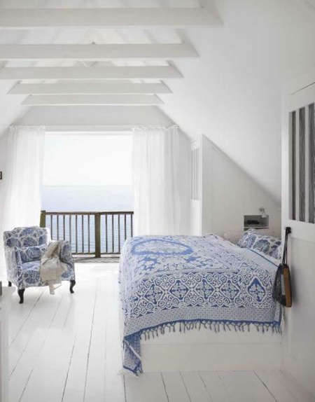
Blue and white is the design world’s equivalent of a crisp button-down shirt: timeless, reliable, and somehow still capable of looking fresh every time it shows up. Whether you are painting a bedroom, refreshing kitchen cabinets, styling a coastal living room, or simply trying to make a small hallway feel less like a shoebox with electrical outlets, the blue and white color palette delivers beauty without shouting for attention.
The magic comes from contrast. White brings light, cleanliness, and breathing room. Blue adds depth, calm, personality, and just enough drama to prevent a room from feeling like a dentist’s waiting area. Together, blue and white paint colors can feel coastal, classic, modern, farmhouse, traditional, preppy, Mediterranean, cottage-inspired, or polished and architectural. In other words, this palette has range. It is not a one-trick decorative pony wearing a sailor hat.
This guide explores how to use blue and white paint in real homes, how to choose the right shades, where the palette works best, and how to avoid common mistakes. We will also look at practical examples, undertones, finishes, furniture pairings, and lived-in experience with this enduring combination.
Why Blue and White Always Works
The reason blue and white remains so popular is simple: it balances emotion and structure. Blue is associated with sky, water, distance, and calm. White is associated with light, simplicity, and clarity. When used together, they create rooms that feel organized but not stiff, peaceful but not boring, and stylish without needing a full design degree or a dramatic renovation budget.
In interior design, white often acts as a visual pause. It gives the eye a place to rest. Blue, meanwhile, provides direction. A navy island in a white kitchen becomes a focal point. A pale blue bedroom wall with white bedding creates softness. Blue built-ins against white trim add architecture even when the room itself is basically a rectangle with ambition.
Choosing the Right Blue Paint
Not all blues behave the same way. A powder blue, a denim blue, a slate blue, and a deep navy may all technically belong to the same family, but they create very different moods. Choosing the right blue paint depends on the room’s light, size, purpose, existing furniture, and the emotional tone you want.
Light Blue: Soft, Airy, and Relaxed
Light blue paint works beautifully in bedrooms, bathrooms, laundry rooms, nurseries, and small spaces. It can make a room feel open and calm, especially when paired with warm white trim or creamy white textiles. Light blue is also forgiving. It usually plays nicely with natural wood, rattan, linen, brushed nickel, and soft gray accents.
For a serene look, choose a blue with a hint of gray rather than a candy-colored baby blue. Gray-blue shades feel more grown-up and flexible. They also avoid the “nursery wall from 1997” effect, which is charming only if you are actually decorating a nursery in 1997.
Medium Blue: Fresh, Classic, and Friendly
Medium blues are excellent for living rooms, dining rooms, entryways, and accent walls. They have enough color to make a design statement but do not usually overpower the space. Think of denim, French blue, Delft blue, or clear sky blue. These shades work well with white wainscoting, white curtains, blue-and-white ceramics, striped rugs, or patterned upholstery.
Medium blue is especially useful when you want a classic American look that still feels cheerful. It can lean coastal with woven textures, traditional with dark wood furniture, or modern with clean white walls and black accents.
Navy Blue: Dramatic, Elegant, and Surprisingly Versatile
Navy blue is the power suit of the paint aisle. It looks confident, polished, and expensive, even when the project involved a weekend, painter’s tape, and one emergency trip for more rollers. Navy works beautifully on kitchen islands, built-ins, powder rooms, front doors, dining rooms, and bedroom accent walls.
The trick is balance. Navy absorbs light, so pair it with white ceilings, white trim, pale flooring, mirrors, or reflective finishes. In a room with limited natural light, navy can feel moody and cozy. That is wonderful if you want a library effect, but less wonderful if you wanted “fresh seaside cottage” and ended up with “submarine after sunset.”
Choosing the Right White Paint
White paint sounds simple until you stand in front of 84 paint chips that all claim to be white while looking suspiciously beige, gray, yellow, pink, or blue. The secret is undertone. A white with warm undertones feels creamy and soft. A cool white feels crisp and modern. A neutral white sits somewhere in the middle.
Warm White
Warm whites pair beautifully with rich navy, denim blue, wood furniture, brass hardware, jute rugs, and traditional decor. They soften the contrast and keep blue from feeling too cold. Warm white is a smart choice for bedrooms, living rooms, older homes, and spaces with warm flooring.
Cool White
Cool whites look clean and sharp with icy blue, cobalt, slate blue, chrome fixtures, and modern architecture. They are useful in bathrooms, contemporary kitchens, and spaces where you want a crisp gallery-like background. However, in a north-facing room, cool white can sometimes look chilly, so always test before committing.
Neutral White
Neutral white is often the safest companion for blue paint. It does not pull too yellow or too gray, which makes it flexible across different rooms. If you are using multiple blues throughout a home, a neutral white trim color can tie everything together without starting a family argument with your undertones.
Best Rooms for a Blue and White Palette
Blue and White Bedrooms
A blue and white bedroom is a classic for good reason. The combination supports rest, softness, and visual order. Try pale blue walls with white bedding for a spa-like retreat, or use white walls with navy pillows, a blue upholstered headboard, and patterned curtains for a layered look. Add texture through linen, cotton, wool, cane, or natural wood to keep the room from feeling flat.
For a more luxurious bedroom, consider navy walls with white trim and ivory bedding. This creates contrast while keeping the room comfortable. Add brass lamps or warm wood nightstands for balance.
Blue and White Kitchens
The blue and white kitchen is having a long, well-deserved moment. White cabinets with a navy island feel polished and practical. Blue lower cabinets with white uppers create depth without making the kitchen feel heavy. A white subway tile backsplash paired with blue cabinetry is another classic option.
If painting all the cabinets feels too bold, start with the island, pantry door, or breakfast nook. Blue bar stools, blue-and-white dishes, or a patterned runner can also introduce the palette without requiring a full cabinet makeover and three days of questioning your life choices.
Blue and White Bathrooms
Bathrooms are natural candidates for blue and white because the palette already suggests water, cleanliness, and freshness. White tile with blue walls, blue vanity cabinets with white countertops, or patterned blue-and-white floor tile can make a bathroom feel custom. Pale blue creates a calm spa mood, while navy adds boutique-hotel drama.
For small bathrooms, keep the ceiling and trim white, then use blue on the vanity or lower wall. This gives the room personality while preserving brightness.
Blue and White Living Rooms
In living rooms, blue and white can be casual or refined. White walls create a clean canvas for blue sofas, blue chairs, patterned pillows, and art. Blue walls with white trim create stronger architecture and a more enveloping mood. If you already own neutral furniture, blue and white accessories can refresh the room quickly.
Layering is key. Combine solids, stripes, florals, checks, ceramics, and textured fabrics. Blue and white can become too predictable if everything is perfectly matched. A little variation makes the space feel collected rather than purchased in one panicked afternoon.
How to Build a Blue and White Whole-House Palette
A whole-house blue and white palette works best when it includes more than one shade of each color. Instead of repeating the exact same blue everywhere, create a family of tones. For example, use soft blue-gray in bedrooms, navy on built-ins, medium blue in a guest bath, and white walls in shared spaces.
Keep one consistent white for trim, doors, and ceilings. This creates flow even when the blue shades change. Then add secondary colors such as warm wood, soft gray, sand, brass, black, green, or terracotta. These supporting tones prevent the home from feeling like a porcelain plate collection moved in and took over.
Blue and White Paint Finish Guide
Color matters, but finish matters too. A matte or flat finish softens walls and hides imperfections, making it good for bedrooms and low-traffic areas. Eggshell or satin is practical for living rooms, hallways, and family spaces because it is easier to clean. Semi-gloss works well for trim, doors, and cabinets because it adds durability and contrast.
For navy or deep blue walls, consider an eggshell finish. It gives a slight glow without looking shiny. For white trim, semi-gloss creates crisp edges and helps the trim stand out. For cabinets, choose a durable enamel or cabinet-grade paint finish that can handle fingerprints, spills, and the occasional dramatic coffee splash.
Patterns That Love Blue and White
Blue and white becomes even more interesting when pattern enters the room. Stripes feel nautical or preppy. Florals feel romantic or cottage-inspired. Checks feel casual and classic. Chinoiserie patterns feel elegant and collected. Geometric prints feel modern and clean.
The easiest way to mix patterns is to vary scale. Pair a large floral pillow with a narrow stripe, or a bold geometric rug with small-scale blue-and-white ceramics. Keep the palette consistent, and the patterns will usually get along. Think of blue and white as the responsible adult supervising the pattern party.
Materials and Accents That Pair Beautifully
Blue and white paint looks best when supported by natural and tactile materials. Wood warms it up. Rattan and wicker make it relaxed. Brass adds glow. Black metal adds contrast. Marble and quartz make it elegant. Linen keeps it breezy. Leather adds richness.
For a coastal look, use white walls, pale blue accents, natural fiber rugs, and light wood. For a traditional look, use navy walls, white trim, antique furniture, and brass lighting. For a modern look, use crisp white walls, cobalt or navy accents, clean lines, and matte black hardware.
Common Mistakes to Avoid
Skipping Paint Samples
Blue changes dramatically with light. A shade that looks perfect online may turn electric, gray, green, or gloomy in your room. Always test paint samples on different walls and look at them in morning, afternoon, and evening light.
Choosing a White Without Checking Undertones
A blue wall next to the wrong white trim can make both colors look strange. A warm white may appear yellow beside a cool blue. A cool white may look icy beside a muted navy. Test them together, not separately.
Forgetting Texture
Blue and white rooms need texture to feel inviting. Without texture, the palette can become sterile. Add woven shades, cotton throws, ceramic lamps, wood frames, patterned rugs, or upholstered furniture.
Using Only One Blue
A room with one exact shade of blue repeated everywhere can feel flat. Mix light, medium, and dark blues for dimension. A navy pillow, pale blue wall, and denim throw can coexist beautifully.
Specific Blue and White Palette Ideas
Classic Coastal
Use warm white walls, pale blue ceilings, natural wood furniture, woven baskets, and linen curtains. Add navy in small doses through pillows or art.
Modern Navy and White
Paint built-ins or lower cabinets navy, keep walls crisp white, and add black hardware. Use simple shapes and minimal accessories for a tailored look.
French Country Blue and Cream
Choose soft blue-gray walls, creamy white trim, antique wood, floral fabrics, and aged brass. This palette feels romantic without becoming sugary.
Blue and White Cottage
Use white shiplap or beadboard, medium blue doors, striped textiles, vintage art, and painted furniture. The result feels relaxed, charming, and very forgiving of real life.
Bold Cobalt Accent
Keep most surfaces white, then add cobalt blue through a front door, powder room vanity, tile backsplash, or statement furniture. This approach is great for people who love color but also love being able to sleep at night.
of Experience: Living With Blue and White Paint
One of the best things about the blue and white palette is that it ages gracefully. I have seen rooms painted in trendy colors look dated within a year, as if the walls suddenly remembered they were part of a fad. Blue and white rarely does that. It can be refreshed with new pillows, art, lamps, or hardware, but the foundation stays steady.
In real homes, the most successful blue and white rooms usually begin with restraint. A homeowner might start with white walls and a blue dresser, or a blue vanity in an otherwise white bathroom. Then the palette grows naturally. A striped towel appears. A blue ceramic bowl joins the kitchen counter. A navy picture frame sneaks onto a shelf. Before long, the room has a point of view, but it does not feel forced.
Painting a room blue also teaches you how powerful light can be. A soft gray-blue that looks elegant at noon may become moodier at night. A navy that looks dramatic in a sunny dining room may feel almost black in a hallway. That is not a flaw; it is part of the color’s personality. Blue has moods. It is basically the poet of the paint deck.
White paint has its own lessons. Many people assume white is easy, but white is only easy after you choose the right one. In one room, a cool white can look fresh and clean. In another, it can look like a refrigerator with baseboards. Warm whites are often more forgiving, especially in homes with wood floors or soft lighting. Still, a warm white beside a very cool blue can look creamy in the wrong way, like the trim is quietly apologizing for itself. Testing is not optional; it is the small step that saves you from repainting while muttering dramatic things into a roller tray.
Another experience worth noting: blue and white works for messy, lived-in homes. It is not just for magazine rooms with untouched sofas and bowls of decorative lemons. Blue denim pillows hide wear. White slipcovers can often be washed. Navy cabinets disguise scuffs better than pure white ones. Patterned blue-and-white rugs are excellent at forgiving crumbs, pet hair, and the mysterious household debris nobody admits creating.
The palette is also emotionally flexible. In the morning, a blue and white kitchen can feel bright and energetic. At night, the same colors can feel calm and settled. In a bedroom, pale blue and white can make the day feel less chaotic. In a home office, navy and white can create focus without making the room feel severe. That flexibility is why designers keep returning to this combination.
Perhaps the most important experience is this: blue and white gives structure to personal style. You can add old family furniture, modern art, coastal shells, brass lamps, thrifted ceramics, striped curtains, or a wildly opinionated floral pillow, and the palette can hold it all together. It gives a room a backbone without stealing its soul.
Conclusion
Palette & Paints: Blue and White is more than a color story; it is a practical design strategy. Blue provides mood, history, and depth. White provides brightness, balance, and flexibility. Together, they can transform a room without making it feel overdecorated or temporary.
Whether you choose pale blue bedroom walls, a navy kitchen island, white trim against dramatic built-ins, or a breezy coastal living room, the key is thoughtful contrast. Test your colors, respect undertones, layer textures, and mix shades of blue for dimension. Done well, blue and white paint creates a home that feels calm, classic, and alivethe rare combination that can impress guests while still surviving laundry day.
SEO Tags
Note: This article is written in original American English for web publication and is based on synthesized research from reputable paint, decorating, and interior design resources.