Some rooms politely ask to be admired. A showhouse bathroom and closet, however, tend to enter the conversation wearing a silk robe, carrying a tray of cucumber water, and whispering, “Please notice my tile.” This tour is all about that kind of space: a primary suite bathroom and walk-in closet designed not only to look beautiful in photographs, but also to teach real lessons about comfort, storage, ligng about it.
The best showhouse spaces are never just pretty. They are idea laboratories. Designers use them to test color palettes, tile combinations, lighting layers, storage systems, and furniture-like details that homeowners can adapt in real life. In this bathroom and closet tour, the magic comes from a spa-like bathroom connected to a generous, practical closet through a small transition zone. It feels polished, but not precious; relaxed, but not sleepy; organized, but not so perfect that you fear folding a sweater incorrectly and being escorted out by a design intern.
The First Impression: A Calm Transition Zone
Before stepping into the bathroom or closet, the suite creates a small pause between the bedroom and the functional spaces. This vestibule-style area works like a design deep breath. Instead of opening directly into a sink, shower, or row of shoes, the layout gives the eye a quiet moment with a floor mirror, warm lighting, and a wall color that continues the calm mood from the bedroom.
This is a clever move in primary suite design. A bathroom and closet are busy by nature. One is full of water, glass, tile, mirrors, and grooming tools. The other is full of fabric, shoes, bags, and “I swear I’ll wear this someday” blazers. A transitional area helps the suite feel intentional rather than chopped into three unrelated rooms. It also gives the homeowner a useful full-length mirror location, which is far more practical than placing one in a narrow closet where you must back into a shoe shelf to see your outfit.
The Bathroom: Spa-Like Without Feeling Sterile
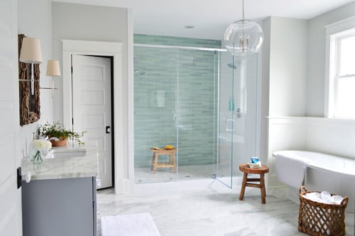
The bathroom leans into a light, airy palette with soft gray cabinetry, pale walls, marble-inspired flooring, and a fresh aqua glass tile accent in the shower. The result is spa-like, but not cold. That distinction matters. Many bathrooms chase the “spa” look and accidentally land somewhere between “medical clinic” and “very fancy ice cube.” Here, texture and warmth save the day.
The aqua shower tile gives the room a watery focal point. It reads as soothing rather than loud, especially because the surrounding white subway tile keeps the composition clean. This is a smart lesson for anyone planning a bathroom remodel: if you love color but fear commitment, use it strategically. An accent wall in the shower, a painted vanity, or a patterned floor can add personality without turning the entire bathroom into a permanent mood swing.
Why the Shower Works
The shower succeeds because it balances three materials instead of letting them fight in a tile cage match. The aqua glass tile adds movement and color. The white subway tile brings simplicity. The shower floor links the palette together with small aqua accents and stone-like texture. When grout color, scale, and spacing are handled carefully, multiple tile choices can feel layered rather than chaotic.
The double shower setup also makes the room feel luxurious in a practical way. Dual showerheads, plus a hand shower, create flexibility for two people, cleaning, rinsing, pets, sore muscles, and the occasional “I dropped the shampoo and now the whole floor is a slip-and-slide” situation. This is showhouse glamour with common sense hiding behind the curtain, except there is no curtain because of course there is glass.
The Vanities: Furniture Details Make Built-Ins Feel Special
The bathroom includes two vanities, a feature that instantly says, “Good morning, we are not elbowing each other over toothpaste today.” But the real design value is in the details. The cabinetry has a soft gray finish, x-frame doors, subtle mirror or glass inserts, and arched trim at the base. These choices make the vanities feel more like custom furniture than standard bathroom storage.
That is one of the strongest takeaways from this showhouse bathroom: utility can still have charm. A vanity is not merely a place to lose bobby pins. It can anchor the room, repeat the home’s architectural language, and add softness through curves, feet, trim, or hardware. The counters, with their gentle green veining, echo the sea-glass tone of the shower tile, proving that a room feels cohesive when materials quietly speak to one another instead of yelling across the space.
Mirrors and Sconces: The Face-Friendly Department
Lighting in a bathroom must do two jobs: flatter the room and tell the truth. Overhead lighting alone is rarely enough. It casts shadows, makes shaving and makeup tricky, and can turn a sleepy morning face into a dramatic crime documentary reenactment. This bathroom uses sconces and a decorative chandelier-style fixture to create layers of light.
The driftwood mirrors add organic texture and contrast against smoother surfaces. They also connect visually to the nearby lighting, which keeps the suite from feeling like a showroom of unrelated pretty things. That is a valuable design rule: repeat a material, finish, shape, or color at least twice. Once is a mistake; twice is a plan.
The Freestanding Tub: The Room’s Quiet Luxury
A freestanding tub near a large window gives the bathroom its “I have my life together” energy. Even if the owner uses it only on Sundays, during stressful weeks, or while hiding from laundry, the tub changes the mood of the room. It makes the bathroom feel like a destination instead of a pit stop.
The tub area also includes beadboard wainscoting, a floor-mounted filler, a small stool, and simple accessories. These supporting pieces matter because a freestanding tub can look lonely if it is simply dropped into a room like a very expensive egg. Wainscoting gives the zone architecture. A stool provides a landing spot for towels, soap, a book, or a snack if your bath fantasy includes nachos. No judgment; design is personal.
The Toilet Corner: Yes, Even This Can Be Designed
It is easy to ignore the toilet when talking about bathroom design, mostly because nobody wants to attend a dinner party and say, “Let me tell you about a gorgeous toilet I saw.” Yet in a polished primary bathroom, even the less glamorous fixtures need to fit the overall look. A more tailored toilet, simple artwork, and a few small accessories can make the corner feel finished instead of forgotten.
The lesson is not that every toilet needs to be a celebrity. The lesson is that no area should feel abandoned. In a high-end bathroom, consistency is what creates calm. If the vanity, shower, and tub are carefully styled, the toilet zone should at least receive enough attention to avoid looking like it wandered in from another house.
The Closet: A Dressing Room With Actual Brains
Now for the closet, which is the kind of space that makes people suddenly believe they could become organized if only given enough shelves. The closet is large, divided into two sections, and arranged with hanging bars, cubbies, angled shoe shelves, a vanity area, hooks, and display moments. It is not just storage; it is a dressing room.
The partition in the center is especially smart because it creates two sides. For a couple, this means each person gets a zone. For one person, it means wardrobe categories can be separated: workwear on one side, casual clothing on the other, shoes in their own area, accessories near the vanity, and the mysterious pile of “clothes that are clean but not emotionally ready for hangers” hopefully eliminated entirely.
Open Shelving: Beautiful, But Be Honest With Yourself
Open shelving looks fantastic in a showhouse because it is styled with a controlled number of bags, shoes, scarves, and folded items. In real life, open shelving requires discipline or bins. Without a system, it can go from boutique to bargain bin in three business days.
The best approach is to mix open and closed storage. Open shelves are excellent for shoes, handbags, hats, and folded sweaters if you can keep them neat. Baskets and boxes are better for socks, belts, scarves, seasonal items, and anything that tends to multiply when unsupervised. A closet does not need to display every object you own. Some things deserve privacy, especially old gym shorts.
The Vanity Inside the Closet
One of the most useful features in the closet is the small vanity area. Placing a getting-ready station in the closet makes sense because clothing, accessories, and final mirror checks already happen there. Instead of spreading makeup, jewelry, hair tools, and perfume across the bathroom counter, a closet vanity creates a dedicated spot for finishing touches.
This idea is especially helpful in shared bathrooms. One person can shower while another gets ready in the closet, reducing traffic jams and the quiet resentment that forms when someone spends twenty minutes looking for the right serum. Add a comfortable stool, a mirror, good lighting, a drawer or box for small items, and the closet becomes a functional dressing room rather than a glorified storage hallway.
Angled Shoe Shelves and Specialty Storage
The angled shoe shelves bring boutique energy while also solving a practical problem: shoes need visibility. When shoes are stacked in boxes or thrown on the floor, they become archaeological layers. Angled shelving keeps pairs visible, accessible, and visually pleasing. It also encourages editing because every shelf has a limit. That limit may be painful, but so is stepping on a heel in the dark.
The closet also includes smaller specialty details like hooks and a tie rack. These details are easy to overlook, yet they make daily routines smoother. Hooks can hold tomorrow’s outfit, a robe, a tote bag, or clothes that are too clean for the hamper but too worn for the drawer. A tie rack, belt rack, jewelry insert, or valet rod can make a closet feel custom without requiring a mansion-sized budget.
What Makes This Showhouse Suite Feel Cohesive?
The bathroom and closet work together because they share a mood. The bathroom is light, fresh, and spa-like. The closet is organized, bright, and practical. The transition zone gives both spaces room to breathe. Materials repeat subtly: gray tones, natural textures, reflective surfaces, soft greens, warm accents, and clean white details.
Cohesion does not mean everything matches. In fact, matching too much can make a home look like it was ordered in a single panic-filled afternoon. Cohesion means the rooms understand one another. The bathroom’s aqua tile nods to the onyx veining. The driftwood mirrors nod to the transitional lighting. The closet vanity extends the getting-ready experience beyond the sink. The whole suite feels like one story with three chapters.
Design Lessons Homeowners Can Steal
1. Create a Pause Between Spaces
If your layout allows it, add a transitional moment between the bedroom, bathroom, and closet. This could be a narrow hall with art, a mirror wall, a linen cabinet, or even a small bench. It makes the suite feel more architectural and less like a chain of doors.
2. Use One Strong Accent
The shower tile is the star, and the rest of the bathroom supports it. This is why the design feels calm. Choose one main accent, such as tile, wallpaper, lighting, a vanity color, or a tub shape, and let the other pieces play backup vocals.
3. Layer Lighting Everywhere
Bathrooms and closets both need more than a lonely ceiling light. Use sconces, chandeliers, recessed lighting, under-shelf lighting, backlit mirrors, or small lamps where safe and appropriate. Good lighting makes a space feel larger, warmer, and much more useful.
4. Design the Closet Around Habits
A beautiful closet that does not match your routine will fail. If you fold jeans, add shelves. If you hang nearly everything, prioritize rods. If you own many shoes, build shoe storage first. If you accessorize daily, place hooks, trays, and small drawers near the mirror.
5. Add Texture to Prevent a Cold Bathroom
Stone, glass, chrome, and porcelain can feel chilly together. Balance them with wood tones, woven baskets, patinaed mirrors, soft textiles, warm metals, or painted millwork. Texture is the difference between “luxury spa” and “please put on paper booties.”
Common Mistakes to Avoid
One common mistake is using too many focal points. A dramatic tile, bold wallpaper, colorful vanity, patterned floor, and sculptural tub can all be beautiful individually, but together they may cause design indigestion. Another mistake is ignoring storage. A bathroom can look wonderful on reveal day, but if there is nowhere for towels, toiletries, hair tools, and cleaning products, real life will quickly redecorate it with clutter.
Closets have their own traps. Too much open storage can become messy. Too many shelves at the wrong height waste space. A lack of lighting makes colors hard to see. No seating makes putting on shoes awkward. And failing to include a hamper is how clothes begin forming a small nation on the floor.
Experience Notes: Living With Showhouse Bathroom and Closet Ideas
The funny thing about touring a showhouse bathroom and closet is that you start by admiring the gorgeous tile, then gradually begin questioning every decision you have ever made at home. Suddenly your plastic laundry basket looks like it owes you an apology. Your bathroom mirror seems too small. Your closet rod appears personally offended by the concept of organization. That is the power of a well-designed suite: it does not just look good; it makes daily routines feel better.
In real life, the most useful idea from this kind of showhouse space is not “buy the biggest tub” or “install a closet large enough to host a family reunion.” It is the idea of designing around sequence. You wake up. You enter the bathroom. You shower or wash up. You move to the closet. You choose clothes, check the mirror, add shoes, grab a bag, and leave. When the layout supports that sequence, mornings become smoother. When it does not, you end up walking back and forth across the room six times looking for socks, which is technically exercise but not the inspiring kind.
A bathroom connected to a closet also teaches the importance of zones. Wet tasks belong in the bathroom. Dry tasks belong in the closet. Grooming can happen in either space, but it needs a proper station. This is why a closet vanity feels so smart. It removes some pressure from the bathroom counter and gives smaller items a home. Anyone who has ever knocked a mascara tube into the sink at 7:12 a.m. understands the emotional value of this decision.
The closet’s divided layout is another practical idea worth copying. Even a modest reach-in closet can benefit from zones: long hanging, short hanging, shelves, shoes, accessories, laundry, and a landing spot for tomorrow’s outfit. The point is not perfection. The point is reducing friction. A good closet should make it easy to put things away, because if storage requires too much effort, the chair in the bedroom will once again become “the chair.” We all know the chair. The chair is powerful.
The bathroom’s material strategy also works in everyday homes. A calm base with one memorable accent is easier to live with than a room where every surface is competing for applause. You might use a soft neutral vanity, classic tile, and one colorful shower wall. Or you might keep the shower simple and choose a patterned floor. The showhouse lesson is restraint with personality, which sounds contradictory but is really the secret sauce.
Finally, this tour proves that luxury is often about attention, not just cost. A mirror placed in the right transition area. A hook exactly where you need it. A stool beside the tub. A shelf angled so shoes are visible. A sconce that lights your face instead of your forehead. These are the details that make a bathroom and closet feel custom. They are also the details that make everyday life a little less chaotic, and honestly, any room that helps us find both shoes before leaving the house deserves a standing ovation.
Conclusion
A tour of the showhouse bathroom and closet reveals more than pretty finishes. It shows how thoughtful design can turn ordinary routines into small daily luxuries. The bathroom uses light colors, layered tile, warm texture, elegant vanities, and a freestanding tub to create a spa-like retreat that still feels human. The closet uses zones, shelving, hooks, shoe storage, and a vanity area to create a dressing room that is both beautiful and useful.
The biggest lesson is simple: great design works hard while looking effortless. A bathroom should calm you down, wake you up, and store your things without making the counter look like a pharmacy exploded. A closet should help you get dressed, not test your patience before coffee. When these two spaces are planned together, the entire primary suite becomes more comfortable, more organized, and much more enjoyable to use.
Note: This article is an original editorial-style home design piece inspired by real showhouse bathroom and closet concepts, current U.S. interior design guidance, and practical renovation principles. Source links are intentionally omitted for clean web publication.