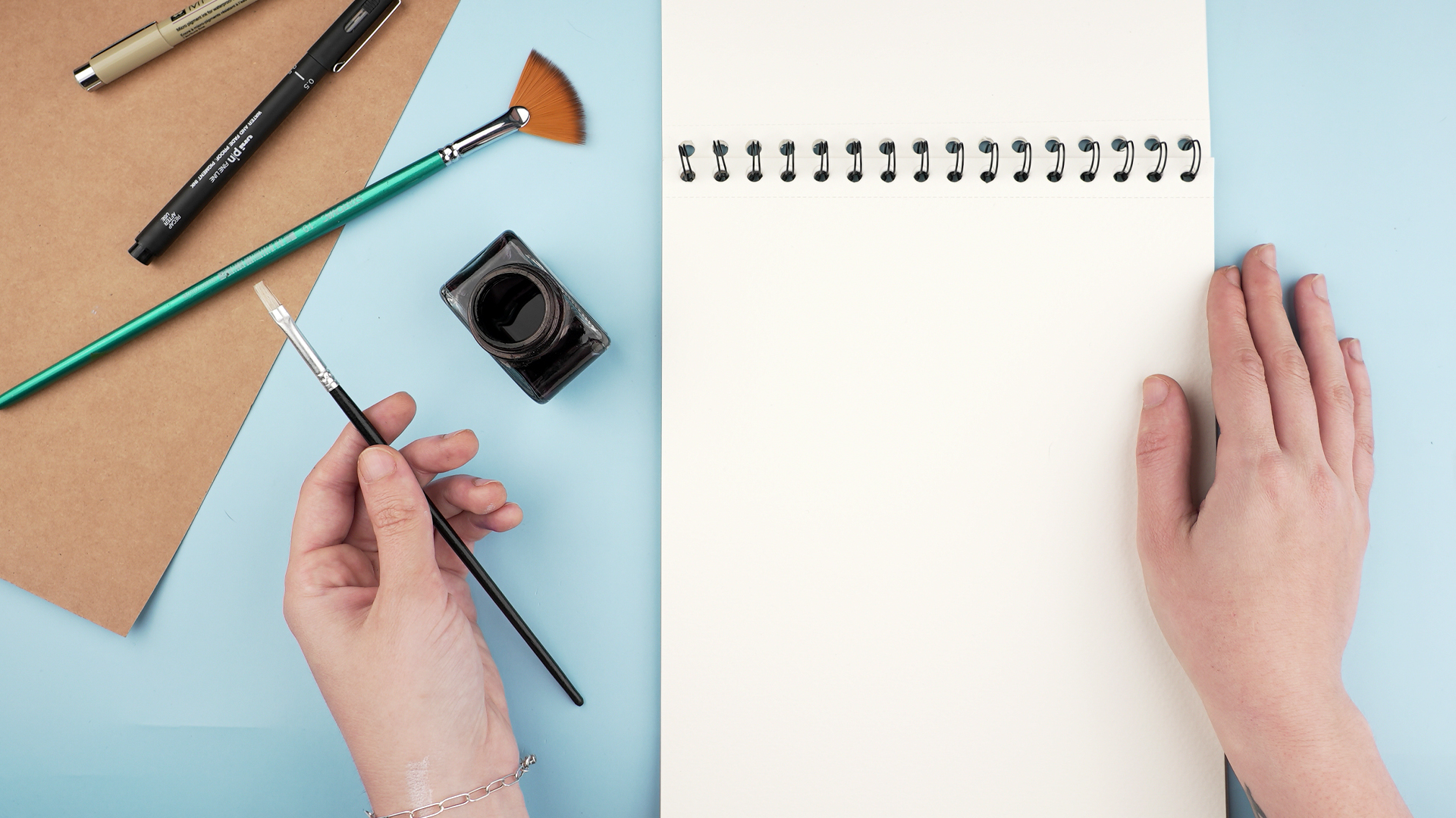
Learning how to ink a drawing is the moment your sketch stops whispering and starts speaking in a confident, stylish voice. Pencil is forgiving, soft, and easy to nudge around. Ink, meanwhile, walks into the room wearing boots. It commits. It defines shapes, clarifies details, adds drama, and turns a loose sketch into polished line art.
The good news? You do not need to be a comic-book legend, tattoo designer, or mysterious café artist with perfect hair to ink well. You need the right tools, a steady process, and a little courage. Inking is not about tracing every pencil mark like a nervous photocopier. It is about making smart decisions: which lines matter, where shadows belong, how thick a contour should be, and when to stop before your drawing looks like it got trapped in a spaghetti storm.
This guide breaks down how to ink a drawing in 14 practical steps, from preparing your pencil sketch to adding line weight, texture, shadows, and final cleanup. Whether you are creating comic art, character design, botanical illustration, urban sketches, manga-style line art, or a simple doodle that deserves a promotion, these steps will help you ink with confidence.
What Does It Mean to Ink a Drawing?
Inking a drawing means applying permanent or semi-permanent lines over a sketch using pens, brushes, markers, dip pens, or digital inking tools. The goal is not just to make the pencil lines darker. Good inking improves clarity, creates depth, separates foreground from background, and gives the artwork a finished visual style.
Traditional inking usually uses fineliners, brush pens, India ink, technical pens, or waterproof drawing ink. Digital inking uses a stylus and software brushes, but the principles are nearly the same: clean lines, intentional contrast, controlled pressure, and smart simplification.
How to Ink a Drawing: 14 Steps
1. Start With a Clean Pencil Sketch
A strong ink drawing begins before the ink appears. Make your pencil sketch clear enough to guide you, but not so dark that it fights the final line work. Use light graphite, such as an H or HB pencil, and avoid pressing too hard. Heavy pencil grooves can trap ink and make erasing difficult later.
Before inking, review the drawing and decide what each line is doing. Is it defining an edge? Showing a fold? Creating texture? If a line has no job, fire it politely. Ink rewards editing. A messy sketch can still become a beautiful inked piece, but a thoughtful sketch makes the process much easier.
2. Choose the Right Paper
Paper matters more than beginners think. Smooth Bristol board, hot-pressed watercolor paper, marker paper, and illustration board are popular choices because they allow pens to glide without catching on rough fibers. A very textured surface may create broken lines, wear down nibs, or cause ink to feather.
If you plan to add watercolor or ink wash, choose paper that can handle moisture. If you only want crisp black line art, smooth Bristol is a reliable option. Test your pen on a corner or scrap before committing. Paper surprises are fun at birthday parties, not halfway through a portrait.
3. Pick Your Inking Tools
You can ink with many tools, and each creates a different personality. Fineliners are great for beginners because they offer consistent lines and come in different nib sizes. Brush pens create expressive thick-to-thin strokes. Dip pens produce elegant, flexible lines but require practice. Technical pens are excellent for precise architectural or mechanical drawings.
For a basic starter kit, try three waterproof fineliners: a small nib for details, a medium nib for general outlines, and a larger nib or brush pen for bold shadows. You do not need twenty pens to begin. In fact, too many tools can make you spend more time choosing a pen than actually drawing, which is how art supplies become tiny expensive furniture.
4. Test Your Ink Before Using It
Always test your ink on the same paper you will use for the final drawing. Check whether the ink bleeds, feathers, smears, or reacts badly with erasers. If you plan to color over your lines with watercolor, markers, or ink wash, make sure the pen is waterproof or compatible with that medium.
Let the test line dry fully, then rub it gently with an eraser and brush water or marker over it. If the line smudges into a gray cloud of regret, choose another pen or allow more drying time.
5. Decide Your Inking Style Before You Begin
Not all ink drawings need the same style. A cartoon character may look best with bold outer contours and simple interior details. A botanical drawing may need delicate lines, stippling, and subtle texture. A comic panel may require dramatic shadows, speed lines, and varied line weight.
Before you ink, ask: Should this drawing feel clean, rough, realistic, graphic, elegant, energetic, or moody? Your answer will guide your line choices. Inking without a style plan is like cooking without knowing whether you are making soup or cookies. Technically possible, but emotionally risky.
6. Ink the Main Contours First
Begin with the most important outside edges and major shapes. These lines establish the structure of the drawing. Use slow, confident strokes instead of tiny scratchy marks. If a line is long, rotate the paper so your hand moves naturally. Your wrist, elbow, and shoulder should work together depending on the length of the line.
Do not rush. Ink looks better when it feels intentional. You can always add more detail later, but you cannot easily remove a heavy outline once it lands. Start controlled, then build.
7. Use Line Weight to Create Depth
Line weight means the thickness or darkness of a line. It is one of the most powerful tools in inking. Thicker lines can show shadow, weight, closeness, or importance. Thinner lines can show light, distance, delicate details, or secondary forms.
Try making outer contours slightly thicker than interior lines. Add heavier lines under objects, beneath hair, inside folds, or where forms overlap. For example, if you are inking a hand holding a cup, the fingers in front can have slightly stronger lines than the cup edge behind them. This helps the viewer understand depth instantly.
8. Add Interior Details Carefully
Once the main outline is set, move to smaller interior lines: facial features, clothing folds, wood grain, leaves, fur, cracks, patterns, and surface details. Keep these lighter than the main contours unless they are in deep shadow.
A common beginner mistake is giving every detail the same heavy line. This flattens the drawing and makes the viewer’s eye tired. Think of your lines like a conversation. Not every line needs to shout. Some can whisper, some can hum, and one or two can dramatically announce, “I am the shadow under the chin.”
9. Build Shading With Hatching
Hatching is shading with repeated parallel lines. Place the lines closer together for darker values and farther apart for lighter values. The direction of your hatching can follow the form of the object, helping it feel rounded or dimensional.
For example, if you are shading a cylinder, curve your hatch marks slightly around the form. If you are shading a wall, straight vertical or horizontal hatching may feel more appropriate. Keep your strokes consistent. Random hatching can work, but only when it looks intentional rather than panicked.
10. Use Cross-Hatching for Darker Values
Cross-hatching adds a second or third layer of lines over the first, usually at an angle. This builds darker tones without filling an area completely black. It is excellent for portraits, fabric folds, landscapes, comic art, and dramatic lighting.
Start lightly and build gradually. If your first layer is too dark, you have nowhere to go. Think of cross-hatching like seasoning food. You can add more pepper. Removing it requires a time machine.
11. Try Stippling for Texture and Control
Stippling uses dots to create value and texture. More dots mean darker areas; fewer dots mean lighter areas. This technique works beautifully for skin texture, stones, plants, insects, old objects, and scientific-style illustrations.
The downside is that stippling takes patience. A lot of patience. Possibly “waiting for bread dough to rise while reading a tax form” patience. But the reward is precise shading with a refined, handmade look. Use a fine pen and keep the dots varied enough to feel natural.
12. Add Solid Blacks for Drama
Solid black areas can make an ink drawing bold and professional. They create contrast, direct attention, and make lighter details pop. Use black shapes in cast shadows, dark clothing, deep hair areas, night scenes, or graphic backgrounds.
Before filling an area, mark it lightly or test the shape visually. Large black areas change the balance of the whole composition. When used well, they add power. When overused, they can swallow your details like a tiny artistic black hole.
13. Let the Ink Dry Completely
Drying time depends on the ink, paper, humidity, and how heavily you applied it. Fineliners may dry quickly, while brush pens, dip ink, and filled black areas can take longer. Wait before erasing pencil lines or adding wet media.
If you are impatient, place the drawing somewhere safe and work on another sketch. Do not wave your hand over the page like a dramatic magician unless you enjoy accidental smears. Ink has a talent for finding sleeves, palms, and the cleanest part of your paper.
14. Erase Pencil Lines and Make Final Touches
After the ink is fully dry, use a clean soft eraser to remove the pencil sketch. Erase gently so you do not dull the ink or damage the paper. Brush away eraser crumbs with a clean brush or cloth instead of your hand, which may contain oil or moisture.
Now review the piece. Add small accents, strengthen a few shadow lines, clean up uneven areas, or add white highlights with a gel pen if appropriate. Stop before you overwork it. A finished ink drawing should feel intentional, not like you challenged every blank space to a duel.
Common Inking Mistakes to Avoid
Using the Same Line Thickness Everywhere
Uniform lines can look stiff unless that is your chosen style. Vary line weight to show depth, light, and importance.
Inking Too Fast
Speed is useful after control develops. At first, slow down and focus on confident strokes.
Ignoring the Light Source
Shadows and thick lines should make sense. Decide where the light is coming from before adding heavy marks.
Overloading the Drawing With Texture
Texture should support the subject. Too much hatching, stippling, and detail can make the piece noisy.
Erasing Before Ink Dries
This is the classic disaster. Wait longer than you think you need to. Future you will be grateful.
Best Inking Techniques for Beginners
If you are new to ink drawing, start with contour lines, simple line weight, hatching, and small areas of solid black. These four skills will carry you surprisingly far. Once comfortable, explore cross-hatching, stippling, dry brush, ink wash, and mixed media.
A great beginner exercise is to draw the same simple object three times, such as a mug, shoe, or houseplant. Ink the first version with clean outlines only. Ink the second with varied line weight. Ink the third with hatching and shadows. This teaches you how each layer changes the mood and readability of the drawing.
How to Ink Different Types of Drawings
Character Art
Focus on clean silhouettes, expressive facial features, and line weight around overlapping forms. Hair, clothing folds, and accessories are excellent places to add detail without cluttering the face.
Comic Art
Use bold contours, strong shadows, clear facial expressions, and readable action lines. Comic inking must communicate quickly because readers move from panel to panel.
Botanical Illustration
Use delicate lines, controlled stippling, and careful contour changes. Leaves, stems, petals, and seeds often need subtle texture instead of heavy outlines.
Urban Sketching
Capture the big shapes first, then add windows, signs, bricks, people, and shadows. Waterproof ink is helpful if you plan to add watercolor washes.
Manga-Inspired Line Art
Use confident outlines, expressive eyes, clean hair shapes, and selective detail. Brush pens are especially useful for dynamic thick-to-thin strokes.
Extra Experience: Practical Lessons From Inking Real Drawings
One of the biggest lessons in learning how to ink a drawing is that your hand confidence improves faster than your fear disappears. Many beginners wait until they feel brave enough to use ink. The funny thing is that bravery usually arrives after you start, not before. The first few lines may feel terrifying, especially on a drawing you like. That is normal. Ink is permanent, but your growth is also permanent. Every page teaches you something.
A helpful habit is to make a “warm-up strip” before inking the final artwork. On a scrap piece of the same paper, draw straight lines, curved lines, circles, dots, and small hatch marks. Test the pressure of your pen. Try pulling lines toward you instead of pushing them away. Practice lifting the pen at the end of a stroke so the line tapers naturally. This two-minute warm-up can prevent shaky first lines and remind your hand that it is, in fact, attached to an artist.
Another real-world lesson is that mistakes are not always disasters. A wobbly line can become a thicker line. A small blot can become a shadow, texture, leaf, button, freckle, crack, or mysterious artistic decision. The trick is not to panic immediately. Pause, look at the whole drawing, and ask whether the mistake can be absorbed into the design. Many professional-looking ink drawings include tiny corrections that viewers never notice.
Line weight is also easier to understand when you observe everyday objects. Look at a lamp, backpack, sneaker, or coffee mug. Notice where edges appear dark because one form overlaps another. Notice the underside of objects, corners, folds, and cast shadows. These are natural places for heavier ink lines. When you train your eye this way, your inking becomes less random and more believable.
For beginners, it is smart to finish several small ink drawings instead of obsessing over one giant masterpiece. A postcard-sized drawing of a plant, a street corner, a cartoon animal, or a kitchen object can teach you plenty. Smaller drawings reduce pressure and make experimentation easier. You can test stippling on one piece, brush pen outlines on another, and ink wash on a third. Over time, patterns appear. You will discover which pens feel comfortable, which paper behaves well, and which techniques match your natural style.
Finally, remember that clean inking does not mean lifeless inking. A perfect mechanical line can be beautiful, but so can a lively imperfect stroke. The goal is not to erase your personality from the drawing. The goal is to make intentional marks that support the artwork. Let some lines breathe. Let some edges fade. Let your shadows create rhythm. Ink is bold, but it does not have to be stiff. The best ink drawings feel both controlled and alive, like the artist knew the rules but still had a little fun breaking them.
Conclusion
Inking a drawing is a skill built from planning, patience, and practice. Start with a clean sketch, choose smooth paper, test your pens, and build your line work in layers. Use line weight to create depth, hatching and cross-hatching to build value, stippling for texture, and solid blacks for drama. Most importantly, do not treat inking as simple tracing. It is a creative stage where your drawing becomes sharper, stronger, and more expressive.
The more you ink, the better your decisions become. You will learn when to use a thin line, when to push a shadow, when to simplify details, and when to put the pen down before your artwork files a complaint. So grab a pen, choose a sketch, take a steady breath, and begin. Your first inked drawing does not need to be perfect. It just needs to teach you enough to make the next one better.