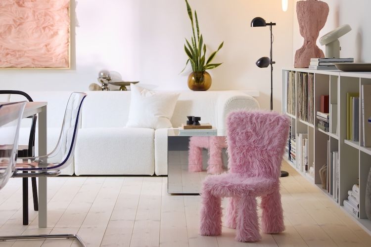
If beige has been the sensible sedan of home decor, IKEA just pulled up in a pink scooter with streamers on the handlebars. For 2026, the brand’s Color of the Year is Rebel Pink, a shade that feels like it drank an espresso, found its confidence, and decided your living room deserved a little more fun. In a year when many color forecasts are leaning earthy, cozy, and muted, IKEA’s choice zigs where others zag. And honestly? It is kind of refreshing.
What makes this pick especially interesting is that IKEA is not presenting Rebel Pink as a gimmick color or a one-season novelty. The company is positioning it as a joyful, expressive hue that still works with everyday living. That is a tricky design high-wire act. Pink can go sugary fast. It can also feel too precious, too loud, or too “someone on social media told me to do this.” But IKEA’s 2026 message is different: this pink is playful, yes, but it is also practical, layerable, and surprisingly versatile.
So why is everyone paying attention? Because Rebel Pink lands right at the intersection of several trends Americans are already seeing in their homes: mood-boosting decor, more personal interiors, a return to color, a little nostalgia, and a growing refusal to make every room look like a rental listing with excellent lighting and no personality. IKEA’s 2026 color story is basically saying, “You can still be Scandinavian and have a pulse.”
Meet Rebel Pink, IKEA’s 2026 Color of the Year
Rebel Pink is the official IKEA Color of the Year for 2026, and the name tells you almost everything you need to know. It is not trying to whisper politely from the corner. It is meant to energize a space, spark joy, and invite a little self-expression into the home. But unlike hot pinks that can overpower a room or pale pinks that vanish into the drywall, Rebel Pink sits in a sweet spot. It feels bright and upbeat without becoming chaotic.
That balance is why so many design writers have described it as unexpectedly useful. The shade has enough softness to play nicely with everyday interiors, but enough attitude to wake up a room that has grown overly dependent on white, greige, oatmeal, mushroom, fog, cloud, mist, pebble, and every other polite neutral that sounds like it belongs on a spa menu.
In other words, Rebel Pink is bold, but it is not reckless. It reads playful rather than childish, expressive rather than messy, and cheerful rather than cartoonish. That distinction matters. People want homes that feel happier and more personal, but not like a carnival exploded near the throw pillows. IKEA seems to understand that tension very well.
Why This Is IKEA’s Most Playful Pick Yet
The word “playful” keeps showing up in conversations around Rebel Pink because IKEA is tying the color to a bigger idea than simple trend forecasting. The brand’s 2026 style direction leans into joy, fun, color, and more emotionally expressive interiors. This is not just about what looks good in a catalog photo. It is about what makes a home feel lively, human, and less emotionally beige.
That philosophy also connects to IKEA’s broader messaging about play at home. The company has been talking more openly about joy, creativity, togetherness, and the role of fun in daily life. That is a smart move in a design culture that has spent years worshipping “calm” to the point where some homes started to feel like beautiful waiting rooms.
Rebel Pink pushes back against that. It suggests that adults do not need to age into chromatic silence. A room can be tidy and still have a sense of humor. A home can be functional and still flirt with whimsy. A chair can hold your body and your inner child at the same time. That last one sounds dramatic, but then again, IKEA is literally styling fuzzy chairs, playful storage, and cheeky accessories around this color story. Subtle? Not always. Memorable? Absolutely.
There is also a cultural reason this color feels timely. Over the last few years, decor has been drifting toward spaces that feel more personal and less rule-bound. Dopamine decor, joycore, playful maximalism, nostalgic silhouettes, graphic patterns, and mood-lifting colors are all part of that shift. Rebel Pink fits neatly into that movement while still feeling wearable for regular people who do not want their apartment to look like a theme park gift shop.
Why Rebel Pink Actually Works in Real Rooms
The biggest surprise about IKEA’s 2026 color pick is not that it is pink. It is that the company is treating pink almost like a bold neutral. At first glance, that sounds like something a design editor says after three coffees and a deadline. But the idea makes sense.
Some colors behave like soloists. Others are team players. Rebel Pink seems to be both. It can absolutely take center stage, especially in upholstery, bedding, accent furniture, or statement decor. But it can also act as a lively bridge between other tones. Pair it with rich browns and it feels grounded. Put it next to burgundy or plum and it gets moodier. Mix it with green and it becomes fresh and energetic. Add lavender and suddenly the room feels playful in a softer, more layered way.
This is where IKEA’s Scandinavian roots keep the trend from spinning off into chaos. The brand is not asking people to paint every wall pink and live inside a strawberry milkshake. The more practical takeaway is to use Rebel Pink the way you would use any strong accent: in doses, in layers, and with materials that keep it feeling sophisticated. Think pale wood, warm white, woven textures, matte ceramics, glass, brushed metal, or earthy fabrics. That combo keeps the color bright without making the room feel loud.
It also helps that pink has matured in interior design. This is not the old “little girl’s bedroom” stereotype anymore. Designers have spent years proving that pink can function like a versatile decor tool, showing up in everything from dramatic dining rooms to restrained, elegant bedrooms. Rebel Pink builds on that evolution, but with a more cheerful, everyday IKEA twist.
How IKEA Is Bringing Rebel Pink to Life
IKEA is not releasing Rebel Pink into the world as an abstract concept. The company is actively building it into products, styling, and the upcoming GREJSIMOJS collection, a 33-piece range designed around play, imagination, and joy in the home. That collection alone explains why the 2026 color story feels so much more animated than a standard annual color announcement.
The product examples are classic IKEA in the best way: accessible, practical, and just odd enough to make you grin. Rebel Pink appears in decor, textiles, and tabletop pieces, but it also shows up in more character-driven designs. Some of the widely discussed examples include a fuzzy MAMMUT chair cover, playful storage pieces, expressive lamps, and cheerful accessories that feel like they wandered in from a particularly stylish dream sequence.
Even outside the collection, IKEA has shown how Rebel Pink can move through different rooms and product categories. It works in bedding, baskets, plant pots, tealight holders, and kitchenware. That matters because it gives shoppers two different entry points. You can go big with furniture and statement decor, or you can test the waters with smaller items that cost less than a takeout splurge and carry much less emotional risk than painting a wall.
And no, you do not have to turn your entire home pink overnight. In fact, IKEA’s product strategy almost seems designed for gradual commitment. A plant pot here, a tray there, maybe a pink lamp or textile, and before you know it your room has a pulse again.
How to Use IKEA’s 2026 Color of the Year at Home
1. Start with accents if you are color-shy
If the idea of Rebel Pink makes you nervous, begin small. A throw pillow, ceramic vase, wire basket, candleholder, or bedding accent can introduce the color without taking over the room. This is the “dip a toe, not the whole personality” method, and it works.
2. Pair it with grounded materials
Pink gets much more sophisticated when it is anchored by natural wood, rattan, linen, bouclé, stone, or warm metallic finishes. These textures prevent the color from feeling too slick or too sweet. They also make the room feel collected instead of themed.
3. Use it with browns, greens, and burgundy
One reason Rebel Pink feels surprisingly adult is its compatibility with deeper, richer colors. Chocolate brown gives it depth. Olive or leaf green creates fresh contrast. Burgundy adds drama. Lavender softens it. Even a little mustard can make the palette feel retro in a very 2026 kind of way.
4. Let neutral walls do the heavy lifting
If your walls are white, cream, soft taupe, or pale gray, congratulations: you already own the perfect backdrop. Rebel Pink thrives when it has breathing room. It does not need constant competition. One or two pink moments in a calm room can be more effective than an all-pink everything approach.
5. Mix fun with function
The smartest version of this trend is not “buy random pink objects until your room looks surprised.” It is choosing useful pieces that happen to add joy. Storage, lighting, bedding, planters, organizers, and tabletop accessories are all excellent places to try Rebel Pink because they earn their square footage.
Why Rebel Pink Feels Right for 2026
Design trends do not emerge from thin air. They usually reflect what people are craving emotionally, aesthetically, and culturally. Rebel Pink makes sense for 2026 because it responds to several desires at once. People want comfort, but they also want energy. They want calm, but not boredom. They want homes that reflect who they are, not what an algorithm told them to buy.
IKEA’s broader messaging around joy at home reinforces that point. The company has highlighted how enjoyment, playfulness, and self-expression can positively shape how people feel in their spaces. That makes Rebel Pink more than a decorative stunt. It becomes a symbol for a slightly different way of thinking about home: not just as a place to keep things organized, but as a place that can lift your mood, support creativity, and make everyday life feel a little less flat.
There is also something strategically clever about choosing pink now. For years, the design world has bounced between ultra-neutral minimalism and carefully curated bursts of color. Rebel Pink lands in the middle. It still feels intentional and design-forward, but it is warmer, friendlier, and more inviting than a severe gallery-white approach. It offers personality without requiring a complete style identity crisis.
And perhaps that is why this color story is resonating. It is not asking you to become a different person. It is just asking whether your home could stand to smile a little more.
Experience the Trend: What Living With Rebel Pink Can Feel Like
Here is the part that often gets lost in trend coverage: color is not just visual. It is experiential. You do not merely see Rebel Pink. You live around it. You notice it while making coffee, while folding laundry, while glancing at a shelf after a long workday, or while your guests spot something fuzzy, pink, and slightly ridiculous in the corner and immediately ask where you got it.
In a kitchen, Rebel Pink tends to feel surprisingly upbeat rather than sugary. A baking dish, mug, tray, or floral textile in this shade can make the room feel less utilitarian and more alive. It changes the vibe of ordinary routines. Suddenly breakfast is not just toast over the sink while checking email like a stressed raccoon. It is toast in a room that looks awake.
In a bedroom, the experience shifts. Rebel Pink in bedding or a small upholstered accent can make the space feel softer and more personal without pushing it into saccharine territory. Paired with cream, brown, muted plum, or warm wood, it creates a cozy kind of energy. Not sleepy-beige cozy. More like “I have opinions, good blankets, and a lamp I actually love” cozy.
In a home office or study nook, this color can work as a low-key morale booster. A pink organizer, desk lamp, memo board, or planter brings a little movement to spaces that can otherwise drift into gray productivity soup. The shade feels especially effective when the work area is mostly neutral. One rebellious pop of color can remind you that efficiency and personality do not have to live in separate zip codes.
Living rooms may be where Rebel Pink has the most fun. This is where the color can become social. It catches the eye, starts conversations, and makes a room feel less staged. A pink accent chair, throw, cushion, or side table detail can act like a design wink. It tells people the room is cared for, but not too precious. You are allowed to sit here, snack here, laugh here, and possibly argue over what movie to watch while pretending everyone agreed on the same streaming service.
For families, the experience can be even more layered. Because IKEA is tying Rebel Pink to play and imagination, the color naturally fits spaces where children and adults overlap. A room can feel more relaxed when it includes shapes, textures, and colors that invite interaction rather than silence. That matters in real homes, where “beautiful” and “lived-in” should not be mortal enemies.
And for people living in small spaces, Rebel Pink can be a clever shortcut to personality. You may not have room for sweeping design gestures, but you can still create memorable moments. A single pink lamp on a narrow shelf, a basket in an entryway, a bright textile on the end of a bed, or a playful object that interrupts an otherwise neutral palette can make a compact home feel curated rather than cramped.
Ultimately, the lived experience of Rebel Pink is less about drama and more about emotional temperature. It warms a room. It lightens the mood. It creates the sense that home is not just where you store your stuff, but where your taste, humor, and energy are allowed to show up. That may be the biggest reason IKEA’s 2026 Color of the Year feels so timely. It does not just decorate a space. It gives it a little life.
Final Thoughts
IKEA’s 2026 Color of the Year feels important not because it is pink, but because of what kind of pink it is. Rebel Pink is expressive without being exhausting, playful without being childish, and flexible enough to work in homes that are modern, cozy, maximalist, Scandinavian, or somewhere in the messy middle where most real people actually live.
It is also a sign that home design is continuing to move toward something more emotional and more personal. Less showroom perfection. More joy. Less fear of color. More rooms that look like actual humans live in them and occasionally buy fun things on purpose.
So yes, IKEA’s 2026 Color of the Year may be their most playful pick yet. But it is not all jokes and fuzzy furniture. It is a smart, timely, mood-lifting color choice that reflects where interiors are headed next: toward homes that feel warmer, bolder, and a whole lot more alive.