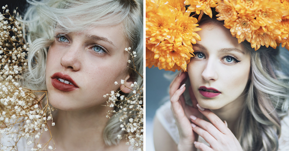
Blue eyes have a strange way of turning a portrait into a weather report. One minute they look like morning fog over a quiet lake; the next, they flash like storm light on glass. That is exactly why I love building dreamy portraits around themnot because one eye color is “better” than another, but because blue gives an artist a whole suitcase of moods: calm, mystery, distance, softness, melancholy, clarity, and the occasional “I know your secret, but I’m too polite to mention it” expression.
When I create portraits inspired by blue eyes, I am not simply painting irises. I am chasing atmosphere. The goal is not to copy a face like a passport photo with better lighting. The goal is to capture the emotional temperature of a person. A good portrait can make a viewer pause, lean closer, and wonder what happened two seconds before the image began. That is the fun part. The canvas becomes a tiny stage, the eyes become the lighting crew, and suddenly the whole face starts telling a story.
Portraiture has always been about more than appearance. Museums and art historians often describe portraits as records of identity, culture, personality, memory, and time. A face can be formal, rebellious, tender, guarded, theatrical, or wildly ordinary in the most interesting way. In dreamy blue-eye portraits, I use that tradition as a springboard, then add a modern twist: soft focus, layered color, symbolic details, floating textures, and a little visual magicthe kind that makes a viewer think, “I know this is a portrait, but why does it feel like a song?”
Why Blue Eyes Create Such a Dreamy Portrait Mood
Blue is one of the most emotionally flexible colors in visual storytelling. In design and color theory, blue is often associated with calm, trust, openness, depth, coolness, and contemplation. But blue is not one personality wearing a blazer. Pale blue feels airy and innocent. Slate blue feels thoughtful. Cobalt feels electric. Navy feels serious, cinematic, and slightly dramatic, like it owns a velvet chair and reads poetry during thunderstorms.
That range makes blue eyes especially interesting for portrait art. They can pull a composition toward softness or intensity depending on lighting, surrounding colors, and expression. A blue iris against warm skin tones may feel luminous and intimate. A blue iris surrounded by cool grays and silvers may feel distant, almost celestial. Add peach, gold, rose, lavender, or shadowy green, and the portrait begins to shift like a sky at sunset.
The Science Adds to the Magic
Part of the fascination comes from the way eye color works. Blue eyes do not contain blue pigment in the simple “paint bucket” sense. Eye color is connected to melanin in the iris and how light interacts with the eye’s structure. Lighter eyes generally have less melanin than darker brown eyes, which allows light scattering to play a larger role in how blue tones appear. In practical art terms, that means blue eyes are already a lesson in reflection, softness, and illusion. Nature basically handed artists a tiny color-theory workshop and placed it right in the middle of the face.
This is why blue eyes may seem to change depending on light, clothing, background, and surrounding colors. A blue eye can look icy, gray, teal, smoky, or bright depending on context. For a portrait artist, that is not a problem. That is a playground.
The Portrait Begins With the Gaze
Before I choose a brush, pencil, tablet stylus, or color palette, I look for the gaze. The gaze decides the emotional direction of the portrait. Is the subject looking directly at the viewer? Then the image may feel intimate, confident, or confrontational. Are the eyes turned away? Now the portrait becomes private, thoughtful, or cinematic. Are the eyelids lowered? That can create mystery, fatigue, elegance, sadness, or quiet strength.
In dreamy portraits inspired by blue eyes, the gaze matters more than perfect symmetry. Real faces are not math homework. A slightly uneven smile, a shadow under one eye, or a lock of hair crossing the forehead can make the whole piece feel alive. Too much perfection turns a portrait into a mannequin with excellent skin care. A little imperfection gives it a pulse.
Direct Gaze vs. Soft Distance
A direct gaze works beautifully when I want the portrait to feel magnetic. Blue eyes can become the central anchor, especially when the surrounding tones are quiet. I might use muted creams, foggy whites, dusty pinks, or soft taupes so the eyes hold the viewer without shouting. The trick is to make the eyes vivid but not radioactive. Nobody wants a portrait where the eyes look like two decorative headlights.
A distant gaze creates a different kind of dream. When the subject looks slightly away, the viewer becomes an observer rather than a participant. This approach is wonderful for portraits with poetic themes: memory, longing, imagination, reflection, or change. I often pair this gaze with airy textures such as mist, clouds, water ripples, translucent fabric, or faint floral shapes. The final image feels less like “Here is a person” and more like “Here is a moment that almost disappeared.”
Building a Color Palette Around Blue Eyes
Color is where dreamy portraiture really starts to float. Blue eyes give me a strong visual starting point, but the surrounding palette decides the mood. A portrait can become romantic, surreal, editorial, vintage, or fantasy-inspired simply by changing the color relationships.
Soft Neutrals for a Gentle, Ethereal Look
When I want the portrait to feel delicate, I use soft neutrals: ivory, pearl gray, warm beige, pale blush, and faded sand. These colors allow blue eyes to glow without making the entire portrait feel cold. This palette is especially useful for close-up portraits where the viewer’s attention should move naturally from the eyes to the lips, cheekbones, hair, and background.
The result is often quiet and intimate, like a page from a visual diary. This approach works well for fine-art portraits, editorial-style photography, digital paintings, and watercolor-inspired illustrations.
Gold and Peach for Warm Contrast
Blue and warm gold are old friends. They sit across from each other emotionally: cool and warm, moonlight and candlelight, calm and glow. I often use touches of gold near the eyes, in jewelry, in background dust, or as a rim of light across the face. Peach and coral tones can also make blue eyes appear more luminous because the warmth creates contrast.
This is one of my favorite combinations because it keeps the portrait from feeling too icy. Blue eyes surrounded only by blue can become beautiful but chilly, like a fancy refrigerator. Add warm tones, and suddenly the face feels human, alive, and approachable.
Lavender, Silver, and Mist for a Surreal Mood
For a more dreamlike effect, I turn to lavender, silver, pale violet, and misty gray. These colors create a soft fantasy atmosphere without pushing the portrait into full fairy-tale territory. The eyes become part of a larger mood, almost like stars seen through thin clouds.
This palette works especially well when the portrait includes symbolic elements: moon shapes, water reflections, translucent flowers, glass, feathers, or blurred lights. The key is restraint. A dreamy portrait should feel magical, not like it lost a fight with a glitter drawer.
Texture: The Secret Ingredient in Dreamy Portraits
Texture can turn a technically good portrait into an unforgettable one. Smooth skin, sharp eyelashes, and clean lines are useful, but dreamy art often needs contrast: soft against sharp, matte against shine, detail against blur.
For blue-eye portraits, I like using textures that echo water, sky, glass, or frost. A faint watercolor bloom around the face can suggest emotion. Grain can make a digital portrait feel more handmade. Fine pencil marks around the eyes can add vulnerability. Soft bokeh lights in the background can make the portrait feel cinematic.
Where to Add Detail
The eyes deserve the highest detail, but not every part of the portrait should compete for attention. I usually sharpen the iris, eyelid edges, lashes, and a few strands of hair near the face. Then I let other areas dissolve slightly. This creates a visual hierarchy. The viewer knows where to look first, then where to wander.
If everything is equally detailed, the image can feel noisy. If everything is too soft, it can feel unfinished. Dreamy portraiture lives in the balance between clarity and blur. Think of it as letting the viewer hold the subject’s gaze while the rest of the world politely steps back.
Symbolism: What Blue Eyes Can Suggest in Art
Blue eyes in art can symbolize many things, depending on context. They may suggest innocence, distance, honesty, sadness, imagination, winter, calm, curiosity, or emotional depth. But symbolism should never be lazy. A portrait becomes more powerful when symbols support the person rather than turn them into a decorative idea.
For example, water can symbolize reflection or emotional movement. Clouds can suggest memory or uncertainty. Stars can hint at wonder. Broken glass might suggest fragility, while pearls can suggest quiet elegance. A field of pale flowers can create softness, but a single flower near the collarbone may feel more intentional. Symbolism is like seasoning: enough makes the dish memorable; too much makes everyone ask what happened.
Examples of Symbolic Portrait Concepts
One portrait concept might feature a subject with pale blue eyes looking through a rain-streaked window. The color palette could include slate, silver, soft cream, and a hint of amber light from inside the room. The meaning: private thoughts, emotional distance, and warmth trying to reach through the weather.
Another concept could use a close-up face surrounded by floating paper cranes in soft blue and white. The eyes would mirror the delicate folds of the paper. The meaning: hope, memory, and the beauty of things made carefully by hand.
A third idea might place the subject against a deep navy background with tiny gold specks, almost like a night sky. The blue eyes become the brightest point, not because they are exaggerated, but because everything else supports them. The meaning: quiet confidence, mystery, and inner light.
How I Create the Dreamy Portrait Effect
My process usually begins with a mood rather than a finished image. I ask myself: should this portrait feel like dawn, twilight, winter, ocean air, a forgotten photograph, or a dream someone almost remembers? Once the mood is clear, the visual choices become easier.
Step 1: Choose the Emotional Direction
I decide whether the portrait should feel peaceful, mysterious, romantic, melancholic, bold, or surreal. For blue-eye-inspired portraits, I often start with words such as “mist,” “glass,” “moonlight,” “quiet,” “tender,” or “electric.” These words guide everything from pose to lighting.
Step 2: Design the Light
Light is the real storyteller. Soft side lighting can make the eyes glow gently. Backlighting can turn hair into a halo and make the face feel almost weightless. Low light can create drama and depth. Bright front light can work too, but it needs subtle shadows so the face does not flatten into a pancake with eyelashes.
Step 3: Keep the Eyes Alive
The catchlightthe tiny reflection in the eyeis crucial. Without it, even a beautifully colored eye can look flat. I usually place a small highlight where it makes sense according to the light source. I also add tiny variations inside the iris: rings, radial lines, gray-blue shifts, and soft darker edges. These details make the eye feel natural rather than painted as a single blue circle.
Step 4: Let the Background Breathe
A dreamy background should support the portrait, not steal the microphone. I prefer atmospheric backgrounds: blurred landscapes, soft gradients, abstract washes, floating shapes, or subtle textures. The best background feels like it belongs to the subject’s inner world.
Why Dreamy Portraits Still Matter in the Age of Fast Images
We live in a world full of quick selfies, filters, profile photos, and images that disappear before your thumb has fully committed to scrolling. Dreamy portraits slow things down. They ask for attention. They say, “Stay here a second. There is more to see.”
That is why portraiture remains powerful. A portrait can preserve identity, but it can also reinterpret it. It can show how someone looks, but more importantly, it can suggest how they feel, what they hide, what they remember, or what kind of light seems to follow them around. Blue eyes are simply one doorway into that deeper visual language.
For artists, this kind of portrait also offers freedom. You can blend realism with imagination. You can honor the structure of the face while bending the atmosphere around it. You can paint someone as a person, a memory, a season, or a mood. That flexibility is what keeps portrait art alive and endlessly interesting.
Experiences From Creating Dreamy Portraits Inspired By Blue Eyes
Over time, I have learned that creating dreamy portraits inspired by blue eyes is less about color accuracy and more about emotional honesty. At first, I used to obsess over getting the exact shade right. Was it pale blue? Gray-blue? Ocean blue? Denim blue? The kind of blue that looks calm until it hears bad news? I would zoom in too far, adjust the hue endlessly, and eventually realize I had spent twenty minutes arguing with five pixels. Very glamorous. Very artistic. Also, very unnecessary.
The breakthrough came when I stopped asking, “What color are these eyes?” and started asking, “What do these eyes make the portrait feel like?” That changed everything. A person’s blue eyes might feel cool and distant in one pose, but warm and playful in another. The same eyes can look serious under soft window light and mischievous under golden afternoon light. The portrait’s mood comes from the whole arrangement: expression, posture, light, color, texture, and space.
One of my favorite experiences was creating a portrait where the eyes were not the brightest blue in the image. Instead, I surrounded the subject with muted navy, foggy gray, and pale cream. The eyes were subtle, almost quiet. At first, I worried they would not stand out enough. But when the portrait came together, the effect was stronger than if I had made them neon blue. The viewer had to slow down to notice them. That tiny pause gave the portrait intimacy.
Another lesson came from using warm colors. I once painted a blue-eye portrait with too much cool shading: blue background, blue highlights, blue shadows, blue everything. It looked less like a dreamy portrait and more like the subject had been trapped inside a decorative ice cube. When I added peach to the cheeks, warm brown to the lashes, and a small golden reflection near the iris, the face came alive. The blue eyes looked brighter because they finally had something warm to respond to.
I have also learned that the most memorable portraits are not always the prettiest in a polished sense. Sometimes the best version includes tired eyes, wind-tossed hair, uneven shadows, or a quiet expression that refuses to explain itself. Dreamy does not have to mean perfect. In fact, perfection can drain the feeling from a portrait. The human face becomes interesting when it carries a little weather.
When working digitally, I like layering translucent washes over the image: soft blue around the edges, a little lavender in the shadows, a pale gold highlight near the cheek or eyelid. When working traditionally, I enjoy watercolor blooms and pencil texture because they create happy accidents. A soft stain of color might spread in a way that looks like fog, breath, or memory. Sometimes the materials know where the dream is going before I do.
The biggest experience I can share is this: blue eyes may inspire the portrait, but they should not control it like tiny royal dictators. The portrait still needs a story. Who is this person? What are they feeling? What kind of world surrounds them? Are they stepping into light or disappearing from it? Once those questions are answered, the eyes become part of something larger. They become the doorway, not the entire house.
That is the beauty of creating dreamy portraits inspired by blue eyes. The process invites patience. It rewards subtlety. It turns color into atmosphere and a glance into narrative. And when everything finally worksthe gaze, the palette, the light, the texturethe portrait seems to breathe. Not loudly. Not dramatically. Just enough to make someone stop scrolling and feel something. In today’s world, that feels like a small miracle with excellent lighting.
Conclusion
Creating dreamy portraits inspired by blue eyes is really about translating a visual detail into emotion. Blue eyes can suggest calm, mystery, softness, distance, or brightness, but the true power of the portrait comes from how the artist shapes the whole scene around them. Through thoughtful color palettes, expressive gazes, symbolic details, and layered textures, a simple portrait can become a quiet story that feels both personal and universal.
The best blue-eye portraits do not worship one feature or chase unrealistic perfection. They use the eyes as a creative spark. From there, the artist builds atmosphere: warm contrast, cool shadows, soft backgrounds, careful highlights, and human imperfections that keep the image alive. Whether painted, photographed, or digitally illustrated, these portraits remind us that art is not only about what we see. It is about what the image makes us feel after we look away.
Note: This article is written for creative and educational inspiration. It celebrates portrait art, color, light, and storytelling without ranking or idealizing any physical feature.


