Kitchens have a special talent: they can look “fine” in listing photos and then feel like a cramped, dimly lit obstacle course in real life.
The good news? Most jaw-dropping before-and-after kitchen makeovers aren’t magic. They’re a handful of smart choiceslayout tweaks, better lighting,
and materials that behave like adults around spaghetti sauce.
Below are 33 makeover stories (the kind you screenshot at 1 a.m. and pretend is “research”) plus practical takeaways to help you plan your own kitchen renovation.
Some are full gut jobs; others are “weekend warrior with a paintbrush and a playlist.” All of them prove the same point: your kitchen doesn’t need to be bigger to feel better.
Steal the Strategy: What Most Great Kitchen “Afters” Have in Common
1) They fix the flow before they pick the finishes
In the best transformations, the “before” usually suffers from one of three problems: dead corners, no landing space near key appliances,
or a traffic lane that slices straight through the cooking zone. The “after” adds breathing roomsometimes by inches, sometimes by a wall coming down.
2) They upgrade lighting like it’s a personality trait
A bright kitchen isn’t just prettierit’s easier to work in. The glow-up formula is simple: layered lighting (ceiling + task + accent),
fewer shadows over counters, and fixtures that make the room feel intentional, not accidental.
3) They focus on one “hero” change
New cabinets are great. So is a new backsplash. But the makeovers people remember usually have a single headliner:
a new island, a statement range hood, a tall pantry wall, or a bold color moment that still feels livable on a random Tuesday.
4) They add storage that matches real habits
The “after” isn’t just more cabinets. It’s the right storage: deep drawers for pots, pullouts for trash and spices, a landing zone for mail,
and a pantry setup that doesn’t require yoga to reach the cereal.
33 Before-and-After Kitchen Makeovers
Small-Space Miracles (Make the footprint feel bigger)
1. The “Dark Galley” to “Bright Lane” Switch
Before: narrow galley, dark uppers, one sad ceiling light. After: lighter cabinet color, reflective surfaces, stronger task lighting, and a runner that visually lengthens the space. Takeaway: brighten first; decorate second.
2. The $200 Renter Refresh That Looks Custom
Before: bland rental kitchen, tired hardware. After: peel-and-stick accents, upgraded pulls, and a cohesive color palette. Takeaway: matching metals and repeating one color can fake “designed.”
3. Tiny Kitchen, Big Storage Energy
Before: no pantry, counters always crowded. After: slim rolling cart, magnetic rails, and vertical shelves. Takeaway: walls are your secret square footage.
4. The One-Wall Kitchen That Finally Works
Before: everything stacked on one counter. After: clear zones (prep, cook, wash) with micro “landing pads” near fridge and stove. Takeaway: zoning is freestart there.
5. Builder-Grade to Boutique With Just Two Materials
Before: generic cabinets + busy counters. After: calm countertop and a simple backsplash with texture. Takeaway: a quieter base makes the whole room feel higher-end.
6. The “No Dining Space” Problem Solved
Before: nowhere to sit except the couch. After: a compact peninsula with stools and slimmer chairs. Takeaway: seating doesn’t require a tablejust a plan.
7. A Tight Corner Becomes a Coffee Station
Before: cluttered counter corner. After: tray, floating shelf, and outlets used intentionally. Takeaway: corral small appliances and your counters look twice as wide.
8. The “Too Many Doors” Cabinet Edit
Before: uppers everywhere, visual chaos. After: a couple of open shelves and fewer upper doors. Takeaway: removing (some) cabinetry can make the kitchen feel more spacious.
9. Small Kitchen, Bold ColorNo Regrets
Before: flat beige. After: one confident color on lower cabinets (or island) and neutrals elsewhere. Takeaway: color reads “custom,” especially when the rest is simple.
10. The “Awkward Nook” Pantry Hack
Before: dead space by the fridge. After: tall pantry cabinet or shallow shelves for snacks and staples. Takeaway: skinny storage beats none at all.
Builder-Grade Glow-Ups (Keep the layout, upgrade the vibe)
11. The Hardware Swap That Changes Everything
Before: dated knobs, mismatched finishes. After: one metal finish repeated across pulls, faucet, and lighting. Takeaway: consistency is the quickest “after” you can buy.
12. Painted Cabinets That Look Like New Ones
Before: orange-toned wood or tired white. After: modern paint color, smoother sheen, and new hinges if needed. Takeaway: prep is the difference between “wow” and “why is it peeling?”
13. The Countertop Upgrade With a Smarter Edge
Before: worn laminate, distracting pattern. After: durable surface with a clean edge profile. Takeaway: simple edges read more timeless (and easier to clean).
14. The Backsplash Goes Full Height
Before: short backsplash that stops awkwardly. After: tile carried to the bottom of uppers (or to the ceiling in key spots). Takeaway: extending one surface makes the kitchen look taller.
15. Under-Cabinet Lighting: The Unsung Hero
Before: shadowy counters. After: warm under-cabinet lights that make everything look intentional. Takeaway: lighting is the makeover that helps you see your makeover.
16. The Sink & Faucet “Face Lift”
Before: stained sink, short faucet, splashing everywhere. After: deeper sink + taller faucet with better reach. Takeaway: daily-use upgrades feel bigger than decorative ones.
17. Flooring That Calms the Room
Before: busy tile competing with everything. After: simpler, warmer flooring that ties into adjacent spaces. Takeaway: floors are a huge visual fieldchoose them like you mean it.
18. Range Hood Glow-Up
Before: tiny microwave hood, big visual void. After: a statement hood (or a cleaner hood cover) that anchors the cooking wall. Takeaway: one strong focal point = instant “after.”
19. The “Too Many Browns” Neutral Reset
Before: brown cabinets, tan tile, beige wallsno contrast. After: a neutral palette with intentional contrast (light + medium + dark). Takeaway: neutrals aren’t boring when they’re layered.
20. The Open Shelf Reality Check
Before: shelves planned for “aesthetic mugs.” After: shelves used for everyday items, styled with boundaries (trays, matching containers). Takeaway: open shelving works best when it’s edited.
Layout Upgrades (Where the real “before/after” drama lives)
21. Peninsula to Island: The Social Upgrade
Before: peninsula blocks traffic. After: island with better clearance and seating. Takeaway: islands are greatif you can walk around them without apologizing.
22. The Wall Comes Down (But the Function Goes Up)
Before: closed-off kitchen, cook isolated. After: opened sightlines plus a defined cooking zone. Takeaway: open-plan works best when the kitchen still has boundaries.
23. The “Fridge in the Wrong Place” Fix
Before: fridge blocks the main path. After: relocated fridge with nearby landing space. Takeaway: small moves can make the whole kitchen feel less chaotic.
24. The Sink Stays (Everything Else Gets Smarter)
Before: budget won’t allow plumbing relocation. After: layout improved by shifting appliances, adding prep space, and rethinking storage. Takeaway: you can get a big “after” without moving every pipe.
25. The Pantry Wall That Eats Clutter
Before: snacks everywhere, no storage strategy. After: tall pantry cabinets + pullouts + a hidden appliance garage. Takeaway: the cleanest kitchens usually have the best “stuff hiding.”
26. Two Cooks, One KitchenFinally
Before: everyone collides at the sink. After: a second prep zone (even a small one) and better work paths. Takeaway: plan for bodies, not just cabinets.
27. The Dishwasher Placement “Aha” Moment
Before: dishwasher blocks a walkway when open. After: repositioned so loading doesn’t stop traffic. Takeaway: test appliance doors in your layout before final decisions.
28. The Island Gets a Job
Before: island is just a big table. After: storage, outlets, trash pullout, and a dedicated prep surface. Takeaway: every inch should earn its rent.
29. The Lighting Plan Gets Serious
Before: one ceiling fixture doing emotional labor for the whole room. After: recessed/flush ambient lighting + pendants + task lighting. Takeaway: great lighting makes average finishes look expensive.
Color & Material Glow-Ups (Personality without chaos)
30. The Statement Island Color
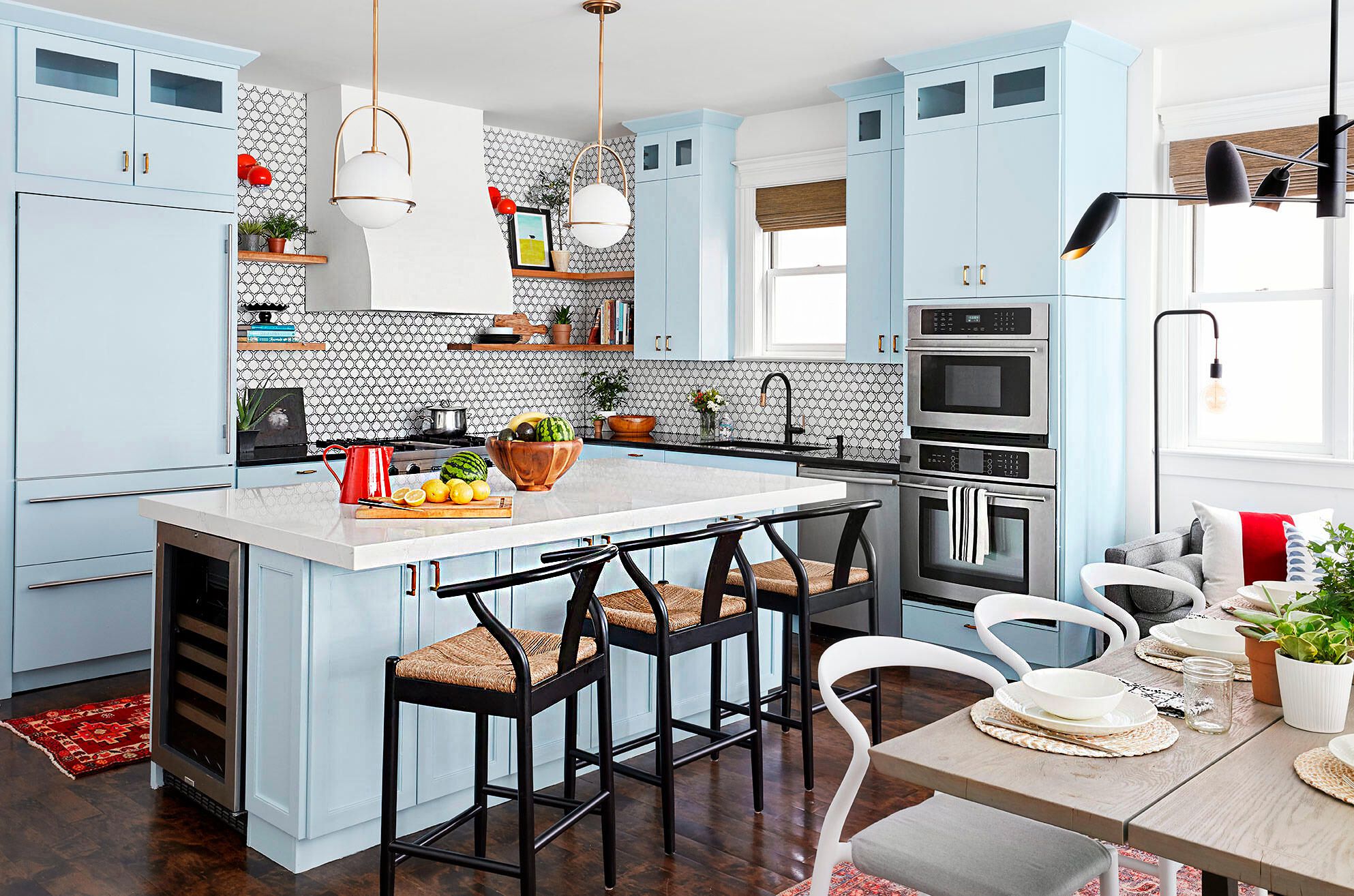
Before: all cabinets match, flat look. After: island in a contrasting color (greens/blues are popular) with a neutral perimeter. Takeaway: color is easiest to love when it’s concentrated.
31. Warm Wood ReturnsBut Updated
Before: dated wood tone, heavy stain. After: lighter wood or a cleaner stain paired with modern hardware. Takeaway: wood reads fresh when the rest of the palette is calm.
32. The “Stone Moment” Backsplash
Before: small tile fights the counters. After: slab-like look or larger-format tile for a smoother visual field. Takeaway: fewer lines often look more luxurious (and clean easier).
33. The Finishing Touches That Seal the Deal
Before: the remodel is “done,” but feels unfinished. After: upgraded switch plates, coordinated bar stools, a washable runner, and one piece of art. Takeaway: finishing details are the difference between “new” and “designed.”
Plan Your Own “After”: A Practical Mini-Checklist
- Measure reality: map traffic paths, appliance door swings, and where you naturally drop groceries.
- Pick your hero change: island, pantry wall, lighting plan, or cabinet transformation.
- Choose a palette with discipline: one dominant neutral + one supporting material + one accent.
- Design storage around habits: where do trash, spices, pans, and small appliances actually live?
- Test function on paper: can two people pass each other? can you unload the dishwasher without blocking the room?
of Renovation Experiences to Make This Real
If you talk to enough homeowners mid-renovation, you’ll hear a pattern: everyone starts confident, then the kitchen disappears, then the group chat becomes
a support hotline, and thensomewhere between backsplash grout and the first meal cooked at home againpeople say, “Okay… worth it.”
The best “experience-based” lesson is that a kitchen renovation isn’t a single decision. It’s a chain of them, and the early ones matter the most.
One common experience: people fall in love with a photo and forget to ask how it works on a weeknight. That’s how you end up with open shelves that look
gorgeous in the morning and look like a tornado hit them by dinner. Homeowners who stay happiest tend to set a few rules: keep the everyday items behind doors,
make the cleaning easy, and choose finishes that don’t demand constant babysitting. Matte surfaces are trendy, surebut if you have kids, dogs, or a deep relationship
with tomato sauce, you’ll want materials that forgive.
Another repeated experience is “we should have planned lighting earlier.” People often underestimate how much lighting affects mood and function.
During a renovation, it’s easy to obsess over countertop samples under showroom spotlights and forget that your real kitchen has different shadows, window angles,
and ceiling heights. Homeowners who plan for layered lighting almost always report a bigger day-to-day payoff than those who only swap finishes.
When the room is evenly lit, cooking feels easier, the space feels cleaner, and even a modest budget looks more polished.
Then there’s the emotional side of layout. Moving a wall or reworking the cooking zone can feel scary (and expensive), but it’s also where homeowners say the biggest
“before/after” difference lives. People describe the “after” as calmernot because their cabinets are prettier, but because the kitchen finally stops fighting them.
The fridge has a landing zone. The trash is where prep happens. The dishwasher opens without blocking the hallway. These are tiny wins that stack up fast.
Finally, almost everyone learns the same humbling truth: the last 10% takes 50% of the patience. That’s the phase of waiting for the final piece of trim,
the backordered pendant, or the one drawer front that arrived mysteriously wrong. The homeowners who enjoy their “after” the most plan for that reality:
they keep a contingency cushion, they choose a few flexible items, and they treat delays as annoyingnot catastrophic.
In the end, the most inspiring makeovers aren’t just photogenic. They’re kitchens that fit the people living there. And that’s the kind of “after” you’ll love long after the reveal.
Conclusion
A great kitchen makeover isn’t about copying someone else’s “after.” It’s about understanding why it worksbetter flow, better lighting, smarter storage,
and a focused design planthen adapting those moves to your space and budget. Start with function, choose one hero change, and let the finishing touches
do what they do best: make it feel like home (but cooler).