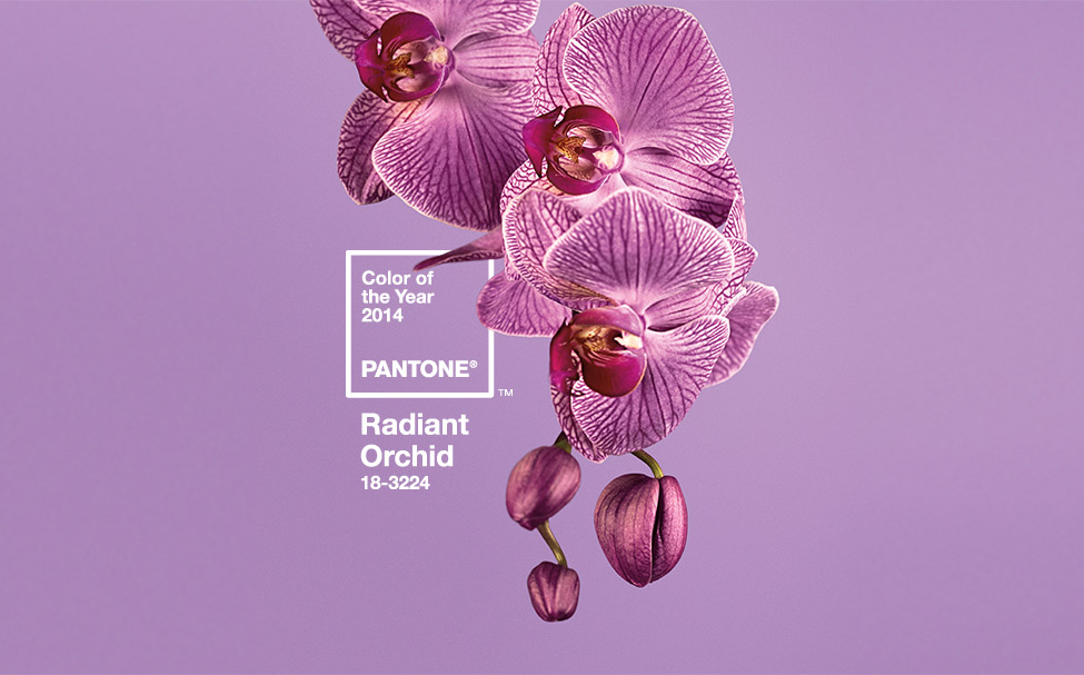
Radiant Orchid is not the sort of color that quietly waits in the corner while beige handles the conversation. This lively blend of purple, fuchsia, and pink arrives with confidence, shakes up a neutral room, and makes even an ordinary throw pillow look as though it has exciting weekend plans.
Selected as Pantone’s 2014 Color of the Year, PANTONE 18-3224 Radiant Orchid was presented as a warm, expressive shade associated with creativity, confidence, and imagination. Although its official year in the spotlight has passed, the color remains surprisingly useful. It sits between warm pink and cool violet, allowing it to work with creamy neutrals, deep blues, natural greens, dark woods, black accents, and metallic finishes.
Historical color identification verified through Pantone and its original U.S. announcement.
The secret is restraint. Radiant Orchid can look sophisticated, playful, romantic, modern, or delightfully eccentric, but using it everywhere at once may make a room resemble the inside of a grape-flavored candy wrapper. These six simple tricks show how to decorate with Radiant Orchid while keeping your home balanced, comfortable, and unmistakably yours.
What Makes Radiant Orchid Work in Home Decor?
Radiant Orchid is more complex than a basic purple. Its rosy undertones give it warmth, while its violet base adds depth. In bright daylight, the color may appear energetic and floral. Under warm evening lamps, it can shift toward berry, mauve, or magenta. Against gray, it often looks cooler and more contemporary; beside cream or natural wood, it becomes softer and more inviting.
That flexibility makes it suitable for several decorating styles. In a modern room, Radiant Orchid can provide a sharp accent against white, charcoal, and black. In a traditional space, it works beautifully with walnut furniture, botanical patterns, and brass. In an eclectic home, it can mingle with turquoise, jade green, orange, and patterned textiles without apologizing to anyone.
Think of It as a Flexible Accent, Not a Rule
A Color of the Year is an invitation, not a decorating commandment carved into a paint chip. You do not need to replace your sofa, repaint four rooms, and buy an orchid-colored toaster. The smartest approach is to determine how much visual energy your room needs and then introduce the shade at the appropriate scale.
A quiet bedroom may need only a velvet pillow or floral print. A bland entryway might welcome an orchid-painted console. A creative studio can handle an entire accent wall. The correct amount depends on the room’s light, size, existing colors, and your personal tolerance for drama before breakfast.
Trick 1: Start with Small, Movable Accessories
The easiest way to decorate with Radiant Orchid is to begin with items that can be moved, exchanged, or temporarily retired when your mood changes. Pillow covers, blankets, lampshades, vases, trays, candles, and framed prints allow you to test the color without making a major financial or emotional commitment.
For a neutral living room, place two orchid-colored pillows on a cream, gray, or tan sofa. Add a small vase on the coffee table and a piece of artwork containing a similar purple-pink note. These accents create a relationship across the room, making the color look intentional rather than accidental.
Choose Two or Three Accent Categories
Avoid buying ten unrelated purple objects simply because they were standing near the checkout aisle. Instead, select two or three categories. You might use textiles, artwork, and flowers, or perhaps a lamp, a decorative box, and one patterned chair cushion.
This strategy also works well for renters. Removable accessories add personality without risking the security deposit or starting a tense email exchange with the landlord titled “About the Purple Wall.”
Small-dose decorating and movable accent guidance is supported by U.S. design coverage from Architectural Digest, Houzz, and Home Stories A to Z.
Trick 2: Give the Color a Neutral Foundation
Radiant Orchid becomes easier to live with when it has a calm background. White, ivory, cream, warm beige, soft gray, charcoal, and natural wood allow the color to stand out without turning the room into a visual shouting contest.
For a light and airy result, combine orchid accents with warm white walls, an oatmeal sofa, pale oak, and woven baskets. For a more dramatic room, place the color against charcoal walls, black furniture, or espresso-stained wood. The darker foundation transforms Radiant Orchid from sweet and floral into rich and glamorous.
Watch the Undertones in Your Neutrals
Not every gray or beige will cooperate. A greenish gray may make Radiant Orchid appear sharper, while a rosy beige can create a softer, blended palette. Yellow cream adds warmth, but a very muddy tan may make the color feel dated.
Place fabric samples or paint chips beside your existing flooring, upholstery, and curtains. Look at the combination in daylight and after sunset. A palette that looks elegant at noon can behave very differently under a warm lamp at 8 p.m. Paint, like certain relatives, has a remarkable ability to change its personality depending on the lighting.
Trick 3: Pick a Color Partner Based on the Mood You Want
Radiant Orchid does not have one perfect companion. Its best partner depends on whether you want the room to feel peaceful, sophisticated, playful, or dramatic.
For a Fresh, Nature-Inspired Palette
Pair Radiant Orchid with leafy green, jade, sage, or turquoise. Green works especially well because it recalls the natural contrast between an orchid bloom and its foliage. Use green on plants, upholstery, ceramic pieces, or patterned curtains while keeping the walls relatively quiet.
For a Polished, Sophisticated Room
Combine orchid with navy, indigo, charcoal, or black. A navy sofa with orchid pillows feels tailored rather than sugary. Black picture frames, a dark wood cabinet, or a charcoal rug can give the color structure and prevent it from floating around the room like a very enthusiastic balloon.
For a Soft and Romantic Look
Use cream, blush, dusty rose, pale lavender, and warm gray. Add linen, velvet, or brushed cotton so the palette feels layered rather than overly precious. This combination suits bedrooms, reading corners, and guest rooms particularly well.
For an Energetic, Eclectic Scheme
Try turquoise, citrus orange, golden yellow, or bright green in controlled amounts. These saturated pairings produce a cheerful, collected effect. Keep one dominant color, however, and let the others play supporting roles. Otherwise, every shade will audition for the lead, and the room will never finish rehearsing.
For a Touch of Glamour
Add brass, gold, copper, mirrored glass, or polished nickel. Warm metals emphasize the pink undertones in Radiant Orchid, while silver-toned finishes bring forward its cooler violet side. A brass lamp beside an orchid chair or a gold-framed botanical print can make the palette feel luxurious without requiring a chandelier large enough to have its own ZIP code.
Recommended pairings with cream, gray, dark neutrals, green, turquoise, orange, gold, navy, and black synthesize guidance from Houzz, Architectural Digest, Story & Space, and HGTV.
Trick 4: Repeat Radiant Orchid in Three Visual Zones
One orchid-colored item can appear random. Repeating the shade in several parts of the room creates rhythm and makes the design look deliberate. A useful approach is to place the color in three visual zones: low, middle, and high.
For example, an orchid thread in the area rug anchors the color near the floor. A pillow or upholstered seat carries it through the middle of the room. A framed print, curtain border, or lampshade repeats it higher on the wall. Your eye naturally travels between these points, helping the space feel connected.
The Shades Do Not Need to Match Perfectly
Exact matching can make a room look overly staged. Mix nearby shades such as berry, mauve, lilac, plum, and pink-violet. As long as the undertones relate, the variation adds depth.
A patterned rug might contain a dusty orchid, while a vase uses a brighter fuchsia-purple and the artwork includes a deep plum. The family resemblance is enough. Think coordinated cousins, not identical triplets wearing matching holiday sweaters.
Trick 5: Use Texture and Pattern to Make It Feel Grown-Up
Large areas of flat, bright color can feel intense. Texture softens Radiant Orchid and gives it dimension. Velvet makes it look rich, linen makes it relaxed, silk adds luminosity, and wool gives it weight. Matte ceramics create an earthy effect, while glass and lacquer make the shade feel contemporary.
Instead of choosing a solid purple bedspread, try an ivory quilt with orchid embroidery. Rather than installing plain orchid curtains, look for a botanical, geometric, or abstract print that includes the color alongside neutrals. Pattern breaks up the saturation and ties the accent into the rest of the room.
Balance Bold Pattern with Quiet Surfaces
If your wallpaper contains a large orchid-colored print, keep the major upholstery simple. If your sofa is patterned, choose a more restrained wall color. One major pattern usually deserves to be the star, while smaller designs can act as supporting characters.
Texture is especially important in rooms with a limited palette. A space containing cream, gray, and Radiant Orchid becomes more interesting when it includes woven baskets, smooth glass, nubby fabric, warm wood, and soft velvet. The room gains variety without requiring six additional colors and a diplomatic summit.
Texture, pattern balance, and bold-color restraint synthesize principles from Architectural Digest and The Spruce.
Trick 6: Create One Focal Moment and Test It in Real Light
After experimenting with accessories, you may decide the room needs a stronger statement. Instead of spreading bold color everywhere, create one focal moment. Paint a small cabinet, update an old chair, cover the back of a bookcase, refresh a fireplace surround, or use Radiant Orchid on a single architectural feature.
An orchid-painted console in an otherwise neutral entryway can look modern and welcoming. A vintage chair upholstered in orchid velvet adds character to a bedroom. In a home office, the inside of a bookcase can provide a lively background for books and decorative objects without overwhelming the workspace.
Test Paint Before Committing
Never rely exclusively on a phone screen or a tiny paint chip. Digital displays, wall texture, neighboring colors, window direction, bulb temperature, and paint sheen can all change how a color appears.
Apply a large sample to a movable board or use a peel-and-stick sample. Check it beside the floor, trim, curtains, and largest furniture pieces. Observe it in morning daylight, afternoon shadow, and evening artificial light. A north-facing room may emphasize the violet side, while warmer light can make the pink and berry tones more noticeable.
If full-strength Radiant Orchid feels too intense, select a muted, grayed, or lighter variation. The goal is not to reproduce a digital swatch with scientific devotion. The goal is to capture the energetic orchid character in a shade that works with your actual home.
Paint-testing and lighting recommendations are based on guidance from Benjamin Moore and Sherwin-Williams.
Room-by-Room Ideas for Decorating with Radiant Orchid
Living Room
Add two patterned pillows, a berry-purple throw, and artwork containing orchid, green, and charcoal. For a larger statement, paint a side table or fireplace while keeping the sofa and rug neutral.
Bedroom
Use Radiant Orchid on a velvet lumbar pillow, bedside lamp, upholstered bench, or floral duvet. Pair it with warm white, soft gray, navy, or natural wood to keep the room restful.
Dining Room
Try orchid napkins, glassware, candles, or a botanical centerpiece. Black dining chairs and brass lighting can turn the color into an elegant evening palette.
Bathroom
Introduce the shade through towels, framed art, a bath mat, or a painted vanity. White tile and chrome create a crisp effect, while cream stone and brass make the color warmer.
Home Office
Use an orchid desk chair, storage boxes, pinboard fabric, or the back panels of built-in shelves. The color adds creative energy without making every video call look as though it is taking place inside a flower shop.
Conclusion: Let Radiant Orchid Add Personality, Not Pressure
Decorating with the 2014 Pantone Color of the Year does not require recreating a 2014 showroom. Radiant Orchid can still feel fresh when it is mixed with contemporary neutrals, natural materials, layered textures, and carefully selected color partners.
Begin with accessories, ground the shade with a neutral foundation, choose complementary colors according to the desired mood, repeat the hue around the room, introduce texture and pattern, and test any permanent application in real light. These steps give you control over the color rather than handing Radiant Orchid the keys and discovering that it has redecorated the entire house overnight.
A Realistic Decorating Experience: A Weekend Radiant Orchid Refresh
Consider a typical living room with off-white walls, a beige sofa, a walnut coffee table, gray curtains, and very little color. Everything is practical and coordinated, yet the room feels like a waiting area where nobody is entirely sure which appointment they have.
The first step in a low-risk Radiant Orchid makeover is not paint. It is a pair of removable pillow covers. One can be solid velvet, while the other uses a botanical print containing orchid, green, cream, and charcoal. Placed on opposite ends of the sofa, the pillows immediately reveal whether the color feels exciting or intrusive.
During the morning, natural light may make the pillows appear bright and distinctly violet. By late afternoon, the walnut furniture and warm flooring can bring forward their pink undertones. Under warm LED lamps at night, the color may become deeper and more berry-like. This simple observation explains why ordering six matching purple objects before testing the first one is a risky hobby.
Next, the color is repeated across the room with a small ceramic vase on the coffee table and an inexpensive abstract print above a side chair. The objects do not match perfectly. The vase is slightly darker, and the artwork includes dusty mauve, but the differences make the room feel collected rather than purchased as a single boxed set.
The gray curtains initially look a little cold beside the new accents, so a cream throw is added to the sofa. That small change creates a visual bridge between the warm beige upholstery and the cooler orchid tones. A leafy plant near the window supplies green, which makes the floral color feel more natural and less like a party decoration left behind after an unusually glamorous birthday.
Once the accessories prove successful, attention turns to a small thrift-store side table. Instead of painting a wall, the table receives an orchid-inspired finish. A large sample is tested first, revealing that the brightest version looks almost neon near the window. A slightly muted berry-orchid shade works better with the walnut coffee table and charcoal picture frames.
After sanding, priming, painting, and allowing proper drying time, the updated table becomes the room’s focal point. A brass lamp placed on top adds warmth, while a few neutral books prevent the surface from becoming a solid block of purple. The result is noticeable but not overwhelming.
The most useful lesson from this kind of makeover is that the room does not need a large quantity of Radiant Orchid. It needs repetition, balance, and context. Three or four thoughtfully positioned accents create more impact than a shopping cart filled with unrelated purple decorations.
The process also demonstrates why decorating should happen in stages. Living with the pillows for a day helps evaluate the color. Adding the artwork shows whether repetition improves the room. Testing the paint prevents a costly mistake. Each decision answers a practical question before the next one begins.
By the end of the weekend, the room still contains the same walls, sofa, curtains, and major furniture. Yet it feels brighter, more personal, and more energetic. The transformation comes from a controlled accent palette rather than a complete renovation. That is the best kind of decorating trick: maximum personality, minimum furniture-moving injuries.