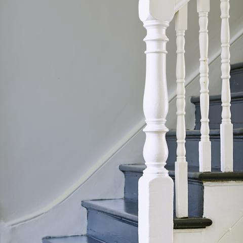
Bert & May’s Pangola Grass Paint is the kind of color that sounds like it wandered in from a botanical field guide, shook hands with a London loft, and decided to stay for dinner. Described in archived product listings as an urban green tinted with blues and grays, Pangola Grass sits in that deliciously tricky space between green, slate, sage, and weathered sea glass. It is not loud. It is not timid. It is the paint equivalent of someone who owns excellent linen napkins but still eats toast over the sink.
Although the original Pangola Grass listing has been marked discontinued in design product catalogs, the color remains worth studying because it captures several design ideas that are still very relevant: muted green paint, natural pigments, low-VOC interiors, limewash texture, eco emulsion finishes, and the growing appetite for rooms that feel grounded rather than over-decorated. In a world where white walls have had a long and exhausting career, Pangola Grass offers a fresher, softer alternative with just enough character to make a wall feel designednot merely painted because the landlord said so.
What Is Bert & May’s Pangola Grass Paint?
Bert & May is best known for tiles, reclaimed materials, handmade surfaces, and a palette inspired by natural pigments. Its color language leans chalky, muted, earthy, and architectural. Pangola Grass fits that vocabulary beautifully. It was described as an urban green paint with blue and gray undertones, designed to add a fresh feel to a room. That phrase matters: urban green is not the same as garden green. This is not a glossy apple, a neon leaf, or a “surprise, your kitchen is now a smoothie bar” kind of green. It is more restrained, more mineral, and more adaptable.
The archived description also notes that Pangola Grass was available in two finish families: lime wash and eco emulsion. That gives the shade two personalities. In lime wash, the color would feel layered, cloudy, and softly imperfect, with the sort of variation people now pay good money to achieve after spending years trying to make every surface perfectly flat. In eco emulsion, the same hue would read cleaner and more familiar, easier to use on standard interior walls while still keeping the understated Bert & May mood.
Why the Color Works: Green, Blue, and Gray in One Calm Package
The strength of Pangola Grass is its undertone balance. Green brings the natural connection. Blue cools it down and prevents it from becoming too yellow or grassy. Gray softens the whole thing, making it easier to pair with stone, timber, concrete, aged brass, linen, and tile. That is the secret sauce. A pure green can be charming but bossy. A gray-green can be elegant but sometimes sleepy. A blue-gray-green, when handled well, has movement. It shifts with daylight, artificial lighting, and surrounding materials.
In a bright room, Pangola Grass would likely appear fresher and slightly more botanical. In a north-facing or shaded room, the gray-blue notes may become more pronounced, creating a cooler and more contemplative atmosphere. Under warm bulbs, it can relax into a softer sage. This flexibility makes it useful for homes that do not want a dramatic color commitment but also refuse to live forever inside a beige spreadsheet.
The Bert & May Aesthetic: Chalky, Honest, and Quietly Dramatic
Bert & May’s design identity has long revolved around tactile materials: encaustic tiles, reclaimed pieces, zellige-style surfaces, terracotta, stone, wood, and pigment-rich finishes. Pangola Grass makes sense in that world because it does not behave like a generic paint-chip green. It feels like a surface color rather than a decorative afterthought. It wants to sit beside handmade tile, not fight it in the parking lot.
The brand’s palette has been associated with natural pigments, hand-mixed colors, and muted tones created to coordinate with tiles and architectural finishes. That matters for interior design because paint rarely works alone. A wall color must negotiate with floors, counters, cabinets, grout, metal finishes, daylight, upholstery, and that one chair nobody is allowed to throw away because it has “character.” Pangola Grass has the kind of softened undertone that can help all those elements speak the same language.
Lime Wash vs. Eco Emulsion: Two Ways to Use Pangola Grass
Lime Wash: For Texture Lovers
Limewash is a mineral-based finish traditionally made with slaked lime, water, and pigment. It is prized for its matte, breathable, softly mottled look. Unlike standard paint that forms a more uniform film on the surface, limewash creates depth through movement and variation. Applied with a brush in thin coats, it can produce walls that look aged, plaster-like, and gently luminous. In Pangola Grass, this would likely highlight the blue-gray undertones and give the green a weathered, Mediterranean quality.
Limewash is especially appealing in living rooms, bedrooms, entryways, dining rooms, and spaces where atmosphere matters more than scrub-it-with-a-sponge practicality. It is less ideal for areas constantly splashed, bumped, or attacked by peanut butter fingerprints. In other words: stunning in a grown-up reading nook, slightly risky in a toddler’s snack zone.
Eco Emulsion: For Everyday Walls
Eco emulsion gives a more conventional painted finish while still aligning with the low-impact, low-odor priorities many homeowners now consider. It is the more practical route for people who want the color of Pangola Grass without the visible movement of limewash. If limewash is the linen shirt with rolled sleeves, eco emulsion is the well-cut cotton button-down: still stylish, just a bit more controlled.
For American homes, an emulsion-style finish would be easier to imagine in bedrooms, hallways, home offices, powder rooms, and kitchens where the walls need to feel fresh but not overly precious. Depending on the exact sheen, it could work as a matte, eggshell, or satin-like surface. Matte and eggshell are typically more flattering for walls because they reduce glare and help hide minor imperfections. Satin or semi-gloss makes more sense on trim, cabinetry, or high-touch areas.
Where Pangola Grass Paint Looks Best
1. Kitchens With Natural Materials
Pangola Grass has a natural affinity for kitchens because it pairs beautifully with tile, wood, brass, stone, and concrete. Imagine it with creamy zellige tile, pale oak shelves, unlacquered brass hardware, and honed marble or soapstone counters. The result is fresh but not sterile, refined but not fussy. It also works well behind open shelving because the muted green creates a gentle backdrop for ceramics, glassware, cookbooks, and the one beautiful bowl everyone pretends is not just for keys.
2. Bathrooms and Powder Rooms
Bathrooms love blue-green-gray tones because they echo water, stone, and spa-like calm without slipping into cliché. Pangola Grass would be especially effective in a powder room, where a small dose of color can feel intentional and memorable. Pair it with handmade white tile, dark bronze fixtures, a stone basin, or a vintage mirror. The color is quiet enough for daily use but interesting enough that guests may ask, “What paint is this?” which is the polite home-design version of applause.
3. Bedrooms That Need Calm, Not Boredom
Green is often associated with rest, balance, and nature. Pangola Grass adds another layer by bringing in blue-gray coolness. In a bedroom, that combination can feel peaceful without becoming bland. Use it on all four walls for a cocooning effect, or apply it behind the bed as a soft focal point. Natural linen, warm white bedding, walnut nightstands, and woven lighting would make the shade feel relaxed and expensive without requiring the room to whisper, “I have a trust fund.”
4. Home Offices and Creative Corners
For a home office, Pangola Grass offers a useful middle ground. It is more inspiring than plain white, less distracting than saturated emerald, and more human than corporate gray. It can support concentration while making the room feel designed. Add a black metal desk lamp, oak desk, tan leather chair, and a few framed prints. Suddenly your email inbox may still be terrible, but at least the wall behind it has emotional intelligence.
5. Entryways and Transitional Spaces
Entryways, mudrooms, and hallways are excellent candidates for muted green paint. These spaces benefit from a color that feels welcoming but not overwhelming. Pangola Grass can bridge different rooms because it works with neutrals, woods, blacks, whites, and earthy colors. In a hallway, it could make framed art pop. In a mudroom, it would pair nicely with peg rails, slate floors, baskets, and durable hooks for coats, bags, and the mysterious single glove that appears every winter.
Best Color Pairings for Pangola Grass
Because Pangola Grass is not a simple green, it rewards thoughtful pairing. Warm whites make it feel fresh and breathable. Creamy neutrals prevent the blue-gray undertones from turning chilly. Natural oak and ash bring out its organic side. Walnut and dark-stained wood make it moodier and more sophisticated. Brass and bronze add warmth, while matte black gives structure.
For a soft palette, combine Pangola Grass with warm white, stone beige, pale oak, and linen. For a bolder scheme, pair it with deep navy, charcoal, oxblood, or chocolate brown. For a Mediterranean-inspired look, add terracotta, aged plaster, reclaimed wood, and patterned tile. For a modern farmhouse update, use it instead of the expected white or gray on cabinetry, then balance it with simple counters and handmade ceramic accents.
How to Style Pangola Grass Without Overdoing It
The easiest mistake with a character-rich muted green is to over-theme it. You do not need fern prints, green pillows, green curtains, green ceramics, and a motivational sign that says “Grow.” The paint already understands the assignment. Let it lead, then support it with texture.
Use woven baskets, stoneware, linen, aged leather, wood grain, handmade tile, wool rugs, and metal accents. Keep the palette layered but edited. A little contrast helps: black picture frames, dark hardware, or a deep wood table can prevent the room from floating away into softness. If the space feels too cool, add warm bulbs, brass, clay, rust, or honey-toned wood. If it feels too earthy, sharpen it with white trim and cleaner-lined furniture.
Application Tips for a Pangola Grass-Inspired Finish
Before committing to a full room, test large samples on multiple walls. Muted green paint can change dramatically throughout the day. Check it in morning light, afternoon light, and evening artificial light. Look at it next to flooring, cabinetry, tile, upholstery, and trim. A color that looks perfect on a tiny card may behave like a completely different person once it gets a whole wall and an audience.
If using a limewash-style product, embrace variation. Brush marks, tonal shifts, and cloudy movement are part of the finish. Several thin coats usually look better than one heavy coat. If using a standard emulsion, prepare walls carefully. Patch holes, sand rough areas, clean surfaces, and use primer when needed. Muted colors can be forgiving, but they are not magical. Paint cannot fix drywall drama; it can only politely distract from it.
Why Muted Green Paint Remains Popular
Muted green continues to perform well in interior design because it offers emotional warmth without visual chaos. Many homeowners want rooms that feel restorative, personal, and connected to nature, but they do not necessarily want a jungle mural behind the sofa. Shades like Pangola Grass satisfy that craving in a grown-up way. They bring the outdoors in without requiring anyone to water the walls.
This is also why blue-gray greens work so well in American homes. They complement coastal, traditional, modern rustic, Mediterranean, cottage, industrial, and minimalist interiors. They can look historic in an older house and fresh in a new build. They flatter natural materials and make mass-produced furniture feel a little more collected. In short, they do a lot of work while pretending to be effortless. Respect the hustle.
Is Pangola Grass Paint Still Available?
Archived product information indicates that Bert & May’s Pangola Grass Paint has been discontinued. That means homeowners may not be able to purchase the original product under that exact listing. However, the color remains useful as inspiration. If you want a similar look, search for muted urban greens with blue and gray undertones, especially in matte, chalky, limewash, mineral, or low-VOC formulations.
When asking a paint retailer for a comparable color, use descriptive language rather than relying only on the name. Try: “a muted green with blue-gray undertones,” “an urban sage,” “a soft green-gray with a cool cast,” or “a chalky blue-green suitable for natural materials.” Bring images if possible. Paint staff are talented, but they are not mind readers, despite what the wall of 2,000 color chips may suggest.
Experience Notes: Living With a Pangola Grass-Inspired Color
Using a Pangola Grass-inspired shade in a real home is less about chasing a perfect match and more about chasing a feeling. The first impression is usually calm. The room seems to exhale. White walls often bounce light around in a way that feels bright but sometimes flat; a muted blue-gray green absorbs a little of that glare and gives the eye somewhere soft to land. In a living room, this can make evenings feel warmer and mornings feel less abrupt. It is the visual equivalent of lowering your voice in a good way.
One of the most satisfying experiences with this kind of paint is watching it change during the day. In early daylight, the green can look fresh and lightly botanical. By late afternoon, it may become more mineral and gray. At night, especially under warm lamps, it can deepen into a cozy sage. That shifting quality makes the color feel alive. It also means sample testing is not optional. Paint a generous patch, then resist the urge to decide within five minutes. Colors are like houseguests: you need to see how they behave after dinner.
In kitchens, a Pangola Grass-style color tends to make utilitarian details look more intentional. Stainless steel becomes less cold. White dishes look cleaner. Wood cutting boards look richer. Brass hardware looks warmer. Even a very simple kitchen can gain depth from the color because the shade has enough gray to feel architectural and enough green to feel natural. The only caution is lighting. If a kitchen has limited natural light and cool LED bulbs, the paint may lean more blue-gray than expected. Swapping bulbs for a warmer temperature can make a surprisingly big difference.
In bedrooms, the experience is even more emotional. A muted green with blue-gray undertones can make a bedroom feel restful without falling into the predictable “spa blue” category. It works particularly well with off-white bedding, oatmeal linen, walnut furniture, and simple art. If the room feels too subdued, add a rust pillow, a patterned rug, or a brass lamp. The goal is not to create a showroom. The goal is to create a room where your nervous system stops filing complaints.
Bathrooms and powder rooms may be the most rewarding places to experiment. Small rooms can handle more personality, and Pangola Grass has enough restraint to keep the space elegant. Pair it with creamy tile and an antique mirror for a vintage feel, or with black fixtures and a floating vanity for a modern look. If using limewash or a limewash-effect finish, make sure the product is suitable for the room’s moisture level and follow the manufacturer’s primer and sealing recommendations. Beautiful walls are wonderful; peeling walls are just performance art nobody asked for.
The best overall lesson from living with this color family is that muted does not mean boring. Pangola Grass proves that a paint color can be calm, practical, and interesting at the same time. It is a smart choice for anyone who wants a natural interior without going full cabin, a colorful wall without shouting, and a design-forward room that still feels comfortable enough for everyday life. That balance is rare, and it is exactly why this discontinued Bert & May shade continues to feel relevant.
Conclusion
Bert & May’s Pangola Grass Paint may no longer be easily found as an active product, but its design value is very much alive. As an urban green with blue and gray undertones, it represents the best of muted interior color: fresh, grounded, versatile, and quietly distinctive. Whether interpreted through limewash texture or a smoother eco emulsion-style finish, the shade offers a sophisticated alternative to plain white, predictable gray, and overly saturated green.
For homeowners, designers, and color lovers, Pangola Grass is less a single discontinued paint listing and more a lesson in how color should behave. It should support materials, shift with light, create mood, and make a room feel more human. That is a lot to ask from a can of paint, but good colors are overachievers. Pangola Grass is one of them.
Note: Product availability and exact formulations may change over time. The discussion above is based on archived product information, known Bert & May design characteristics, and practical interior paint guidance.