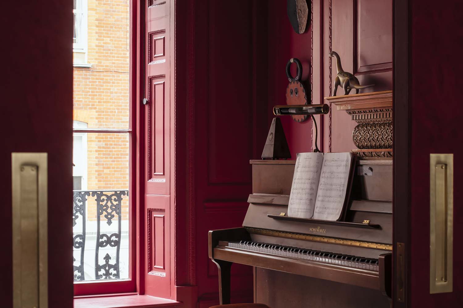
Red paint has a reputation for being difficult. One minute it looks sophisticated and architectural; the next, your dining room appears to be auditioning for a tomato sauce commercial. The difference usually comes down to undertone, lighting, finish, and restraint.
Architects and interior designers rarely treat red as one loud, universal color. They work with brick red, earthy terracotta, rusty scarlet, historic crimson, oxblood, burgundy, and softened clay tones. These nuanced reds can warm a narrow hallway, define kitchen cabinetry, bring depth to a library, or make an ordinary front door feel like the entrance to somewhere important.
The following ten red paint colors combine architect recommendations, designer-tested applications, manufacturer guidance, and practical decorating lessons. The goal is not to crown one universally perfect red. It is to help you find the red that behaves properly in your room instead of staging a small visual rebellion.
Why Architects Keep Returning to Red Paint
Red creates contrast, warmth, rhythm, and a clear focal point. It can visually connect brick, warm wood, leather, antique textiles, copper, and natural stone. Unlike a fashionable neutral that may depend heavily on current trends, a well-chosen earthy red often feels connected to traditional building materials and historic architecture.
The key phrase is well chosen. Bright primary red can dominate a restful room, while a muddier red with brown, orange, yellow, or violet undertones may feel surprisingly grounded. Designers frequently use the strongest reds on doors, furniture, islands, trim, floors, and ceilings. Softer terracotta reds are easier to spread across full walls.
Red can also function as the unexpected note that wakes up an otherwise controlled palette. A red window frame in a cream kitchen or a lacquered red cabinet in a gray hallway may be more effective than painting four walls simply because the paint can was already open.
10 Best Red Paint Colors Architects and Designers Love
1. Farrow & Ball Book Room Red No. 50
Best for: Libraries, stairwells, studies, small living rooms, and historic interiors.
Book Room Red is an aged terracotta with a deliberately muddy quality. That description may not sound glamorous, but muddy colors are often easier to live with because they contain enough brown and earthiness to prevent them from shouting across the room.
In a compact library or stairwell, Book Room Red creates a cocooning effect without the sharpness of a clean scarlet. It works especially well with aged oak, dark-stained floors, tobacco leather, antique brass, cream plaster, and framed works on paper. A matte finish emphasizes its softness, while gloss on doors or trim reveals a more dramatic personality.
Farrow & Ball describes it as one of its earthiest reds and recommends it for smaller spaces. Architect-led interiors have also used it across stair walls, railings, and steps to turn circulation space into a memorable architectural feature.
2. Farrow & Ball Picture Gallery Red No. 42
Best for: Dining rooms, art walls, formal sitting rooms, and gallery-style hallways.
Picture Gallery Red has the depth required to support traditional paintings, ornate frames, and sculptural furniture. It is richer and more formal than a casual clay red, making it a strong choice when the room needs to feel intimate rather than breezy.
This color is particularly effective behind oil paintings because the red acts as a visual field rather than a blank background. Gold frames become warmer, deep greens look more luxurious, and creamy whites gain definition. The result can feel historic without becoming museum-like, provided the room includes a few relaxed elements such as linen, woven shades, or modern lighting.
Studio Oink has highlighted the shade for presenting classical art and creating an opulent yet contemporary atmosphere.
3. Farrow & Ball Red Earth No. 64
Best for: Kitchens, boot rooms, bedrooms, cabinetry, benches, and sunlit spaces.
Red Earth is one of the easiest introductions to red paint because it leans toward light terracotta. Yellow and red pigments give it a warm, baked-clay appearance that feels comfortable in both old houses and modern apartments.
Its great trick is movement. In clear daylight, it can appear cheerful and mineral. As the room darkens, it develops a deeper, cozier presence. That flexibility makes it useful for kitchens with changing daylight, bedrooms that need warmth, and transitional spaces where a true red might feel overly theatrical.
Architects and designers have used Red Earth on brick-inspired kitchen cabinets, benches, two-tone walls, and bedroom ceilings. Pair it with chalky white, pale plaster, olive, faded blue, walnut, or natural linen.
4. Mylands Crayfish Party BH.19
Best for: Window frames, shelf interiors, islands, freestanding furniture, and small accents.
Crayfish Party may have the most entertaining name on this list, and fortunately, the paint itself also knows how to have a good time. It is a terracotta red with rusty undertones, designed to add a concentrated pop without behaving like a stop sign.
This is an excellent “small but strategic” red. Paint the interior of a bookcase, a pair of stools, the edge of a pantry door, or a kitchen window frame. Against buttery yellow, warm cream, dusty blue, or timber, it adds energy while maintaining an earthy connection to the rest of the room.
Designer Beata Heuman developed the color with Mylands as part of a versatile collection, noting its usefulness in small doses throughout a scheme.
5. Farrow & Ball Bamboozle No. 304
Best for: Kitchen islands, pantries, cabinets, doors, and lively contemporary interiors.
Bamboozle is a warm, spirited red that sits comfortably between classic red and earthy orange. It has enough brightness to energize a kitchen but enough complexity to coexist with other colors.
That balance is important. A kitchen island painted in Bamboozle can become the heart of the room without making the surrounding counters, tile, wood, and artwork disappear. It works particularly well in spaces with generous daylight, where the warmth can be appreciated without becoming heavy.
Architects Jon Handley and Melissa Baker of Pulltab used it on a West Village kitchen island after testing colors in both daylight and evening conditions. Their approach is worth copying: the paint color that wins at noon may become an entirely different creature under warm bulbs after dinner.
6. Mylands Henna BH.18
Best for: Painted floors, vestibules, furniture, millwork, and color-drenched entries.
Henna is a burnt red that behaves almost like a neutral. Its brown and terracotta qualities allow it to anchor a room in the same way that dark timber or worn leather might.
It is especially appealing on floors, where brighter reds can look toy-like. Henna feels established and slightly timeworn, even when the paint is fresh. Use it with bone white, putty, ochre, faded floral fabrics, dark blue, or mossy green.
A gloss finish can make Henna striking in a small vestibule or on furniture, while a more subdued floor finish creates a quieter, utilitarian effect. Mylands specifically identifies it as a versatile choice for floors, smaller spaces, and furniture.
7. Farrow & Ball Rectory Red No. 217
Best for: Front doors, music rooms, dining rooms, formal trim, and full color drenching.
Rectory Red is the confident classic of the group. It reads as unmistakably red, but its warmth keeps it from feeling synthetic. On a front door, it delivers traditional charm. Across the walls, ceiling, and trim of a room, it creates a bold architectural envelope.
This color benefits from commitment. A timid patch on one wall may feel disconnected, while a fully drenched music room can look intentional and enveloping. Crisp white creates a clean contrast, but warm stone, tobacco brown, old gold, black lacquer, and deep green produce a richer result.
Designers have repeatedly selected Rectory Red for front doors and dramatic interiors, including a Georgian music room where the shade covers nearly every painted surface.
8. Edward Bulmer Sang de Boeuf
Best for: Banquettes, libraries, dining nooks, paneling, and period-inspired rooms.
Sang de Boeuf is a brown-red built from the visual language of traditional oxide and ochre pigments. It has authority without feeling severe, making it a natural fit for rooms that need depth rather than brightness.
Use it around a dining banquette, on paneling, or inside a book-lined room. It pairs beautifully with dusty plaster, mustard, olive, aged brass, woven rush, and dark woods. Because the shade is grounded, it can support patterned fabrics and collections without making the room feel chaotic.
Edward Bulmer describes the color as a historically influenced red made visually rich through red oxide and yellow-ochre character. Designers have used it to give intimate seating areas a considered, architectural presence.
9. Benjamin Moore Heritage Red HC-181
Best for: Living rooms, dining rooms, front doors, statement cabinetry, and traditional American homes.
Heritage Red is a strong, classic red with enough richness for formal rooms and enough clarity for exterior accents. It is an effective choice when you want a recognizably red result rather than terracotta, rust, or burgundy.
For interiors, balance its intensity with crisp trim, substantial wood furniture, artwork, and tactile fabrics. Velvet, leather, animal patterns, and polished metal can all stand up to it. On a front door, the shade gives immediate definition without requiring the rest of the exterior to become colorful.
Designers Barclay Butera and Erick J. Espinoza have both praised Heritage Red for statement rooms and front doors.
10. Sherwin-Williams Borscht SW 7578
Best for: Powder rooms, laundry rooms, offices, mudrooms, and moody small spaces.
Borscht is a deep maroon red with plum and brown qualities. It is less fiery than a true red and more atmospheric, which makes it especially useful in small rooms where drama is welcome.
A laundry room painted in Borscht instantly feels less like a place where socks go missing and more like a deliberate interior. Pair it with mink brown, creamy stone, smoky pink, dark bronze, unlacquered brass, or warm white. In artificial evening light, its wine-like depth becomes particularly noticeable.
Designers Kevin Kaminski and Alexis Pew have recommended Borscht for intimate utility spaces, offices, and other rooms where a dark, muted color can add visual depth.
How to Choose the Right Red Paint for Your Room
Study the Undertone Before the Color Name
Paint names are charming, but they are not a scientific measuring system. One brand’s “brick” may look orange, while another brand’s “terracotta” may turn pink beside your flooring. Compare the red to your fixed materials: tile, stone, wood, countertops, upholstery, and metal finishes.
Orange-reds usually feel warm and active. Brown-reds feel grounded. Violet-reds look luxurious and moody. Clay reds are generally the most forgiving for large areas.
Test Large Samples in Several Locations
A tiny chip cannot show how red will reflect across an entire room. Paint a large movable sample board or apply generous test areas to different walls. Examine them in morning light, afternoon sun, cloudy conditions, and artificial evening light.
Benjamin Moore and Sherwin-Williams both recommend observing samples under changing natural and artificial lighting. This is especially important with red because gloss level, neighboring colors, and light temperature can noticeably alter its appearance.
Choose the Finish as Carefully as the Shade
Matte red absorbs light and feels soft, velvety, and architectural. Satin is practical for cabinets and busy trim. High gloss increases reflected light, making the color appear more vivid and glamorous.
Gloss also highlights dents, brush marks, and imperfect preparation. A dramatic red door in gloss can look spectacular, but only after careful sanding and priming. Paint manufacturers formulate colors across different sheens because the same named shade may appear noticeably different in matte and gloss finishes.
Use Red Where It Has a Clear Job
Before painting, decide what the red is supposed to accomplish. Is it creating a focal point, warming a cold room, connecting to existing brick, defining cabinetry, or making a small room feel enveloping? Red works best when it has a role beyond “we wanted something bold.”
Colors and Materials That Pair Well with Red
- Warm white and cream: Softens strong reds without producing a harsh contrast.
- Olive and moss green: Creates an earthy complementary relationship.
- Dusty blue and navy: Balances red with cooler visual weight.
- Natural wood: Reinforces the warmth of brick, rust, and terracotta reds.
- Black: Adds graphic definition to traditional or contemporary rooms.
- Blush and muted pink: Builds a layered tonal palette rather than a sharp contrast.
- Brass and bronze: Bring warmth and reflected light to darker reds.
Complementary combinations such as red and green can be highly effective, but both colors do not need equal intensity. A muted olive paired with brick red usually feels more sophisticated than bright scarlet beside vivid emerald.
Preparing Walls and Woodwork for Red Paint
Strong colors are not forgiving of rushed preparation. Clean the surface, fill holes, sand rough areas, remove dust, and prime where necessary. Bare wood, repaired walls, stained areas, and major color changes generally benefit from a separate primer.
For deep red paint, a gray or tinted primer can improve coverage and reduce the number of finish coats. Apply full, even coats and allow proper drying time. Trying to stretch half a coat across the final wall is how respectable adults end up arguing with paint rollers at midnight.
Professional painting guidance also recommends large test areas and tinted primer beneath dark colors. Those extra preparation steps help achieve an even, saturated finish instead of a patchy result.
Experience Notes: What Using Red Paint Actually Teaches You
The First Sample Is Rarely the Final Choice
One of the most common experiences when choosing red is discovering how inaccurate the original mental picture was. A color that looked like sophisticated brick on a screen may turn coral beside honey-colored oak. A burgundy sample may become almost purple under cool LED bulbs. A clean red may reflect onto a white ceiling and give the entire room a faint rosy glow.
The useful lesson is not that red is impossible. It is that red interacts aggressively with its surroundings. Neutral paint can disguise a slightly mismatched undertone; red announces it with a small brass band.
Painting One Object Can Change the Entire Room
Red often has more impact when concentrated. A red island can make pale cabinetry look intentional. A painted door can turn a plain hallway into a composed sequence of views. Red shelf interiors can add depth without reducing the room’s sense of space.
This is why many successful projects begin with architectural details rather than full walls. Doors, trim, floors, window frames, banquettes, and built-ins already have clear boundaries. The red looks purposeful because the architecture tells it where to stop.
Earthy Reds Are Easier to Live With Than Bright Reds
In day-to-day use, clay, rust, brick, oxblood, and brown-red shades tend to be more adaptable than primary red. They connect naturally to timber, leather, brick, pottery, woven fibers, and aged metal. They also tolerate changing daylight without becoming fluorescent.
That does not make bright red a bad choice. It simply means bright red needs more discipline. It is excellent for a front door, a small cabinet, a graphic chair, or a contemporary kitchen detail. Spread across a large bedroom, however, it may provide more morning motivation than anyone requested.
Red Rewards Better Lighting
A single ceiling fixture can flatten a deep red room. Layered lighting allows the color to reveal its depth. Wall sconces graze the surface, table lamps create warm pools, and picture lights make art stand out against dark red walls.
Bulb temperature matters too. Very cool light can make warm reds appear blunt or slightly purple. Warm light usually enhances terracotta and brown-red shades, although extremely yellow bulbs may push an orange-red too far toward pumpkin. Testing the sample beside the actual fixtures is more reliable than debating undertones in a paint aisle.
Finish Can Transform the Same Red into Two Different Colors
A matte red wall may appear quiet and chalky, while the identical color on glossy trim can look deeper and more saturated. This contrast can be used intentionally. Color-drenching a room does not require using the same sheen everywhere. Matte walls with satin trim create subtle variation while maintaining a continuous palette.
Gloss is especially effective on small, well-prepared surfaces such as doors, cabinets, and window frames. It reflects movement and daylight, giving the red a polished quality. On imperfect walls, matte is kinder and usually more architectural.
The Best Red Rooms Include Visual Rest
Even a fully red room benefits from materials that allow the eye to pause. Natural linen, pale ceilings, woven flooring, unpainted wood, simple pottery, and restrained artwork can prevent the room from feeling overstimulating.
Visual rest does not always mean white. Chocolate brown, dusty rose, charcoal, aged brass, and olive can quietly support red. The goal is to create hierarchy: one element leads, several elements support, and nothing looks as though it arrived at the party carrying its own microphone.
Red Paint Is Bold, but It Is Also Surprisingly Practical
After the initial drama settles, a good red often becomes part of the architecture. A terracotta hallway stops feeling daring and starts feeling warm. A burgundy powder room becomes an expected little jewel box. A red-painted floor develops scuffs and character rather than looking ruined by normal life.
The most successful experience comes from choosing a red connected to something already present: brick outside the window, a favorite textile, an antique rug, warm floorboards, or a piece of art. That connection gives the color a reason to exist, which is far more valuable than choosing it simply because a trend report said red was having a moment.
Conclusion
The best red paint colors are not necessarily the loudest. Architects often favor nuanced reds that contain clay, brown, orange, or plum undertones because these shades respond beautifully to architecture, natural materials, and changing light.
Book Room Red and Picture Gallery Red bring historic depth. Red Earth, Crayfish Party, and Henna offer flexible earthiness. Bamboozle and Heritage Red provide confident color, while Rectory Red rewards full commitment. Sang de Boeuf and Borscht create darker, more intimate rooms.
Whichever shade you choose, test it generously, examine it at several times of day, select the correct finish, and give it a clearly defined role. Red may be bold, but with a little preparation, it is far more cooperative than its reputation suggests.