Note: This original, web-ready article synthesizes current U.S. design, paint, fashion, and lifestyle trend information into a fresh, publishable guide.
Fall has a way of making everyone suddenly opinionated about color. One minute we are perfectly fine with breezy whites and summer blues, and the next we are standing in a store whispering, “Is this throw pillow more cinnamon or cider?” That is the magic of a great fall palette. It does not simply decorate a room or an outfit; it changes the mood. It makes coffee taste more serious, candles feel more necessary, and a plain beige sweater seem like a personality trait.
The current obsession with fall palettes is not just about pumpkins, though pumpkins remain aggressively committed to the brand. Today’s autumn color story is richer, moodier, and more flexible than the classic orange-and-brown combo. Designers, paint brands, fashion editors, and home stylists are leaning into warm neutrals, chocolate browns, deep burgundy, olive green, muted plum, marigold, rust, clay, cream, and soft blue-gray. These shades feel seasonal without turning your home into a craft store display that got too excited in September.
In this guide, we will explore why the fall color palette is everywhere, how to use it in interiors, fashion, beauty, branding, table settings, and everyday life, and why this year’s autumn tones feel more grown-up, grounded, and quietly luxurious than ever.
Why the Fall Palette Feels So Irresistible Right Now
The modern fall palette is built around comfort, but not the sleepy kind. It feels cozy, layered, and emotionally useful. After years of crisp minimalism, gray interiors, and all-white rooms that look beautiful but are emotionally unavailable, people are craving warmth again. A fall palette answers that craving with colors that feel lived-in: mocha, tobacco, cinnamon, olive, plum, camel, terracotta, and wine.
These colors work because they sit close to nature. Think of changing leaves, dried grasses, wet bark, spiced drinks, leather boots, roasted squash, and the inside of a very dramatic bakery. Earth-inspired tones have a calming quality, but they also have depth. They make a room feel collected instead of decorated. They make a wardrobe look intentional instead of “I grabbed whatever was clean.”
Another reason fall palettes are trending is their versatility. You can go classic with rust, caramel, and cream. You can go moody with burgundy, espresso, and plum. You can go modern with olive, warm gray, clay, and black. You can even bring in unexpected accents like chartreuse, powder pink, or icy blue if you want your autumn aesthetic to wink instead of nod.
The Core Colors of a Modern Fall Palette
A successful fall color palette usually begins with a few dependable foundation shades, then adds one or two accent colors for personality. The trick is balance. Too many dark colors can feel heavy. Too many warm colors can feel like you are living inside a sweet potato. The best palettes mix warmth, contrast, softness, and texture.
1. Mocha Brown
Mocha brown is the unofficial spokesperson for cozy sophistication. It feels like coffee, chocolate, suede, and a very expensive sofa having a tasteful group chat. This color works beautifully in living rooms, bedrooms, wardrobes, and brand visuals because it is warm without being loud. Pair it with cream for softness, burgundy for drama, olive for earthiness, or pale blue for contrast.
2. Cinnamon and Cider Tones
Cinnamon, cider, and caramel tones bring the unmistakable warmth of fall without relying on bright orange. These shades are excellent for pillows, rugs, ceramic vases, knitwear, table linens, and wall art. They also make natural materials like wood, rattan, linen, and leather look even better, which is convenient because fall loves texture almost as much as it loves pretending a scarf is a full outfit.
3. Deep Burgundy
Burgundy is one of the strongest fall color trends because it behaves like a neutral with a flair for drama. It can be elegant, romantic, vintage, modern, or slightly mysterious depending on how it is styled. In home decor, burgundy works well in velvet pillows, lampshades, dining chairs, floral arrangements, and painted accent walls. In fashion, it shines in coats, bags, boots, lipstick, and nail polish.
4. Olive and Moss Green
Olive green has become a modern autumn essential. It is earthy, grounding, and easy to combine with browns, creams, blacks, and golds. Moss and dill green also add a botanical note that keeps fall interiors from feeling too dry or heavy. A moss-green sofa, olive trench coat, sage ceramic dish, or forest-green manicure can instantly make a look feel seasonal without screaming, “I have been waiting for sweater weather since July.”
5. Muted Plum and Mauve
Muted plum, mauve, and eggplant shades add softness and sophistication. These colors are especially useful when you want a fall palette that feels less rustic and more refined. Plum pairs well with camel, chocolate brown, mustard, charcoal, and cream. It is also a lovely alternative to burgundy if you prefer cooler undertones.
6. Marigold and Mustard
Yellow can be tricky in fall because it can quickly become too cheerful, like a sunflower that has had too much espresso. But marigold and mustard are different. They are warm, deep, and slightly vintage. Use them as accents in artwork, scarves, taper candles, napkins, or small furniture pieces. A little goes a long way, which is good news for anyone who has ever bought a mustard-yellow chair and then realized it has become the mayor of the room.
7. Cream, Oat, and Warm White
No fall palette survives on dark colors alone. Cream, oat, ivory, and warm white keep the look breathable. These shades soften intense colors and make rooms feel layered instead of crowded. In fashion, they brighten brown, green, and burgundy. In interiors, they work well on walls, curtains, bedding, and large upholstered pieces.
How to Use a Fall Palette in Home Decor
The easiest way to bring a fall palette into your home is to start with textiles. Pillows, throws, curtains, bedding, table runners, and rugs offer color without commitment. If you regret a rust-colored pillow, it is a small emotional event. If you regret painting your entire dining room eggplant, that is a weekend project with consequences.
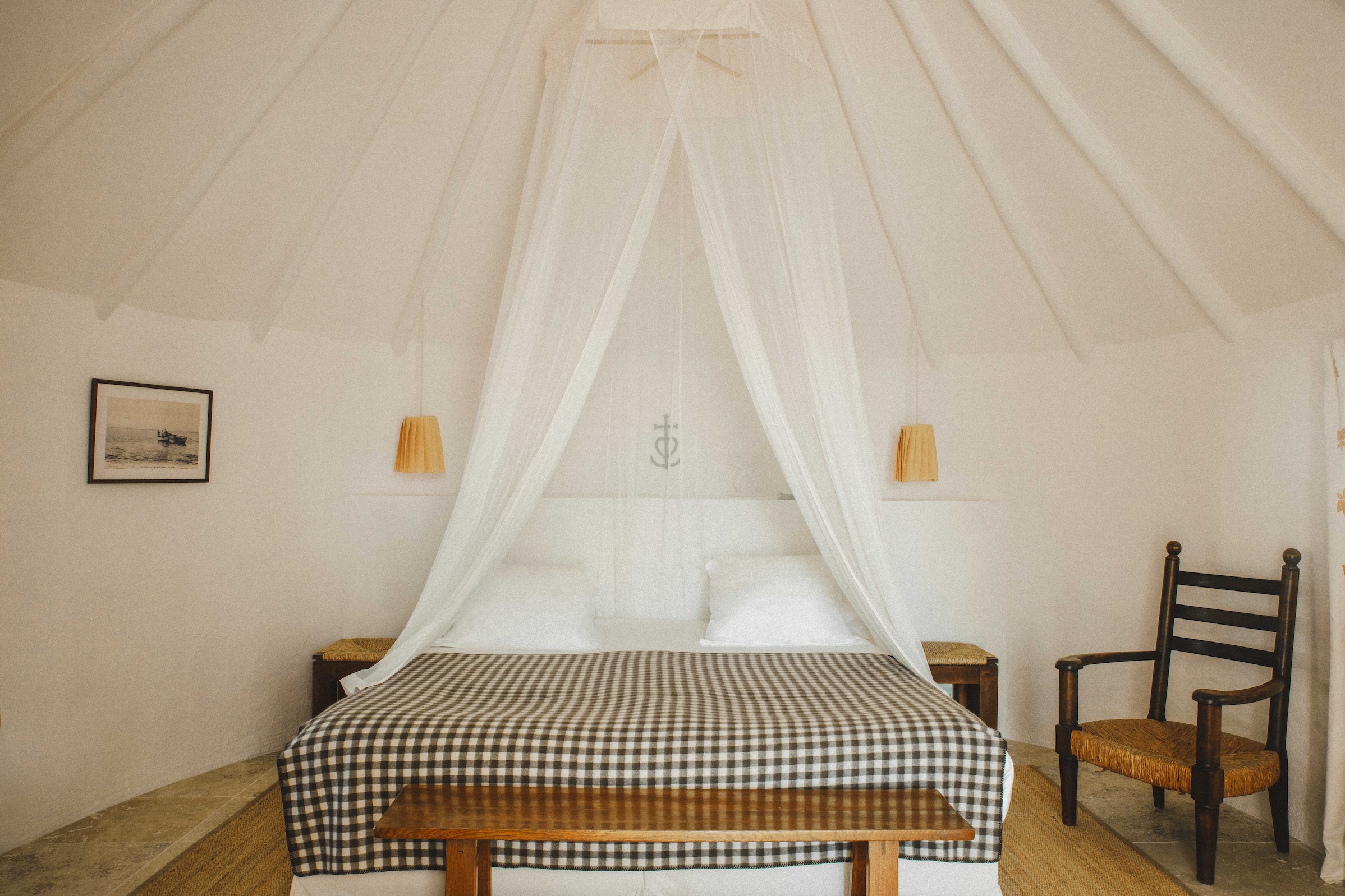
Begin with a neutral base, such as cream, warm beige, taupe, or soft gray-brown. Then layer in two main fall colors. For example, a living room could combine oat walls, a mocha sofa, olive pillows, and a burgundy throw. A bedroom could use cream bedding, a cinnamon quilt, dark wood nightstands, and plum artwork. A dining room could mix a walnut table, ivory plates, rust napkins, amber glassware, and taper candles in deep wine tones.
Texture matters as much as color. Fall palettes look best when paired with tactile materials: wool, velvet, bouclé, corduroy, linen, leather, aged brass, ceramic, natural wood, woven baskets, and stone. These textures prevent warm colors from looking flat. They also give a space that “I casually live in a magazine spread” feeling, even if there is laundry hiding behind the chair.
Fall Palette Ideas for Every Room
Living Room
For a living room, try chocolate brown, cream, olive, and rust. Use the deepest color on one large element, such as a sofa, rug, or media cabinet. Then repeat smaller tones throughout the space with pillows, books, pottery, and art. Repetition makes the palette look intentional, not like your decor was chosen by a leaf pile.
Kitchen
In the kitchen, fall color can appear through smaller details. Think amber glass jars, copper cookware, wooden cutting boards, olive dish towels, dark green plants, and ceramic mugs in cinnamon or cream. If you are ready for a bigger change, olive or deep blue-gray cabinets can feel modern and grounded.
Bedroom
A bedroom should feel restful, so keep the palette softer. Try warm white, mushroom, dusty plum, and caramel. Layer bedding in different textures instead of using too many patterns. A velvet lumbar pillow, a quilted throw, and linen sheets can create a fall mood without turning bedtime into a harvest festival.
Entryway
The entryway is perfect for seasonal color because it is small and high-impact. Add a burgundy runner, a brass mirror, a woven basket, a moss-green umbrella stand, or a bowl filled with pinecones and dried leaves. This is also a great place for a moody wall color if the rest of your home stays neutral.
How to Wear the Fall Palette
A fall palette works beautifully in fashion because the colors are flattering, practical, and easy to mix. Chocolate brown is replacing black in many seasonal wardrobes because it feels softer and more luxurious. Burgundy adds polish. Olive works almost like denim. Cream brightens the face. Rust and caramel bring warmth.
For an everyday outfit, try straight-leg jeans, a cream sweater, a chocolate belt, and burgundy loafers. For a work look, pair olive trousers with a camel blazer and ivory blouse. For a weekend outfit, combine a mocha cardigan, white tee, dark denim, and suede boots. For a bolder look, mix burgundy with marigold or plum with chocolate brown.
Accessories are the easiest entry point. A burgundy bag, olive scarf, caramel boot, tortoiseshell sunglasses, or cinnamon knit beanie can shift an entire outfit into fall territory. Nail polish and lipstick also count. In fact, a deep wine manicure may be the most efficient seasonal upgrade available to humankind.
Unexpected Fall Color Combinations That Actually Work
The most interesting fall palettes often include one surprise. Traditional autumn colors are beautiful, but unexpected pairings make them feel current. Try olive green with powder pink for a soft, modern contrast. Pair chocolate brown with icy blue for a polished look that feels fresh. Combine burgundy with buttercream for warmth without heaviness. Use plum with mustard for a vintage-inspired scheme. Add chartreuse to rust or brown if you enjoy a little chaos with excellent taste.
For interiors, these combinations are best used in small doses. A powder-pink vase on a walnut console, a blue-gray lamp beside a mocha chair, or a chartreuse velvet pillow on a cream sofa can make a room feel designed rather than predictable. In fashion, the same rule applies. Let one unexpected color be the conversation starter while the rest of the outfit behaves itself.
Fall Palette for Table Settings and Entertaining
Fall entertaining is where a seasonal palette can truly show off. Start with a neutral tablecloth or bare wood table. Add rust or olive napkins, cream plates, amber glasses, and brass candlesticks. For a centerpiece, skip anything too stiff. Use eucalyptus, dried grasses, small gourds, pears, figs, branches, or dark florals. The goal is abundance, not perfection.
A modern fall table does not need to be orange. In fact, some of the most elegant autumn tables use burgundy, plum, brown, cream, and green. Add black accents for drama or gold accents for warmth. If you are hosting Thanksgiving, Friendsgiving, or a casual soup night, this palette instantly makes the meal feel more special, even if the soup came from a carton and you are calling it “rustic.”
Fall Palette for Branding, Social Media, and Creative Projects
The fall palette is not limited to closets and couches. It also works beautifully for digital design, photography, packaging, and social media content. Warm neutrals and earthy colors create a sense of trust, comfort, and craftsmanship. That is why cafes, wellness brands, handmade shops, lifestyle blogs, and boutique businesses often lean into autumn-inspired color stories.
For a brand palette, try mocha as the primary color, cream as the background, burgundy as the accent, and olive as the supporting shade. For a softer look, use oatmeal, clay, dusty rose, and mushroom. For a more premium mood, combine espresso, plum, brass, and ivory. These palettes feel timeless but still seasonal, making them useful for newsletters, Pinterest graphics, product photography, and fall campaigns.
Common Fall Palette Mistakes to Avoid
The first mistake is using every fall color at once. Orange, red, brown, yellow, green, burgundy, gold, and plaid can quickly become visual soup. Choose three to five colors and repeat them consistently.
The second mistake is forgetting contrast. A room filled only with mid-tone warm colors can look muddy. Add cream, black, dark brown, or brass to create definition.
The third mistake is relying only on seasonal decorations. Pumpkins are charming, but color has more staying power. A mocha throw, olive vase, or burgundy lamp can work from September through winter without looking like it missed the holiday memo.
The fourth mistake is ignoring your existing space. A fall palette should complement what you already own. If your room has cool gray walls, try plum, blue-gray, chocolate, and cream. If your space has warm wood floors, lean into olive, caramel, rust, and ivory.
Experience Section: Living With a Fall Palette
There is something surprisingly personal about choosing a fall palette. It starts innocently. You buy one cinnamon-colored pillow because it looks cozy and harmless. Then suddenly you are comparing candle wax shades like a museum curator. Is this amber too yellow? Is that burgundy too purple? Does this olive throw say “effortless autumn” or “camp counselor with strong opinions”? The fall palette has a way of pulling people into its warm little orbit.
One of the best experiences with a fall palette is how quickly it changes the feeling of a space. You do not need a full renovation. You can swap a bright summer blanket for a chunky oat-colored knit, add a dark wood tray to the coffee table, place a few taper candles in brass holders, and suddenly the room feels slower in the best possible way. It invites you to sit down. It makes reading a book seem noble. It makes ordering takeout feel like a curated dining experience if you put it on a ceramic plate.
In a wardrobe, the transformation is just as satisfying. Fall colors tend to make outfits look more expensive, even when they are not. A chocolate sweater with jeans feels polished. Burgundy shoes make basics look intentional. Olive outerwear somehow works with everything while pretending not to. Cream knitwear gives the whole outfit a soft glow, although it does require a brave relationship with coffee.
The most enjoyable part of experimenting with a fall palette is discovering that it does not have to match anyone else’s version of autumn. Some people love classic rust, camel, and pumpkin. Others prefer smoky plum, espresso, and charcoal. Some want cottage-style warmth with dried florals and plaid. Others want modern minimalism with brown, black, and cream. The palette becomes a seasonal mood board for how you want life to feel: calmer, warmer, richer, softer, or just slightly more organized than it actually is.
There is also a practical pleasure in fall colors. They hide real life beautifully. Darker throws forgive pets. Brown boots survive sidewalks. Olive jackets do not panic at the first sign of weather. Burgundy lipstick makes a simple outfit look finished in twelve seconds. Even a fall table setting can rescue an ordinary meal. Add amber glasses, cloth napkins, and a few pears in a bowl, and suddenly Tuesday dinner has emotional depth.
Living with a fall palette is not about chasing trends. It is about noticing the colors that make you exhale when the days get shorter. It is the visual equivalent of lowering the lights, warming your hands around a mug, and deciding that staying in can be a luxurious plan. And if it all begins with one tiny rust-colored pillow, well, consider yourself warned. That pillow has plans.
Conclusion
The current obsession with fall palettes makes perfect sense. These colors are warm, grounded, stylish, and easy to personalize. Mocha brown, cinnamon, burgundy, olive, plum, marigold, cream, rust, and clay can create a home that feels welcoming, a wardrobe that feels polished, and a visual identity that feels rich without being fussy.
The best fall palette is not the one that follows every trend. It is the one that feels good in your actual life. Start small, repeat your favorite shades, mix textures, and leave room for one unexpected color. Autumn may be temporary, but a well-chosen fall color palette can carry comfort, depth, and beauty far beyond the season.