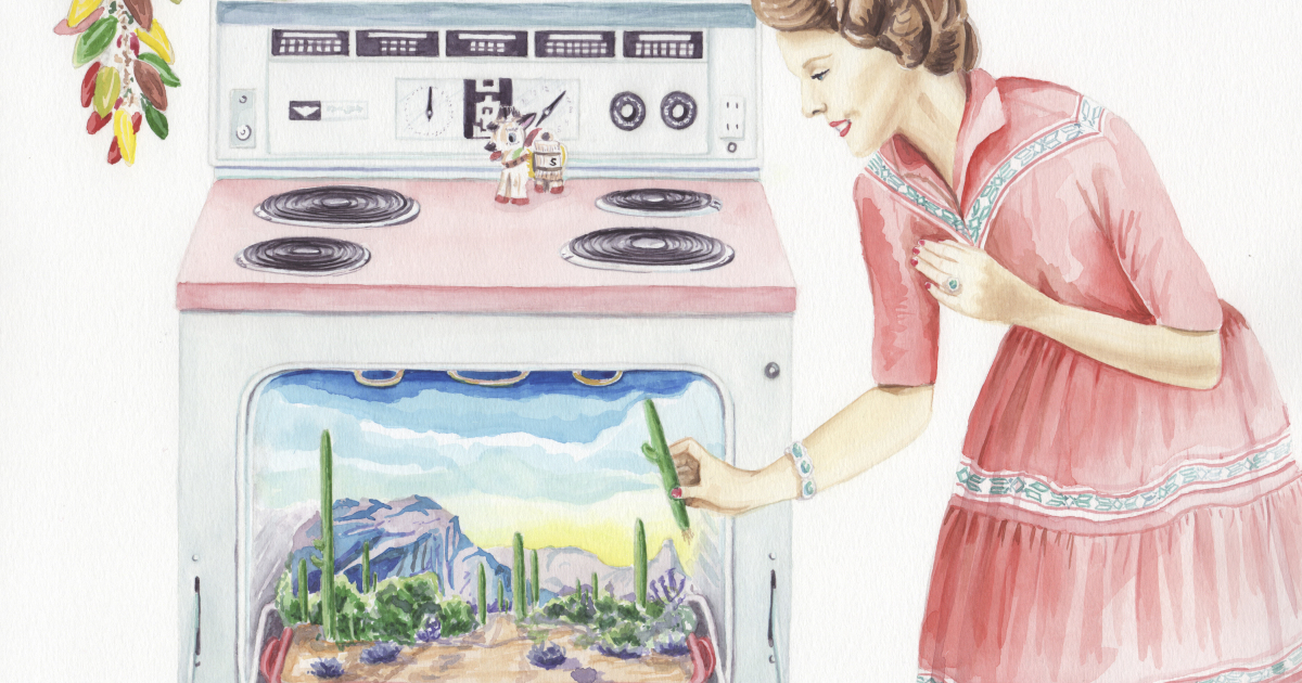
Retro-themed drawings have a funny way of making time behave badly. One minute you are sketching a smiling robot with a chrome jaw and a suspiciously optimistic antenna, and the next minute you are mentally living inside a 1970s cereal commercial, a 1980s arcade cabinet, or a 1990s bedroom with glow-in-the-dark stars stuck to the ceiling. That is the magic of retro art: it does not simply copy the past. It edits memory, adds better colors, removes the boring parts, and gives everything a soundtrack with too much synthesizer.
When I talk about my retro-themed drawings, I mean artwork inspired by vintage illustration, mid-century graphic design, old advertisements, comic books, arcade culture, record covers, analog technology, and the cheerful weirdness of past decades. These drawings may include bold linework, grainy textures, halftone dots, warm color palettes, chunky typography, geometric shapes, exaggerated characters, and little visual jokes that make the artwork feel familiar even when the subject is completely new.
Retro drawing is popular because it offers something modern audiences crave: personality. In a world where digital images can look polished enough to make a toaster feel insecure, retro-inspired artwork brings back the marks of the hand. It celebrates imperfection, texture, humor, and visual warmth. A wobbly line can feel more alive than a perfect one. A faded orange background can say more than a thousand gradients. And a drawing of a cassette tape can somehow make people nostalgic for rewinding, even if half of them have never touched a pencil.
What Makes a Drawing Feel Retro?
A retro-themed drawing is not just an old-looking picture. It is a carefully designed mood. The word “retro” usually refers to a modern work that borrows from earlier styles, especially from the mid-20th century through the early digital age. The best retro drawings use history as a toolbox rather than a costume closet. They borrow shapes, colors, textures, and attitudes from past visual culture, then remix them into something fresh.
Color Palettes with Personality
Color is often the first thing people notice in vintage-inspired illustration. A retro palette may include mustard yellow, burnt orange, avocado green, dusty pink, teal, cream, cherry red, chocolate brown, or faded sky blue. These colors immediately suggest printed posters, old packaging, diner signs, vinyl sleeves, and sun-faded magazine pages.
Instead of using colors that look freshly squeezed from a high-resolution screen, retro drawings often feel slightly aged. The colors are warm, softened, or intentionally imperfect. A cream background can replace bright white. A muted red can replace neon red. A grainy overlay can make the image feel as if it has survived a few decades in a shoebox under someone’s bed, which is honestly where many treasures live.
Bold Shapes and Simple Forms
Mid-century modern design, vintage advertising, and poster art often relied on strong shapes and clear silhouettes. Retro-themed drawings follow that logic. Characters may have simple bodies, oversized heads, expressive hands, and graphic outlines. Objects may be reduced to their most recognizable forms: a rotary phone becomes a circle, a curve, and a cord; a television becomes a box with rabbit ears; a record player becomes a few clean circles and one elegant tonearm.
This simplicity does not mean the art is easy or lazy. In fact, reducing an object to its most charming shape can be harder than drawing every screw, shadow, and dust particle. Retro illustration asks the artist to decide what matters most and then make it sing. Or at least hum pleasantly in the background like a refrigerator from 1963.
Texture, Grain, and Printed Imperfections
One of the best parts of retro-themed drawing is texture. Old posters, comics, newspapers, and packaging were shaped by printing methods that created dots, misregistration, ink bleed, paper grain, and uneven color coverage. Today, artists often recreate those effects digitally or by hand because they add depth and charm.
Halftone dots can give a drawing comic-book energy. Rough brush edges can make a poster feel handmade. Slightly offset colors can mimic vintage screen printing. Paper texture can soften the entire image. These details remind viewers that artwork is not just an image; it is an object, a surface, a thing that could have been touched, folded, pinned to a wall, or rescued from a thrift-store bin by someone with excellent taste and limited shelf space.
The Creative Roots Behind My Retro-Themed Drawings
My retro-themed drawings pull inspiration from several visual traditions. Mid-century graphic design contributes the clean shapes and confident layouts. Pop art contributes humor, bold color, and the idea that everyday objects deserve dramatic attention. Vintage comics contribute expressive faces, speech bubbles, and energetic movement. Old advertising contributes playful optimism, even when the product being sold was something wildly ordinary, like canned peas or a vacuum cleaner with the emotional presence of a spaceship.
There is also influence from arcade graphics, early computer interfaces, 1980s packaging, sci-fi posters, record album art, and retro-futurism. Retro-futurism is especially fun because it imagines the future as people in the past once dreamed it would be: shiny helmets, bubble cars, robot assistants, moon vacations, and buttons everywhere. So many buttons. Apparently the future was supposed to involve pressing many mysterious buttons while wearing a silver jumpsuit.
Why Nostalgia Works So Well in Art
Nostalgia is powerful because it connects images to emotion. A drawing of an old television is not only a drawing of a machine. It may remind someone of Saturday morning cartoons, family movie nights, video game marathons, or the strange honor of adjusting an antenna while everyone shouted directions from the couch. Retro art uses these emotional shortcuts to create instant warmth.
However, nostalgia becomes more interesting when it is not treated as a museum display. The goal is not to say, “Everything was better back then.” The goal is to use the visual language of the past to say something alive today. A retro drawing can be funny, ironic, sincere, dreamy, stylish, or even critical. It can celebrate old design while gently laughing at it. After all, some vintage color combinations were brave. Others were crimes committed against wallpaper.
Common Themes in My Retro-Themed Drawings
Although retro art can go in many directions, my drawings often return to a few favorite subjects. These themes help create a consistent visual world while leaving enough room for surprise.
Old Technology with Big Feelings
Nothing says retro quite like a gadget that looks both outdated and deeply lovable. Cassette tapes, boomboxes, floppy disks, typewriters, CRT televisions, payphones, film cameras, jukeboxes, and arcade machines all make excellent drawing subjects. They have strong silhouettes, recognizable details, and built-in nostalgia.
I like drawing old technology as if it has a personality. A cassette tape might look shy. A television might look dramatic. A payphone might look lonely, as though it has been waiting years for someone to call and ask about its extended warranty. Giving emotion to these objects turns them from props into characters. It also reminds us that technology changes quickly, but the feelings attached to it can last much longer.
Retro Characters and Everyday Scenes
Retro-themed characters often have exaggerated expressions, simplified anatomy, and fashion details from different decades. A character might wear cat-eye glasses, bell-bottom pants, a bowling shirt, high-waisted jeans, roller skates, or a space-age helmet. The goal is not perfect historical accuracy. It is visual storytelling.
Everyday scenes also become more interesting through a retro lens. A diner counter, a record shop, a laundromat, a living room, a beach boardwalk, or a drive-in theater can become a tiny stage for color and humor. These places feel familiar, even if they are invented. They create a world where the coffee is always hot, the signs are always hand-painted, and the floor pattern is always doing slightly too much.
Retro-Futuristic Worlds
Some of my favorite retro-themed drawings imagine a future that never quite arrived. I like drawing tiny rockets, domestic robots, space diners, floating cars, moon motels, and astronauts who look more prepared for a cocktail party than a dangerous mission. Retro-futurism lets an artist blend optimism with absurdity. It says, “What if tomorrow looked like yesterday’s dream?”
This style works especially well because it is both nostalgic and imaginative. It borrows from the past but does not stay there. Instead, it builds alternate worlds where everything is curved, colorful, chrome-plated, and slightly impractical. In other words, perfect for drawing.
My Process for Creating Retro-Themed Drawings
Creating a retro-inspired illustration usually starts with research, but not the stiff, academic kind where everyone suddenly becomes afraid of having fun. I collect visual references from vintage packaging, old posters, classic cartoons, magazine ads, record covers, furniture catalogs, comic panels, and design books. I look for recurring patterns: colors, shapes, typography, textures, and composition styles.
Then I begin sketching. At this stage, I keep the drawing loose. Retro art benefits from confidence, but it also needs playfulness. If the first sketch looks too perfect, I usually rough it up. If a character looks too modern, I simplify the shapes. If an object looks too realistic, I exaggerate its silhouette. The goal is not to draw a cassette tape exactly as it existed. The goal is to draw the cassette tape people remember: charming, chunky, and possibly full of songs recorded from the radio at suspiciously low quality.
Step 1: Choosing the Era and Mood
Before drawing, I decide what kind of retro feeling I want. A 1950s-inspired illustration may use clean shapes, pastel colors, diner imagery, and optimistic advertising energy. A 1960s-inspired drawing may lean into psychedelic curves, bold lettering, and playful distortion. A 1970s look may feature earthy colors, rounded forms, and groovy patterns. An 1980s-inspired piece might include neon, chrome, arcade graphics, grids, and energetic contrast. A 1990s style may involve sticker-like shapes, bright patterns, chunky icons, and early digital attitude.
Choosing the era helps keep the drawing focused. Mixing decades can work beautifully, but it has to be intentional. Otherwise, the illustration may look less like retro art and more like a garage sale had a meeting with a disco ball.
Step 2: Building a Strong Composition
Retro posters and advertisements often use clear composition. There is usually a strong focal point, readable movement, and a satisfying balance between text and image. In my drawings, I try to create a layout that feels bold at a glance and rewarding up close.
I often start with large shapes before adding details. For example, if I am drawing a retro robot, I may begin with a rounded rectangle for the body, a dome for the head, and circles for the joints. Once the silhouette feels right, I add facial expression, buttons, shadows, textures, and small jokes. A tiny label reading “Definitely Not Evil” can do wonders for a robot’s public relations campaign.
Step 3: Adding Texture and Final Details
The finishing stage is where retro drawings come alive. I may add grain, halftone dots, faded edges, paper texture, ink-like outlines, or subtle color misalignment. I also check whether the image feels too clean. If it does, I give it a little visual dust. Not real dust, of course. Real dust is less charming and more likely to make you sneeze on your sketchbook.
Details should support the mood rather than overwhelm it. A few well-placed stars, stripes, sparkles, labels, or speech bubbles can make a drawing feel complete. Too many details can bury the main idea. Retro art works best when it feels designed, not decorated to within an inch of its life.
Why Retro-Themed Drawings Still Feel Fresh
It may seem strange that art inspired by the past can feel modern, but that contrast is exactly what makes it exciting. Retro-themed drawings stand out online because they do not chase the cold perfection of many digital visuals. They feel warm, human, and memorable. They carry the confidence of old design but speak to current tastes.
Retro illustration also gives artists a flexible language. It can be used for posters, editorial art, social media graphics, stickers, packaging, apparel, branding, children’s books, comics, murals, and personal sketchbooks. A retro style can look cute, sophisticated, rebellious, cozy, surreal, or hilarious depending on the artist’s choices.
For brands and creators, retro drawings can communicate authenticity and character. For personal artists, they offer a way to explore memory, humor, and identity. For viewers, they offer a small vacation from visual sameness. In a crowded feed, a retro drawing can feel like finding a postcard from a cooler universe.
Tips for Artists Who Want to Try Retro Drawing
If you want to create retro-themed drawings, start by studying real visual references. Look at vintage posters, product labels, comics, animation backgrounds, record sleeves, magazine ads, and old logos. Pay attention to how artists used limited colors, bold shapes, expressive type, and clever composition.
Next, choose a limited color palette. This is one of the fastest ways to create a retro feeling. Try using three to five main colors instead of every color available. Limitations can make your work stronger because they force you to solve problems creatively. Also, they prevent your drawing from looking like a rainbow got startled.
Practice simplifying objects. Draw a camera using only basic shapes. Draw a diner sign with five lines. Draw a character with a clear silhouette before adding clothes or facial details. Retro illustration rewards clarity. If the drawing reads well from across the room, you are probably on the right track.
Finally, add texture with purpose. Grain, dots, scratches, and faded edges can create atmosphere, but they should not hide weak design. Think of texture as seasoning. A little makes the dish better. Too much and suddenly your illustration tastes like a printer jam.
Experiences Behind My Retro-Themed Drawings
My experience with retro-themed drawings began with a simple attraction to old visual things: faded posters, vintage packaging, comic panels, diner signs, arcade screens, and album covers that looked as if they had lived interesting lives. I was not only interested in how they looked, but in how they made me feel. A retro color palette could instantly change the mood of a sketch. A rounded type style could make a drawing feel friendlier. A rough texture could make a brand-new image feel like it had a story before I even added one.
At first, I made the common beginner mistake of thinking retro meant adding beige, orange, and a few scratches to everything. That worked for about five minutes. Then every drawing started looking like it had been stored in a basement next to a box of holiday decorations. Over time, I learned that retro style is not a filter. It is a set of design decisions. The shape language matters. The spacing matters. The type matters. The humor matters. Even the amount of empty space matters.
One of the most useful lessons came from drawing old objects as characters. I once sketched a tired cassette tape with droopy eyes and a loose ribbon, and it immediately felt more interesting than a technically accurate cassette. The little face turned the object into a memory. It suggested mixtapes, road trips, bedroom stereos, and the tragic ceremony of using a pencil to rewind tangled tape. That drawing taught me that retro art becomes stronger when it connects design with emotion.
Another important experience was learning to stop over-rendering. Modern digital tools make it tempting to add endless shadows, highlights, gradients, and tiny details. Retro-inspired drawing often works better when it is bold and restrained. I began using flatter colors, cleaner shapes, and more deliberate textures. Instead of making a robot look metallic through complex rendering, I could use two colors, a few shine marks, and a confident outline. The result felt more stylish and more fun.
I also discovered that retro-themed drawings are great conversation starters. People respond to them with their own memories. Someone might see a drawing of a payphone and remember calling home from school. Someone else might see a diner illustration and think of road trips. A drawing of an arcade cabinet can unlock stories about tokens, high scores, and the heroic frustration of losing to a pixelated spaceship. This response makes the work feel collaborative, even when the drawing itself was created alone.
The best part of making retro-themed drawings is that the style gives me permission to be playful. I can exaggerate shapes, bend perspective, invent brands, design fake posters, create impossible gadgets, and add jokes in tiny labels. Retro art has room for charm. It does not demand perfect realism. It asks for rhythm, personality, and a good sense of timing. In that way, it feels close to storytelling. Every color, line, and texture becomes part of the joke, the memory, or the mood.
Today, when I create a retro-themed drawing, I think less about copying a decade and more about building a feeling. I want the artwork to feel familiar but not predictable, nostalgic but not dusty, stylish but not stiff. The goal is to make something that looks as if it could have existed years ago, but somehow belongs exactly where it is now. That balance is what keeps me returning to retro illustration. It is a creative time machine, but thankfully, no dangerous wiring or questionable science is required.
Conclusion
My retro-themed drawings are more than a collection of vintage-inspired images. They are a way to explore memory, design history, humor, and personal style through bold shapes, warm colors, playful characters, and textured visual storytelling. Retro art continues to feel relevant because it gives modern viewers something they often miss: charm with fingerprints on it. Whether the subject is an old television, a space-age robot, a diner sign, or a cassette tape with emotional baggage, retro drawing turns familiar objects into visual stories.
The beauty of retro-themed illustration is that it does not ask artists to live in the past. It invites them to borrow the best parts of old visual culture and use them to create something new. With the right balance of research, imagination, restraint, and humor, a retro drawing can feel timeless, personal, and wonderfully alive. And if it happens to include a tiny robot holding a milkshake under a neon moon, well, that is just good taste.
Note: This article is written as original, publish-ready HTML content based on real retro art, illustration, design history, nostalgia, and visual culture research. It does not include external links or citation placeholders.