Choosing an exterior paint color sounds easy right up until you stand in front of a wall of swatches that all claim to be some version of “warm cloud,” “soft stone,” or “polite greige.” Suddenly, your weekend makeover turns into a low-stakes identity crisis for your house. Should it be crisp? Cozy? Dramatic? Quietly expensive? Friendly but not too friendly? Modern but not “this home was designed by a tablet?”
Here is the good news: picking modern exterior house colors does not have to feel like speed-dating 400 paint chips under fluorescent lighting. The best advice from top experts is surprisingly practical. A strong modern palette is less about chasing the trend of the minute and more about reading your home correctly. That means working with your roof, stone, brick, landscape, sunlight, and architecture instead of fighting them in the name of bold self-expression.
Modern exteriors today are warmer, more grounded, and more natural than many homeowners expect. Yes, black-and-white color schemes still have a place. But so do taupes, clay-based neutrals, earthy greens, smoky blues, warm whites, and soft charcoals. The most successful homes feel edited, balanced, and believable in their setting. In other words, the goal is not to make your house scream. It is to make people slow down and think, “Wow, that looks right.”
What “modern” exterior color really means now
When people say they want a modern exterior, they often mean one of three things: cleaner lines, fewer visual distractions, or a more current color palette. They do not necessarily mean a stark white cube with a black door and windows so dark they look like sunglasses.
Today’s modern exterior color schemes lean toward restraint. Instead of using a bunch of competing colors, they create interest through contrast, undertone, finish, texture, and proportion. A warm white paired with charcoal trim can look modern. A muted olive body with soft cream trim can look modern. A mushroom taupe facade with black-framed windows and natural wood can look modern too. The unifying thread is intention.
That is why top color pros often start with a simple rule: make the house look like one complete thought. If every element seems to belong to the same story, you are headed in the right direction.
Start with the parts you are not painting
This is the step homeowners skip when they fall in love with a color on social media and then wonder why it looks weird on their actual house. Your exterior paint does not exist in a vacuum. It has to live with the roof, brick, stone, pavers, driveway, metal railings, window frames, and even large landscape features.
Think of these fixed elements as the permanent cast members. Paint is the costume department. The costume department does not get to ignore the cast.
Look closely at undertones
A gray roof can have blue undertones, brown undertones, green undertones, or a mix of several. Stone can read creamy, pinkish, beige, taupe, or cool silver. Brick may lean orange, wine-red, brown, or dusty rose. If your paint undertones clash with those fixed materials, the whole exterior can feel slightly off even when the color itself is beautiful.
For example, a cool icy gray on siding may feel too sharp next to a warm brown roof. A creamy white may look muddy beside cool blue-gray stone. A modern exterior works best when the undertones are in conversation instead of in a feud.
Read the neighborhood too
No, you do not have to match every house on the block. But it helps to understand the neighborhood rhythm. If every home is warm and earthy, a super-bright blue-white facade may feel jarring. If the area leans contemporary, a yellow-beige from 2004 may feel sleepy. The smartest choice often lands somewhere between personal taste and contextual common sense.
Use a three-part palette, not a color pileup
One of the most useful expert shortcuts is to assign each exterior color a job. Most homes need three roles:
1. Field color
This is the main body color, the star of the show, the one doing the heavy lifting. It should suit the scale of the home, flatter the materials, and feel good in the available light.
2. Trim color
This frames windows, fascia, corners, railings, and architectural details. In modern homes, trim is often quieter than it used to be. Instead of bright, high-contrast trim everywhere, many current palettes use a subtle shift in value for a cleaner look.
3. Accent color
This belongs on the front door, shutters, garage door, or a limited architectural feature. Accent colors are where personality shows up without taking over the whole facade.
If your palette starts creeping past three major tones, pause. That is usually the moment a fresh, modern concept turns into a visual group project with no leader.
The strongest modern exterior color directions right now
Color trends change, but the best modern exterior shades share something in common: they look livable. They feel grounded in nature, flattering in daylight, and flexible across different house styles.
Warm whites and soft creams
Warm whites are still one of the safest and smartest modern choices, but the best ones are not stark. They have a little softness, often with creamy, beige, or subtle greige undertones. This keeps the house from looking too cold, too flat, or like it was painted with leftover printer paper.
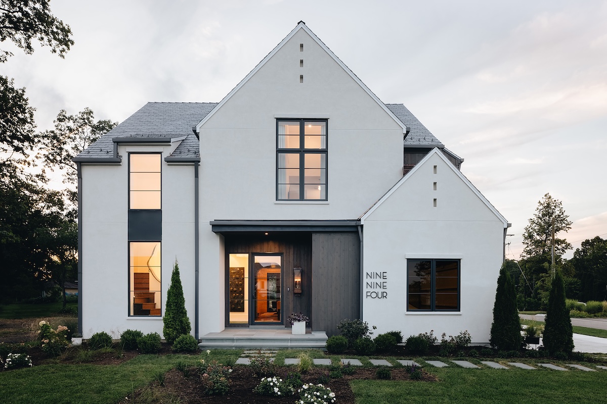
A warm white exterior works especially well with black windows, medium wood doors, natural stone, and muted landscaping. It also helps smaller homes feel open and fresh without screaming for attention.
Greige, taupe, and mushroom tones
If modern white feels too bright and plain gray feels too chilly, meet the overachievers of exterior color: greige, taupe, and mushroom. These shades bridge warm and cool beautifully, which makes them excellent choices for homes with mixed materials. They are sophisticated without trying too hard and timeless without being boring.
These shades often shine on ranch homes, suburban two-stories, updated traditional homes, and minimalist new builds that want warmth instead of stark contrast.
Soft charcoals and gentle blacks
Dark exteriors can be stunning, especially on modern architecture with strong lines. But successful dark homes usually use softened black or charcoal instead of pure, harsh black. A slightly muted dark color tends to look richer and more architectural.
Pair dark siding with warm wood, off-white trim, or stone to keep the exterior from feeling heavy. On the right house, charcoal feels polished and dramatic. On the wrong house, or in the wrong light, it can look like your home is mourning. Test carefully.
Muted greens
Soft olive, sage, eucalyptus, and gray-green have become modern favorites for a reason. They connect beautifully with landscape, flatter natural materials, and feel fresh without being loud. These shades are particularly effective when you want your home to feel calm, tailored, and rooted to its site.
Muted green is a clever option for homes surrounded by mature trees, homes with stone foundations, and houses that need a little softness without losing style.
Smoky blues
Blue can be modern too, as long as it is toned down. Think slate blue, stormy blue-gray, coastal navy, or muted denim rather than bright patriotic blue. A smoky blue exterior feels classic and current at the same time, especially with white, soft gray, or charcoal accents.
This is a great choice if you want more personality than gray but less trend risk than a bold color experiment.
Earthy accents and natural wood notes
Modern exteriors are increasingly borrowing from the landscape. That is why clay, terracotta, sand, ocher, and wood-inspired accents feel so right. Even when the main body color is neutral, a warm front door or natural wood detail can make the whole facade feel more curated and welcoming.
How to match color to architecture
The same paint color can look brilliant on one house and deeply confused on another. Architecture matters.
Modern farmhouse
Go for warm whites, creamy off-whites, or soft grays with restrained black accents. Avoid making every feature high contrast. Too much black can make the look feel like a trend costume instead of a home.
Midcentury modern
Try earthy neutrals, olive, deep taupe, brown-gray, muted green, or low-key charcoal. Pair them with wood, stone, and an accent door that adds just enough energy. Midcentury homes usually prefer confidence over fuss.
Contemporary boxy homes
These can handle stronger contrasts and darker tones, especially when there are large windows, metal details, and clean geometry. Charcoal, soft black, warm greige, and bone white all work well when the materials are high quality.
Ranch homes
Ranches often benefit from colors that lengthen and simplify the facade. Mid-tone neutrals, greens, and blue-grays can modernize them beautifully. Avoid too many little color shifts that chop up the front elevation.
Coastal and cottage-inspired homes
Modern coastal does not have to mean bright turquoise and seashell energy. Try softened blues, driftwood grays, sandy taupes, misty greens, or warm whites with a weathered wood door for a look that feels fresh but grown-up.
Mistakes that make an exterior look dated fast
Picking from a tiny chip
Exterior colors behave differently outdoors. Sunlight can wash them out, bright skies can cool them down, and shadows can deepen them dramatically. A small chip lies. Politely, but still.
Ignoring undertones
This is how beige turns pink, white turns yellow, and gray turns blue when it hits the side of your home. Always compare samples side by side with your roof, stone, brick, and trim materials.
Using too many contrasts
A modern exterior usually looks edited. If the body, trim, shutters, door, garage, and porch ceiling are all trying to become the main character, nobody wins.
Choosing trend over fit
Yes, moody exteriors are beautiful. No, not every home wants to be charcoal. Yes, warm white is popular. No, not every house looks good in it. The best color is the one that suits your architecture and setting, not the one currently collecting the most saves online.
Forgetting about maintenance
Dark colors can show dust, chalking, and weathering more quickly. In sunny climates, they may also fade faster. Some surfaces and sidings need more prep, better primers, or more thoughtful product selection. Color and upkeep are a package deal.
How to test exterior colors like a pro
Before you commit, slow down and run a real test. This is where a good decision becomes a great one.
Step 1: Narrow it to three body colors
Pick options that all work with your fixed materials. Do not test a warm creamy white, a blue-gray, and an olive if your roof only suits one of those directions. Be strategic.
Step 2: Paint large swatches
Use sizable samples on multiple sides of the house. A color that looks perfect on the sunny front may collapse into gloom on the shaded side.
Step 3: Check morning, noon, and evening
Exterior light changes constantly. Modern colors should feel steady and attractive across different conditions, not only during one magical half hour.
Step 4: Test trim and accent with the body color
A body color never lives alone. Try it next to your trim and door options before making the call.
Step 5: View it from the curb
Most people do not stand six inches from your siding. Walk across the street. The whole composition matters more than the chip.
Step 6: Sleep on it
If you are still excited after two days, good sign. If you panic every time the sun shifts, that is your answer too.
Expert-style pairing ideas for a modern exterior
If you want a shortcut, these combinations are flexible, current, and broadly flattering:
Warm white + charcoal trim + natural wood door
Clean, modern, welcoming, and easy to dress up with black hardware and simple landscaping.
Mushroom taupe + soft white trim + deep green door
Quietly upscale and especially strong with stone, gravel, and mature plantings.
Sage green + creamy trim + black window accents
Fresh and organic, ideal for homes that want personality without drama.
Slate blue-gray + crisp off-white trim + walnut-stained wood
Classic with a modern edge, especially on traditional homes being updated.
Soft black or charcoal + warm wood + muted metal details
Bold, architectural, and best when the house has strong lines and enough light to support it.
Resale-friendly modern color choices
If resale matters, lean toward colors that feel polished, calm, and broadly appealing. Warm whites, balanced greiges, dusty greens, taupes, and blue-grays usually have more staying power than highly saturated or unusual colors. That does not mean you have to play it boring. It means the personality should be well placed. Let the front door, lighting, hardware, and landscaping do some of the flirting.
In many cases, a buyer is not looking for your dream color. They are looking for a house that feels cared for, cohesive, and easy to imagine as theirs. Modern exteriors do that well when they feel intentional instead of trendy.
Experience-based lessons homeowners often learn the hard way
One of the most common experiences people have when selecting modern exterior house colors is realizing that the “perfect” online inspiration photo was perfect for that house, not necessarily theirs. A homeowner falls in love with a deep black facade on a sleek home in the Pacific Northwest, then paints a sun-drenched suburban ranch the same color and discovers it suddenly looks hotter, flatter, and much more severe than expected. The lesson is not that dark paint is bad. It is that context is everything.
Another frequent experience involves white paint. Homeowners often assume white is the easy choice because it feels clean and timeless. Then the samples go up, and surprise: one white looks pink, another looks yellow, and a third looks so icy the house seems mildly offended. This is usually the moment people learn about undertones the hard way. Once they compare the white against the roof and stone, the best option usually becomes obvious. It is rarely the brightest white. It is usually the one that quietly gets along with everything else.
Many people also discover that landscaping changes color perception more than they expected. A soft green-gray may look elegant on a bare new build, then turn muddy once dense shrubs and tree cover fill in around the property. On the other hand, a warm greige that seemed a little plain in winter can look rich and grounded once summer greenery arrives. Homeowners who pause to think about the full year, not just one season, usually make better choices.
There is also the classic front-door dilemma. People want personality, but they do not want regret. So they play it safe with a door color that disappears, then wish they had gone bolder. Or they choose a loud accent that looked charming on a swatch and cartoonish on a full-size door. The happy middle is often a grounded accent: deep green, muted navy, warm terracotta, rich brown, or classic black. These shades read intentional and stylish without hijacking the whole facade.
Another real-world experience is sample fatigue. After staring at fifteen nearly identical taupes, every adult begins to question reality. This is normal. The fix is to stop chasing infinite options and compare only the finalists in large outdoor samples. At that stage, the winner usually emerges fast. One color feels calm, one feels too pink, and one just sits there like a boring conference call. Trust the one that makes the house feel settled.
Finally, homeowners almost always say the same thing after the project is done: the right exterior color made the house feel more expensive, more cared for, and more like them. Not louder. Not trendier. Just more complete. That is the real secret of modern exterior color selection. It is not about picking a fashionable shade. It is about making the whole property feel resolved.
Final thoughts
Selecting modern exterior house colors is part design decision, part detective work, and part emotional support paint chip journey. The smartest approach is also the least flashy: study your fixed materials, understand undertones, keep the palette edited, test generously, and choose a scheme that fits the architecture instead of trying to overpower it.
When in doubt, go warmer, calmer, and more natural than you think you need. Modern homes do not have to be cold. The best ones feel balanced, believable, and quietly confident. And if your final choice makes the house look like it has finally gotten a good night’s sleep, you probably nailed it.