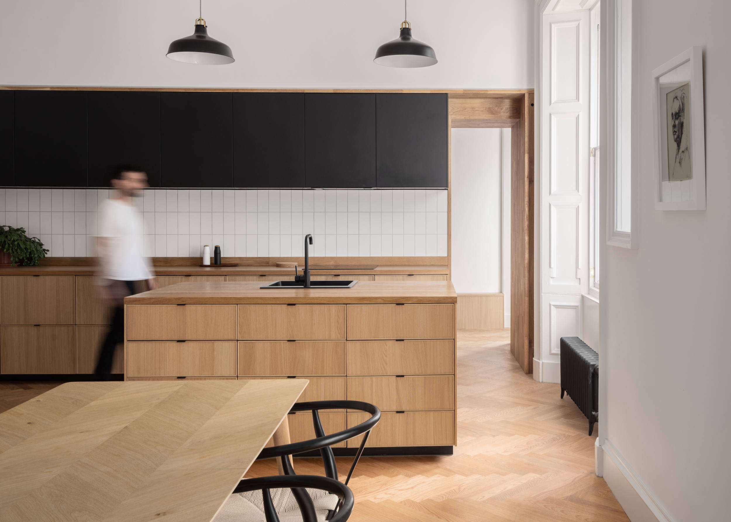
Japandi interiors have mastered a trick most homes desperately need: looking polished without appearing as though nobody is allowed to sit down. By blending Japanese simplicity and appreciation for natural imperfection with Scandinavian warmth and functionality, Japandi style creates rooms that feel quiet, useful, and genuinely comfortable.
Color plays a major role in that atmosphere. The best Japandi-style paint colors are usually soft, earthy, and slightly muted. Warm whites, sandy beiges, stone grays, dusty greens, clay tones, and restrained blacks work alongside wood, linen, ceramic, rattan, and stone rather than competing with them. The result is minimalism with a pulsenot a blank white room that resembles a very tasteful dentist’s office.
The following 16 paint colors offer practical options for walls, cabinets, trim, ceilings, and accents. Each one can help you build a calming Japandi color palette while still giving your home depth and personality.
What Makes a Paint Color Feel Japandi?
A successful Japandi palette starts with nature. Picture weathered stone, unbleached linen, pale oak, dark walnut, moss, mist, clay, sand, and charcoal. These colors are typically lower in saturation, meaning they feel softened rather than loud. Even the darker shades tend to look earthy instead of sharp.
Warm undertones are especially useful because they complement natural wood and woven fibers. However, Japandi rooms do not have to be entirely beige. Muted blue, sage green, terracotta, brown, and soft black can prevent a neutral interior from becoming flat. The goal is harmony: no single surface should enter the room wearing a sequined jacket and demanding applause.
Before choosing a color, consider your flooring, furniture, natural light, and fixed finishes. A warm cream may look beautiful beside white oak but noticeably yellow next to cool marble. Likewise, a green-gray can appear peaceful in daylight and surprisingly blue beneath certain LED bulbs. Always test large samples before painting the entire room.
16 Calming Japandi-Style Paint Colors
1. Benjamin Moore Gray Cloud 2126-60
Gray Cloud is a light, restrained gray that creates a clean background without feeling icy. It works particularly well in living rooms with pale wood furniture, cream upholstery, and charcoal accents. Use it where you want the visual quiet of white with a little more definition. In bright rooms, it reads airy; in softer light, it develops a gentle, misty character.
2. Benjamin Moore Swiss Coffee OC-45
Swiss Coffee is a warm off-white suited to bedrooms, hallways, and open living spaces. Its creamy quality softens minimalist furniture and keeps white walls from looking clinical. Pair it with oak, walnut, woven baskets, and natural linen. It is also a useful trim color when stark white would create too much contrast against beige, taupe, or clay-colored walls.
3. Behr Blank Canvas DC-003
Blank Canvas offers the warmth of cream while remaining light enough to function as a whole-house neutral. It is an easy foundation for a Japandi living room filled with pale timber, handmade pottery, and textured textiles. Because the color is warmer than a basic builder white, it helps large or sparsely furnished rooms feel intentional rather than unfinished.
4. Sherwin-Williams Shiitake SW 9173
Named after the mushroom but considerably less likely to end up in your stir-fry, Shiitake is a warm stone gray with an organic, grounded appearance. It can bridge light Scandinavian wood tones and darker Japanese-inspired furniture. Try it in a dining room, home office, or quiet reading area with black metal, ceramic lighting, and off-white fabrics.
5. Clare Set in Stone
Set in Stone provides a calm gray backdrop for rooms that contain multiple wood finishes. It is especially effective in bathrooms with stone tile, a wood vanity, matte fixtures, and simple cotton towels. To keep gray from feeling cold, add warm lighting and tactile materials such as slatted wood, plaster, linen, or a handwoven rug.
6. Behr Tranquil Gray DC-007
Tranquil Gray is a balanced midtone neutral that feels more substantial than an off-white but remains easy on the eyes. Use it on walls when you want light furniture and artwork to stand out gently. It can also create attractive tonal contrast with warm white trim without producing the dramatic outline associated with darker gray paint.
7. Sherwin-Williams Balanced Beige SW 7037
Balanced Beige brings subtle warmth to family rooms, bedrooms, and entryways. It pairs naturally with jute, wool, rattan, oak, and medium brown leather. For a layered Japandi palette, combine it with a lighter cream on the ceiling and a deeper brown or muted black on doors. The room gains depth while remaining calm and cohesive.
8. Farrow & Ball Slipper Satin No. 2004
Slipper Satin is a delicate neutral with a soft, chalky appearance that suits quiet interiors. It can make modern apartments feel less rigid and older homes feel refreshed without erasing their character. Use it with limewashed surfaces, curved furniture, paper lanterns, and sandy textiles for a room that looks relaxed rather than aggressively decorated.
9. Behr Jojoba N390-3
Jojoba is a dusty green that adds nature-inspired color without disrupting a neutral Japandi scheme. It works beautifully in bedrooms, bathrooms, or reading corners where a gentle green can create a restorative mood. Pair it with warm white, light wood, tan linen, and a few real plantspreferably plants you have not accidentally converted into decorative twigs.
10. Sherwin-Williams Retreat SW 6207
Retreat is a muted green with blue-gray undertones, giving it more depth than a pale sage. It is a strong option for kitchen cabinets, a bedroom accent wall, built-in shelves, or a small study. Natural oak keeps it fresh, while walnut and black accents bring out its sophisticated side. Use a matte or eggshell finish for a softer effect.
11. Sherwin-Williams Cascade Green SW 0066
Cascade Green can turn a bathroom into a spa-like space when paired with wood, stone, and simple white fixtures. The shade is colorful enough to feel refreshing but subdued enough for Japandi minimalism. Consider painting the walls and ceiling in the same color to reduce visual interruptions, particularly in a compact powder room or bathroom.
12. Valspar Renew Blue 8003-37D
Although warm neutrals dominate Japandi design, a softened blue can introduce the feeling of sky, water, and open air. Renew Blue works well in bedrooms, bathrooms, laundry rooms, and sunlit kitchens. Balance it with beige, cream, light wood, and handmade ceramic pieces so the palette stays earthy rather than drifting into a beach-house theme.
13. Behr Canyon Dusk S210-4
Canyon Dusk is an earthy clay tone that adds warmth without the intensity of bright orange or red. It can make a dining nook, bedroom, or entry feel grounded and welcoming. Pair it with cream walls, pale oak, dark brown, and matte black. Even a small painted alcove can provide enough color to energize an otherwise neutral interior.
14. Sherwin-Williams Foothills SW 7514
Foothills is a deep stone brown that offers softer contrast than pure black. Use it on an interior door, fireplace surround, kitchen island, built-in cabinet, or lower section of a two-tone wall. The color looks particularly handsome beside warm white plaster and medium-toned wood, giving a room structure without making it feel heavy.
15. Behr Cracked Pepper PPU18-1
Cracked Pepper is a soft charcoal that can outline architectural features and anchor pale Japandi interiors. Apply it selectively to cabinetry, trim, doors, shelving, or a single feature wall. A little dark contrast emphasizes clean lines; too much can turn your serene retreat into the headquarters of a very stylish supervillain. Balance it with cream, linen, and visible wood grain.
16. Farrow & Ball Tar No. CC1
Tar is a warm off-black that feels more organic and inviting than a crisp, inky black. It is a sophisticated option for exterior details, interior doors, cabinetry, or compact rooms designed to feel cocooning. Combine it with off-white walls, dark timber, aged brass, and rough ceramics. Its depth supports the Japanese side of Japandi while natural textures preserve Scandinavian warmth.
How to Build a Complete Japandi Color Palette
You rarely need all 16 colors in one house. In fact, using them together would be less “calming sanctuary” and more “paint store inventory incident.” A practical palette generally needs three main components.
Choose a Quiet Base Color
Use a warm white, pale beige, or light gray across approximately 60% of the visible room. This may include most walls, the ceiling, and large upholstered furniture. Swiss Coffee, Blank Canvas, Gray Cloud, or Slipper Satin can provide that calm foundation.
Add an Earthy Secondary Color
Reserve approximately 30% of the palette for a richer neutral or nature-inspired shade. Shiitake, Jojoba, Balanced Beige, Renew Blue, or Canyon Dusk could appear on cabinetry, an accent wall, drapery, bedding, or a large rug.
Finish with Controlled Contrast
Use the remaining portion for darker details. Foothills, Cracked Pepper, or Tar can define window frames, doors, lamps, hardware, picture frames, and furniture legs. Repeating a dark accent a few times around the room makes the contrast look deliberate rather than accidental.
Coordinate Paint with Natural Materials
Japandi style depends as much on texture as color. A simple beige wall becomes far more interesting beside open-grain oak, wrinkled linen, handmade clay, honed stone, wool, bamboo, or limewash. Instead of adding numerous decorative objects, allow variations in texture and craftsmanship to create visual interest.
Room-by-Room Japandi Paint Ideas
For a Japandi living room, begin with a warm off-white and add a green-gray or stone-brown feature through built-ins or an architectural wall. Keep the ceiling close to the wall color to preserve flow. Low-profile wood furniture and a textured neutral rug will reinforce the calm, grounded atmosphere.
In a bedroom, choose Swiss Coffee, Jojoba, Tranquil Gray, or Renew Blue. Painting the ceiling in the same coloror a lighter version of itcan soften the room and reduce hard visual boundaries. Layer cotton, linen, wool, and wood instead of filling the bed with seventeen decorative pillows that must be relocated every night.
Kitchens can handle slightly stronger contrast. Try warm white walls with Retreat cabinets, a Foothills island, or Cracked Pepper accents. Natural stone counters and visible wood grain will prevent the painted surfaces from feeling too manufactured.
Bathrooms are ideal for Cascade Green, Set in Stone, or Shiitake. Use moisture-resistant paint in an appropriate sheen, then add wood, stone, woven storage, and simple fixtures. The space should feel like a private retreat, even when someone has left a toothpaste cap performing its usual disappearing act.
Experiences and Practical Lessons from Japandi Paint Projects
One of the most common experiences when creating a Japandi room is discovering that “neutral” does not mean predictable. A warm white that looks beautifully creamy on a paint card may turn yellow beside cool flooring. A subtle gray can develop blue or lavender undertones in a north-facing room. That is why experienced decorators test paint on several walls rather than trusting a small chip viewed beneath store lighting.
Large sample boards are especially helpful. They can be moved beside the floor, sofa, cabinets, window, and favorite wood furniture. Observe them in morning light, afternoon sun, and artificial light after dark. Many homeowners are surprised to find that their preferred sample at noon becomes their least favorite at night. Paint is apparently allowed to have multiple personalities.
Another recurring lesson is that Japandi interiors need warmth as much as they need simplicity. Removing clutter and painting everything white does not automatically produce serenity. Without wood, woven fibers, soft textiles, pottery, plants, and varied surfaces, the room can feel empty rather than peaceful. The most successful projects use paint as a backdrop for natural materials instead of expecting color to do the entire job.
Wood undertones matter too. White oak and ash generally pair easily with cream, beige, muted green, and pale gray. Walnut often benefits from lighter walls that reveal its depth. Red-toned cherry or mahogany may clash with pinkish beige but look balanced beside a gentle green-gray. Bringing wood samples into the color-selection process can prevent an expensive repaint.
Sheen also changes the result. Flat and matte finishes disguise minor wall imperfections and create the soft, mineral-like appearance associated with Japandi design. Eggshell is practical for living rooms and bedrooms that need occasional cleaning. Satin or semigloss may be better for cabinets, doors, trim, and moisture-prone areas, but a very shiny finish can feel visually busy. The calmer the intended room, the more restrained the sheen should usually be.
Many people also learn that dark paint is not the enemy of a calming home. A carefully placed charcoal door, brown cabinet, or off-black fireplace can make a pale room feel more balanced. The problem arises when contrast is random. Repeating the same dark shade in three or four small elementsperhaps a door, lamp, frame, and chair legcreates rhythm and makes the palette appear intentional.
Finally, successful Japandi rooms tend to evolve rather than arrive fully assembled in a weekend shopping spree. Homeowners often get better results by painting first, living with the space, and adding useful objects gradually. This slower approach supports the style’s emphasis on quality, craftsmanship, and purpose. It also gives you time to decide whether a decorative object truly belongs in the room or merely looked persuasive while sitting under flattering store lights.
Final Thoughts
The best Japandi-style paint colors create calm without removing character. Warm whites and gentle grays provide breathing room, while sage green, clay, brown, muted blue, and soft black connect the interior to nature. Choose a small, coordinated palette, test every color in your actual lighting, and let wood grain and handcrafted textures remain visible.
Japandi design is not about making your home perfect. It is about making every color, surface, and object feel considered. When the palette supports both simplicity and comfort, your home can look beautifully composed while still welcoming naps, coffee spills, children, pets, and ordinary life.
SEO Tags
Note: This original article synthesizes color and design guidance from Benjamin Moore, Sherwin-Williams, Behr, Clare, Better Homes & Gardens, Architectural Digest, The Spruce, Real Simple, HGTV, Apartment Therapy, House Beautiful, Domino, and Rocky Mountain Hardware. Paint appearance varies by lighting, sheen, surrounding materials, and screen settings; physical sampling is recommended. Research basis: