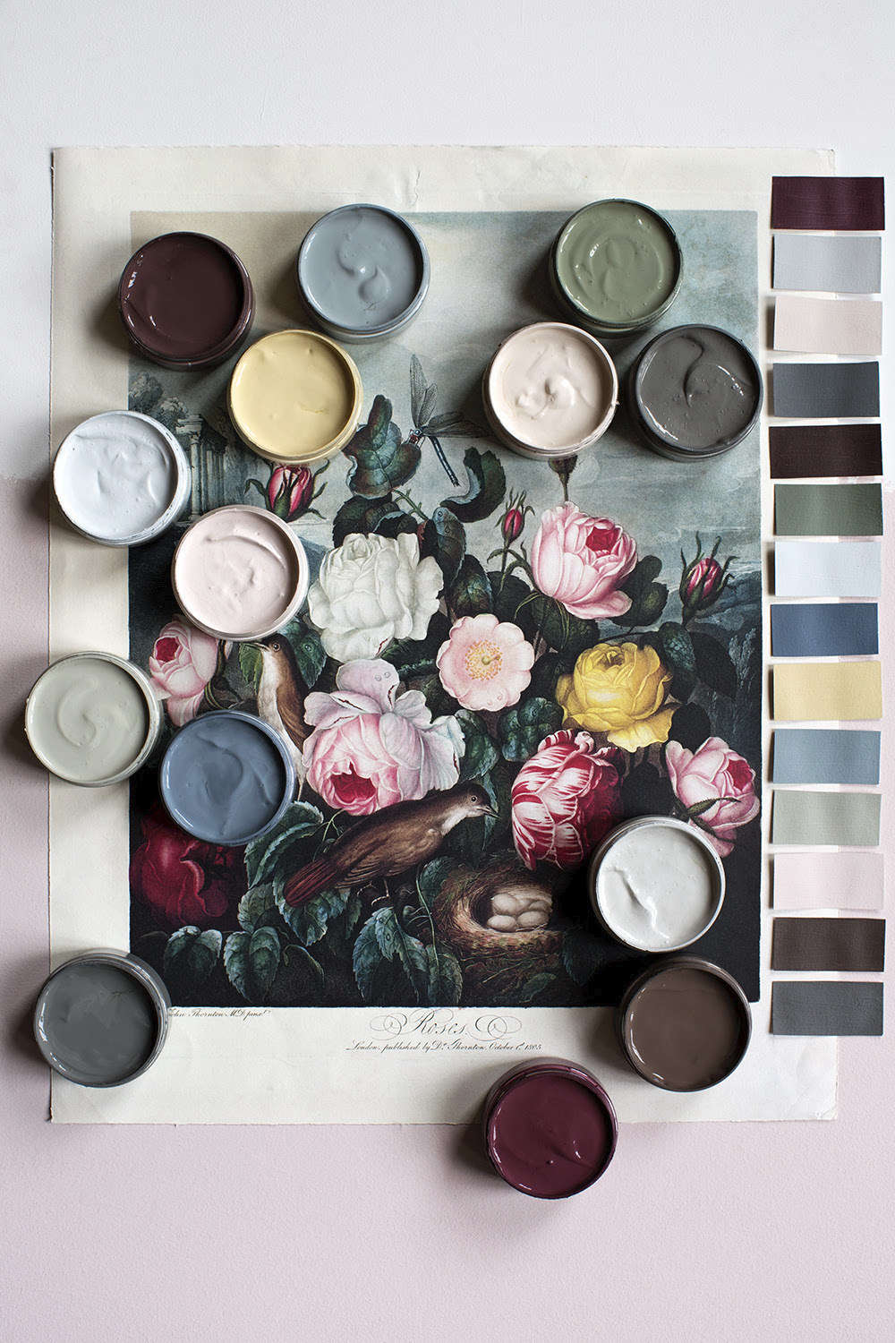
Autumn is not just a season. It is a full-color mood board with better snacks, softer lighting, and absolutely no obligation to explain why you suddenly need three rust-colored pillows. From golden wheat and cider brown to mossy green and dramatic plum, the shades of autumn make ordinary rooms, outfits, tables, and routines feel richer, warmer, and a little more cinematic.
This year, the most exciting autumn color palettes are moving beyond the predictable orange-and-black formula. Think earthy neutrals, weathered clay, smoky greens, deep berry tones, soft ivory, and warm metallic accents. The result is less “seasonal aisle at a giant store” and more “cozy house in a movie where someone is always baking something impressive.”
Why We Keep Falling for Autumn Colors
There is something almost unfairly effective about autumn color palettes. A single burnt-orange throw blanket can make a sofa look more inviting. A deep burgundy napkin can make Tuesday-night pasta feel like a dinner party. A moss-green wall can give a room the quiet confidence of a forest trail after rain.
The appeal begins outdoors. Autumn landscapes naturally combine bright golds, rusty reds, tobacco browns, muted greens, and soft grays. Those colors do not compete; they layer. A red maple leaf can sit beside a faded green shrub and a warm brown fence without anyone calling a meeting about visual harmony. Nature simply gets on with it, showing us that a palette can feel bold and balanced at the same time.
Inside the home, autumn shades create a sense of comfort because they feel grounded. They recall wood, wool, clay, coffee, leaves, late-afternoon light, old books, and the mysterious emotional power of soup. Unlike a color trend built around one flashy hue, autumn colors work as a family. You can choose one warm accent, a dark anchor, and a light neutral, then create a room that feels collected rather than staged.
The current obsession is not about turning every corner into a pumpkin patch. It is about using fall colors with intention. A modern autumn palette can be minimal, moody, traditional, playful, elegant, rustic, or all of the above before noon.
The Essential Shades of Autumn
The best autumn palettes mix familiar seasonal hues with a few unexpected shades. Instead of decorating with every color of a candy corn bag, build a richer story around tones that can live in your space well beyond October.
1. Cider Brown: The New Cozy Neutral
Brown has returned with confidence. Not the sad beige of forgotten waiting rooms, but layered shades of chestnut, cocoa, caramel, espresso, and warm tobacco. Cider brown works beautifully as a grounding neutral because it pairs naturally with cream, brass, olive green, rust, navy, and soft pink.
Try it through a leather chair, dark wood picture frames, a woven basket, a brown plaid throw, or a coffee-table book with a rich, earthy cover. In a room full of pale furniture, brown gives the eye somewhere to land. It says, “Yes, this room is calm, but it also owns a very good candle.”
2. Burnt Sienna and Terracotta: Autumn Without the Costume
Burnt sienna, clay, cinnamon, brick, and terracotta are the grown-up cousins of bright pumpkin orange. They carry warmth without feeling overly themed. These shades look especially good with cream, pale wood, charcoal, sage, and faded denim blue.
Use terracotta in small doses if you are nervous: a table runner, ceramic vase, pillow cover, lampshade, framed print, or linen napkin. For a bolder move, paint a powder room, reading nook, or dining-room accent wall in a softened clay shade. It can make even a plain corner look like it has stories to tell.
3. Oxblood and Burgundy: The Drama Department of Fall
Deep red shades bring instant depth. Burgundy, oxblood, merlot, cranberry, and wine-red tones are ideal for people who want autumn warmth with a little more mystery. These colors are excellent for velvet, leather, painted cabinetry, table linens, statement art, or a single dramatic chair.
Burgundy becomes especially sophisticated when paired with warm ivory, camel, muted blush, brass, or smoky blue. It can also be softened with natural textures such as linen, rattan, oak, and wool. The goal is not to make the room look like a vampire lounge. Unless that is the goal. In that case, carry on.
4. Moss, Olive, and Forest Green: Nature’s Quiet Flex
Green belongs in an autumn palette because the season is not only about leaves changing color. It is also about the deep evergreen tones that make gold, rust, and berry colors look even more alive. Mossy green, olive, forest green, and sage add calm and richness without overwhelming a room.
Olive green works beautifully in kitchens, entryways, bedrooms, and dining spaces because it feels warm rather than chilly. Pair it with aged brass, wood, stone, cream textiles, and warm brown accents. Forest green is more dramatic and works well in small rooms where you want atmosphere rather than visual volume.
5. Marigold and Harvest Gold: The Glow-Up Color
Yellow is easy to underestimate until you see it next to a deep brown, an inky blue, or a charcoal gray. Marigold, mustard, goldenrod, and harvest gold bring warmth to a space without requiring a major renovation or an emotional commitment to painting the entire living room.
A gold velvet pillow, a yellow ceramic bowl, a striped blanket, or a vintage-style lamp can introduce the color gracefully. The trick is choosing a slightly muted or earthy yellow instead of something that looks like it escaped from a highlighter factory.
6. Plum and Aubergine: The Unexpected Autumn Shade
Plum, eggplant, mulberry, and dusty violet bring a richer, more modern edge to an autumn color palette. These shades feel especially inviting in bedrooms, dining rooms, and reading corners because they create depth without relying on black or gray.
Pair plum with olive green for a moody garden-inspired look, or combine it with ivory and brass for something softer. A dark plum candleholder, upholstered bench, curtain panel, or painted bookshelf can make a room feel more intentional immediately.
7. Cream, Khaki, and Warm Ivory: The Essential Breathing Room
Every rich autumn palette needs a place to exhale. Creamy white, warm ivory, biscuit, khaki, and soft taupe keep deeper colors from feeling heavy. They also make a room more flexible, allowing you to swap seasonal accents without replacing everything you own.
Use warm neutrals on larger surfaces: walls, curtains, rugs, bedding, or main upholstery. Then layer in autumn color through smaller pieces. This approach creates a cozy atmosphere while protecting you from the deeply personal crisis of realizing you painted an entire room the color of chili powder.
How to Build a Modern Autumn Color Palette
A successful autumn palette does not need twelve colors and a color wheel that requires a graduate degree. Start with three elements: a neutral base, a warm feature color, and a darker grounding shade.
Palette One: The Fireside Classic
Use warm ivory as the base, rust as the main accent, and chestnut brown as the anchor. Add brass or antique gold details for glow. This palette works well in living rooms, dining rooms, and entryways because it feels welcoming without becoming too formal.
Palette Two: The Woodland Edit
Combine moss green, mushroom taupe, faded black, and cream. Add touches of amber glass or warm wood. This palette is perfect for anyone who loves autumn but prefers foggy forest walks to bright pumpkin displays.
Palette Three: The Berry Harvest
Pair burgundy, plum, dusty rose, and warm beige. Add dark wood or aged brass to keep the colors grounded. This combination works especially well for dinner tables, bedrooms, and small entertaining spaces.
Palette Four: The Golden Afternoon
Start with camel, honey gold, soft white, and deep blue-gray. The blue-gray gives the palette contrast, while the gold and camel keep it warm. It feels cheerful without looking like a school bus stopped in your dining room.
Palette Five: The Soft Autumn Minimalist
Choose oatmeal, clay, sage, and dark espresso. This is the answer for people who want seasonal warmth but do not want a single decorative gourd staring at them from across the room. Focus on texture: linen, woven wool, ceramic, stone, wood, and matte metal.
Bringing Shades of Autumn Into Your Home
Refresh Your Living Room Without Replacing Everything
The living room is the easiest place to experiment because textiles do most of the work. Swap lightweight summer throws for wool, boucle, knit cotton, or brushed flannel. Add two or three pillows in colors such as rust, olive, burgundy, or marigold. Choose one patterned piece and keep the rest solid so the sofa does not begin to resemble a confused fabric sample book.
A tray on the coffee table can hold a candle, a small ceramic bowl, a stack of books, and a sprig of dried foliage. The secret is restraint. A room does not need fifty tiny pumpkins to feel seasonal. It needs a few thoughtful objects that make the existing space feel warmer.
Create an Autumn Table That Feels Effortless
For a fall table setting, begin with a neutral cloth or runner. Add linen napkins in deep red, olive, mustard, or cinnamon. Use simple glassware and let natural materials do the heavy lifting: pears, apples, dried branches, leaves, nuts, grain, or small gourds in muted tones.
Instead of making every item match perfectly, aim for related warmth. A brown ceramic plate, an ivory candle, a plum napkin, and a brass spoon can feel more interesting together than a fully coordinated set. Autumn is layered by nature; your table can be, too.
Use Lighting Like a Color Accessory
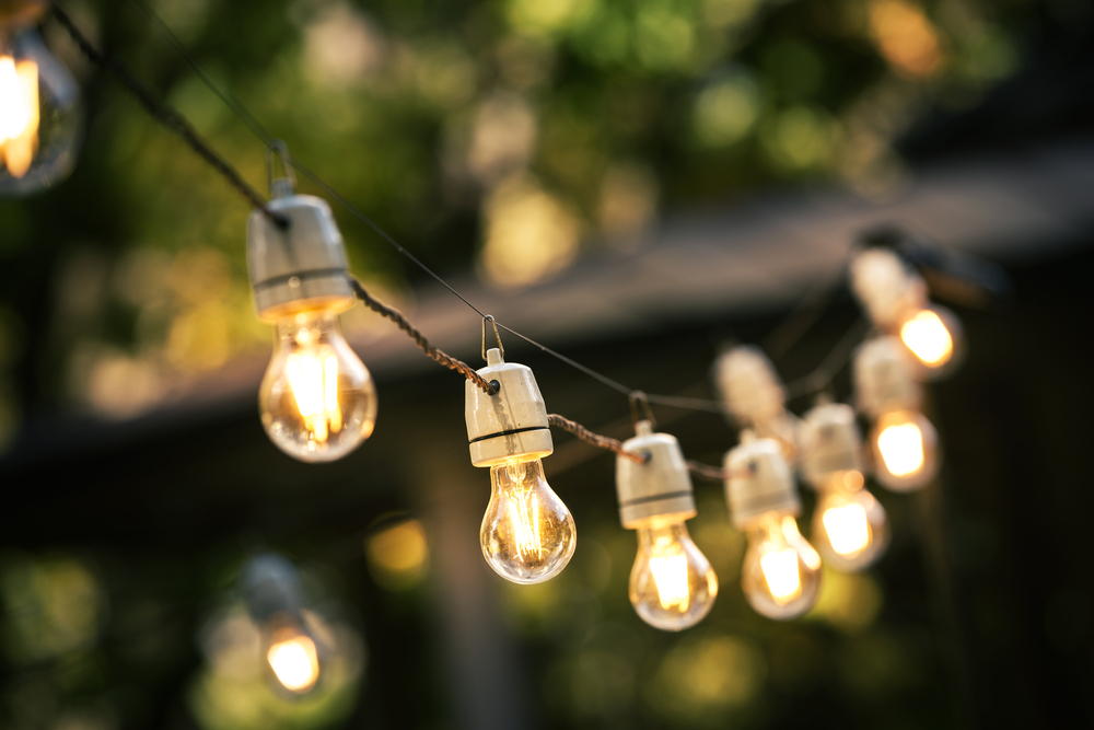
Lighting changes how every autumn color reads. Warm bulbs make browns feel richer, clay tones feel softer, and greens feel more inviting. Add a lamp with a linen shade, a few taper candles, or an amber-glass votive to create depth after sunset.
Avoid harsh white lighting when possible. Nothing drains the romance from a cinnamon-colored room faster than illumination that feels like it belongs in a dentist’s office. Autumn is not asking for darkness; it is asking for glow.
Bring the Palette Outside
Front porches, balconies, and patios can carry autumn color through planters, cushions, doormats, lanterns, and blankets. Mix natural shades rather than using only orange. Try cream pumpkins, deep red mums, olive planters, weathered wood, dried grasses, and a rust-colored outdoor pillow.
A simple seating area with a warm throw and a small side table can make an outdoor space feel useful long after summer has packed up its flip-flops. The goal is to create a spot for coffee, reading, conversation, or pretending you are in a magazine spread for at least seven minutes.
Autumn Shades Beyond Home Decor
The fascination with fall color is not limited to interiors. Autumn shades also make everyday style feel more polished. A camel sweater, olive overshirt, burgundy scarf, rust handbag, or brown leather boot can work as a seasonal update without becoming a costume.
For beauty, the same principle applies: think warm but nuanced. Berry lip colors, soft brown eyeliner, muted copper nails, and rosy blushes can echo the season without looking theatrical. The best shades are the ones that make you feel like you have your life together, even if your laundry chair has become a piece of permanent furniture.
Food also gets to join the party. Think apple cider, roasted squash, cinnamon, dark chocolate, cranberry, caramel, toasted nuts, and maple. These flavors mirror the color palette, which may explain why an autumn table full of amber, burgundy, and brown feels instantly complete. Your eyes are having dinner before your fork gets involved.
Common Autumn Color Mistakes to Avoid
First, do not treat orange as the only legal fall color. Orange is wonderful, but it looks better when supported by cream, brown, green, plum, navy, or charcoal. Too much bright orange can turn a stylish room into a seasonal advertisement for candy.
Second, avoid buying decorations that only work for two weeks. Instead of investing in items with obvious slogans or highly specific holiday graphics, choose textiles, ceramics, glassware, and baskets in versatile autumn shades. A dark green vase, rust-colored blanket, or brass candleholder can stay useful long after the leaves are gone.
Third, remember texture. Color becomes more interesting when paired with materials that have character: linen, wood, wool, velvet, leather, ceramic, stone, rattan, and brushed metal. A plain brown pillow may look ordinary, but a brown velvet pillow catches light and adds depth. Texture is the quiet overachiever of seasonal decorating.
Personal Autumn Experiences: The Colors That Make the Season Feel Real
My favorite autumn moments rarely happen during the big, obvious events. They happen in the spaces between them: the first morning when the air feels noticeably sharper, the first time a sweater becomes necessary instead of decorative, the first cup of coffee that seems to taste better simply because it is held in both hands.
There is a particular shade of gold that appears in late afternoon when sunlight lands on dry grass, old brick, and the edges of leaves. It is not bright yellow. It is softer, almost toasted, like honey mixed with dust and sunlight. That color always feels like the season’s opening sentence. It says that the year is changing, but it does not make a big speech about it.
I think that is why autumn colors feel so emotional. They are familiar without being boring. A rust-colored scarf can bring back memories of school walks, football games, weekend markets, road trips, and the smell of leaves after rain. A dark green sweater can feel like a cabin weekend, even when you are actually sitting in traffic with a grocery list on the passenger seat.
One autumn, I started collecting small color moments instead of trying to create a perfect seasonal home. A brown paper bag holding apples from the market. A dark red notebook on a desk. A chipped amber mug. A green branch in a clear glass bottle. A blanket folded over the arm of a chair. None of these things were expensive or especially dramatic, but together they changed the feeling of the room.
That experience taught me that autumn decorating is less about buying “fall decor” and more about noticing what already feels seasonal. A stack of old books in warm colors can become a display. A bowl of pears can become a centerpiece. A wooden cutting board, a linen napkin, and a candle can make an ordinary kitchen counter feel more intentional.
The same idea works outside. A walk through a neighborhood in autumn can become a color study. Notice the faded sage paint on a porch railing, the dark purple berries on a shrub, the brick-red leaves gathered near a curb, or the brown-gold grass moving in the wind. These are the shades that feel most believable because they are imperfect. They fade, weather, layer, and change by the day.
Autumn also reminds me that warm colors do not have to be loud. Sometimes the best fall palette is nearly neutral: oatmeal, taupe, wood, soft gray, and one small accent of burgundy. Sometimes it is moody: olive walls, a dark rug, brass lamps, and an oversized wool blanket. Sometimes it is cheerful: marigold flowers, cinnamon-colored mugs, and a bright red apple sitting on a windowsill.
The real joy of autumn shades is that they invite us to slow down and make ordinary moments feel considered. They make a room feel ready for conversation. They make a simple dinner feel like an occasion. They make a rainy afternoon feel less like bad weather and more like a reason to stay in.
That is the obsession: not just the colors themselves, but what they encourage us to do. Sit longer. Notice more. Light a lamp before sunset. Put out the good napkins. Wear the coat you forgot you loved. Autumn gives us permission to make everyday life a little warmer, one shade at a time.
Conclusion: Let Autumn Be a Palette, Not a Rulebook
The best shades of autumn are not limited to orange leaves and pumpkin decorations. They include deep browns, softened clay, warm ivory, moss green, marigold, burgundy, plum, and every rich tone in between. Use them in layers, balance them with neutrals, and let texture carry as much weight as color.
Whether you refresh one shelf, redesign a dining table, update your wardrobe, or simply buy a better candle, autumn color can make daily life feel more welcoming. Pick the shades that feel good in your home, ignore the ones that do not, and remember: the most stylish seasonal look is the one that still feels like you.