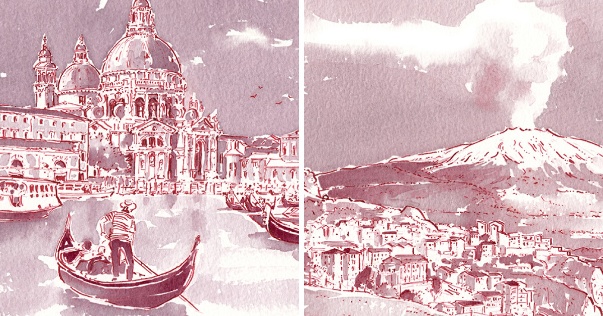
Some artists pack watercolor tubes when they travel. Others carry charcoal, ink, or a camera with a suspiciously full memory card. Then there is the artist who looks at a glass of wine and thinks, “Nice pigment.” That is the delightful twist behind the story of an artist turning wine into amazing travel paintings: the destination is not only the subject of the artwork, but also the material that brings it to life.
The concept sounds like something invented during a very creative dinner party, but it has serious artistic charm. In one widely shared project, artist Richard Mars painted five wine destinations using wine sourced from each place he depicted. The idea was simple and brilliant: if a landscape has a flavor, why not let that flavor become the color? A Santorini scene, for example, was not merely inspired by Santorini wine; it was painted with it. The result turns travel art into a kind of visual souvenir, one that carries geography, agriculture, culture, and a little bit of chemistry on the page.
Wine painting sits at the intersection of travel illustration, experimental art, and storytelling. It asks viewers to look twice. At first glance, you see buildings, coastlines, vineyard hills, old streets, or sunlit destinations. Then comes the delightful surprise: those sepia shadows and soft burgundy tones came from wine. Suddenly the artwork feels less like a postcard and more like a memory stain, in the best possible way.
What Makes Wine Painting So Fascinating?
Wine painting is not just a gimmick. It works because wine contains natural pigments, especially in red varieties. These pigments can create soft pinks, rusty reds, purples, browns, and golden stains depending on the type of wine, its age, acidity, concentration, and how it interacts with paper. Unlike commercial paint, wine is unpredictable. It blooms, fades, spreads, dries unevenly, and often refuses to behave like a polite studio guest.
That unpredictability is exactly what gives wine paintings their personality. A brush loaded with wine may look pale at first, then dry darker around the edges. A second layer can deepen the tone. A stronger reduction may behave more like ink. Some wines lean brick red; others become violet, amber, or tea-colored. The finished image often has a vintage mood, as though it has already lived a small life before arriving in the frame.
In travel paintings, that aged effect feels especially fitting. Cities and wine regions are layered places. They are shaped by weather, soil, architecture, migration, food, farming, and generations of human effort. Wine, too, is a layered material. When an artist paints a destination with wine from that destination, the medium becomes part of the message.
The Richard Mars Project: A Destination Painted From Itself
The most memorable example connected to the phrase “Artist Turns Wine Into Amazing Travel Paintings” features Richard Mars, who created a series of five wine-location paintings for National Drink Wine Day. Each location was painted using wine sourced from the destination shown in the artwork. That detail matters. It means the color palette was not chosen from a store shelf; it was drawn from the land, grapes, and winemaking culture of each place.
The project was linked to exciting wine regions selected by Joe Fattorini of The Wine Show. Rather than treating the regions as generic pretty places, the paintings turned each one into a visual identity. The landscape, the local wine, and the final artwork became connected in one elegant loop. In a world full of mass-produced travel prints, this approach feels refreshingly personal.
One detail from the project has become especially memorable: the wine from Santorini was reportedly difficult to use because it needed to be thickened before it could behave properly on paper. That little challenge reveals a lot about the medium. Wine is not paint. It does not arrive with perfect opacity, predictable viscosity, or a label that says “ideal for landscapes.” It makes the artist negotiate with it. And honestly, that is part of the fun.
Why Wine Works as a Travel-Art Medium
It Carries a Sense of Place
Travel paintings usually try to capture the look of a place. Wine painting goes further by bringing in something physically connected to the place. A wine region is shaped by climate, soil, elevation, rainfall, grape varieties, farming traditions, and local craft. When wine becomes pigment, the painting contains a trace of that environment. It is not only “about” a destination; it is partly “from” the destination.
This is why wine paintings feel different from ordinary travel illustrations. A painted skyline made with conventional watercolor can be beautiful. A painted skyline made with a local wine adds a quiet conceptual wink. It says, “This place made its own color.”
It Creates a Natural Vintage Look
Wine does not usually produce bright cartoon color. Instead, it creates warm, moody, organic tones. That makes it ideal for old streets, ancient walls, vineyard slopes, harbors, rustic villages, and romantic city views. The results often resemble antique maps, aged postcards, or sepia travel journals. If regular watercolor is a crisp travel photo, wine painting is the memory you keep retelling years later.
It Turns Imperfection Into Style
Wine can stain unpredictably. It may form darker edges, cloudy gradients, or delicate patches. For a perfectionist, that sounds like a tiny nightmare wearing a beret. For an artist, it can be a gift. Those irregular marks give travel scenes atmosphere. A street corner can feel sun-baked. A hill can feel wind-softened. A building can look as though time has brushed against it.
The Art and Science Behind Wine Pigments
Red wine gets much of its color from anthocyanins, natural plant pigments found in grape skins. These compounds are sensitive to factors such as acidity, oxygen, aging, and concentration. That is one reason wine can shift in color over time, both in a bottle and on paper. Tannins and other phenolic compounds can also influence how deep, stable, or brownish the final stain becomes.
For painters, this means wine behaves like a living material compared with standard paint. It may change as it dries. It may look different after a few days. It may fade if exposed to strong light. The artist has to work with the material’s personality rather than forcing it into total obedience. Wine painting is less like commanding an army and more like convincing a cat to sit for a portrait.
Paper also matters. Absorbent paper can pull the wine into soft blooms. Less absorbent surfaces may keep edges sharper. Layering can deepen shadows, but too much liquid may buckle the page. The best wine paintings often balance control and accident, using the medium’s natural staining power without letting it run the entire show.
Wine Art Is Part of a Bigger Creative Tradition
Although Richard Mars’ travel paintings are especially eye-catching, wine art is not a one-person novelty. Other artists have explored wine as a creative medium, often using it for portraits, still lifes, vineyard scenes, or abstract works. Elisabetta Rogai, for example, is known for painting with wine, especially in figurative works. Sanja Jankovic has been recognized for using wine to reinterpret well-known images. Elysia Myers has built a practice around wine art, connecting the finished artwork to the emotion and craft behind winemaking.
These artists prove that wine painting is more than a clever social-media moment. It belongs to a wider family of experimental materials, where creators ask what else can become art. Coffee, tea, soil, natural dyes, ash, and plant pigments have all found their way into artwork. Wine fits naturally into that world because it already carries color, scent, culture, and symbolism.
Travel art has a long tradition, too. Artists have carried sketchbooks across cities, mountains, coastlines, and museums for centuries. Travel sketching captures more than scenery; it records attention. A quick drawing can preserve the curve of a street, the angle of afternoon light, or the odd little balcony that a camera might ignore. Wine travel painting adds another layer by turning the destination’s own agricultural product into the visual language of the scene.
How Wine Changes the Mood of Travel Paintings
Imagine a painting of Venice created with ordinary paint. Now imagine the same scene washed in wine tones: reddish-brown canals, soft rose shadows, rooftops that look toasted by time. The second version immediately feels older, warmer, and more intimate. Wine can make a destination look like a memory even when the painting is brand-new.
That emotional quality is perfect for wine regions and historic travel destinations. Places such as Santorini, Tuscany, Bordeaux, Napa Valley, Porto, or Mendoza are not just map points. They are associated with landscape, food culture, craftsmanship, and slow-looking beauty. Wine painting matches that rhythm. It does not shout. It settles.
Because the palette is naturally limited, the artist must focus on value, composition, and atmosphere. This limitation can actually make the painting stronger. Without a rainbow of colors competing for attention, the viewer notices shape, texture, contrast, and storytelling. A vineyard row becomes a pattern. A doorway becomes a dark pause. A coastline becomes a pale edge where the world opens up.
Specific Examples of Wine Travel Painting Ideas
Santorini in Wine Washes
Santorini is famous for whitewashed architecture, blue domes, volcanic cliffs, and intense Mediterranean light. Painting it with wine creates an interesting challenge because the island’s visual identity is bright, while wine tends to produce warm, earthy tones. That contrast can make the artwork more interpretive than literal. Instead of copying the island’s colors exactly, the painting can suggest heat, stone, shadow, and age.
Vineyard Hills and Rural Roads
Wine is especially suited to vineyard landscapes because the subject and medium are connected. Rows of vines, rolling hills, small farmhouses, and distant mountains can be built with layered washes. Darker wine tones can define trunks and shadows, while diluted washes can suggest mist or late-afternoon light. The result feels organic because the material and subject speak the same visual language.
Old City Streets
Wine can make urban travel scenes feel cinematic. Narrow alleys, stone facades, café windows, arches, and balconies all benefit from warm monochrome values. The limited palette gives the scene unity, while darker layers can emphasize doors, windows, rooflines, and figures. It is the kind of look that makes a viewer imagine footsteps, distant music, and a suitcase wheel getting stuck on cobblestones.
Why Audiences Love This Kind of Art
People respond to wine travel paintings because they combine two powerful ideas: place and transformation. A familiar object becomes unexpected. A drink becomes pigment. A destination becomes both image and ingredient. That transformation is easy to understand, but still magical enough to feel fresh.
There is also a storytelling advantage. A normal landscape painting may prompt someone to say, “That is beautiful.” A wine painting invites follow-up questions: “Wait, that was painted with what?” The answer creates instant curiosity. Viewers do not need an art history degree to enjoy the concept. They only need to understand that the material has a meaningful connection to the scene.
In web culture, that kind of hook matters. Images that combine beauty with a surprising process tend to travel well online. Wine painting offers both. It is visually attractive, conceptually simple, and just unusual enough to make people stop scrolling for a moment. In today’s attention economy, that moment is basically a standing ovation.
What Artists Can Learn From Wine Painting
The biggest lesson is that constraints can create originality. Wine offers a narrow palette, uncertain behavior, and technical problems. Instead of seeing those as weaknesses, artists can use them as creative rules. The limitations force decisions. They encourage experimentation. They make each piece feel less manufactured and more discovered.
Wine painting also reminds artists to think deeply about materials. A medium is never neutral. Oil paint, watercolor, charcoal, ink, clay, fabric, and digital brushes all carry different histories and emotions. Wine carries associations with land, celebration, agriculture, patience, and aging. When used thoughtfully, it adds meaning before the first line is even drawn.
For travel artists, the lesson is even stronger: the best travel art does not simply reproduce landmarks. It interprets them. A painting does not need to look like a tourist brochure. It can feel like a weathered note from the road, a quiet memory, or a visual conversation between place and material.
The Beauty of Slow Art in a Fast-Scrolling World
Wine paintings feel slow. They remind us that not everything needs to be instant, glossy, or perfectly controlled. The medium asks for patience. Layers need time to dry. Colors may settle in surprising ways. The final work may look delicate, aged, and slightly mysterious.
That slowness fits the spirit of travel. The best journeys are not only about checking attractions off a list. They are about noticing the color of a wall at sunset, the shape of hills from a train window, or the texture of a handwritten menu. Wine painting captures that kind of attention. It turns looking into lingering.
There is humor in it, too. A wine painting carries elegance, but it also carries a playful sense of “why not?” Why not paint a wine region with its own wine? Why not let a glass become a landscape? Why not let a stain become a skyline? Great creative ideas often begin with questions that sound a little ridiculous until someone makes them beautiful.
Added Experiences: What It Feels Like to Encounter Wine Travel Paintings
Seeing a wine travel painting in person feels different from seeing a normal print. The first thing you notice is the warmth. The tones are not loud or polished; they are soft, earthy, and slightly unpredictable. They seem to have seeped into the paper rather than sitting on top of it. That gives the artwork a handmade honesty, as if the image arrived slowly instead of being forced into place.
One of the most enjoyable experiences related to this topic is comparing the artwork with the destination it represents. A photo might show crisp details: blue water, white stone, green vines, sharp rooftops. A wine painting translates those details into mood. It may not capture every window or every leaf, but it can capture the emotional temperature of a place. That is often what people remember from travel anyway. Not every exact detail survives, but the feeling does.
Another memorable experience is watching viewers react when they learn what the painting is made from. At first, people admire the image. Then someone explains that the pigment is wine, and the room changes. People lean closer. They inspect the shadows. They ask whether different wines create different colors. They wonder if the painting smells like wine. Usually, it does not in any dramatic way, but the question is part of the charm. The medium makes people curious, and curiosity is one of the best doors into art.
Wine travel paintings also make wonderful conversation pieces because they connect art with geography. A painting of a vineyard made with wine from that region can remind someone of a road trip, a family meal, a hillside town, or a once-in-a-lifetime vacation. Even for viewers who have never visited the destination, the concept makes the place feel tangible. It is like holding a little piece of the landscape, translated through pigment and paper.
For artists, experimenting with unconventional materials can be humbling. Wine does not always cooperate. It may dry lighter than expected. It may spread too far. It may create a stain that looks less like a romantic Italian village and more like a small accident involving a tablecloth. But those surprises teach flexibility. They remind artists that creativity is not always about perfect control. Sometimes it is about responding gracefully when the material has its own opinion.
For travelers, the idea encourages deeper observation. Instead of rushing through a destination, wine painting suggests a slower question: what color does this place feel like? Is it dusty rose, deep plum, amber, brick, gold, or soft brown? What local material could tell its story? That mindset changes how people experience travel. The destination becomes more than a backdrop for photos. It becomes a source of texture, tone, and meaning.
The best part is that wine travel painting blends sophistication with play. It can be elegant enough for a gallery wall, yet fun enough to make people smile. It respects craft without becoming stiff. It celebrates place without turning into a travel advertisement. And it proves that art can come from unexpected materials, including the ones sitting quietly at the edge of the dinner table.
Conclusion: When a Destination Paints Its Own Portrait
The story of an artist turning wine into amazing travel paintings is more than a quirky headline. It is a reminder that materials matter, places have color, and creativity often begins where ordinary habits end. Richard Mars’ destination-based wine paintings show how a landscape can be represented not only through image, but through substance. The wine becomes a bridge between vineyard and view, culture and craft, memory and mark-making.
Wine painting works because it is imperfect, atmospheric, and meaningful. Its stains are part of its beauty. Its limitations become style. Its connection to travel gives each piece a sense of origin. In a world filled with digital images, a wine painting feels refreshingly human: a little unpredictable, a little romantic, and just mischievous enough to make art feel fun again.
Whether the subject is Santorini, a vineyard road, an old European street, or a sunlit hillside, wine can turn a travel scene into something richer than a souvenir. It becomes a portrait made from the place itself. And that is the real magic: not simply painting what a destination looks like, but letting the destination help paint its own story.