Some office kitchens are designed to do one thing: keep the coffee machine from looking lonely. Then there is the glam work kitchen by Belgian designer Joris Van Apers, a room that seems to say, “Yes, we can review building plans here, but please admire the centuries-old terracotta first.” It is practical, atmospheric, deeply material, and just dramatic enough to make a spreadsheet feel like a scene from an art-house film.
Located at the Joris Van Apers studio in Reet, near Antwerp, this Belgian-style kitchen is not a glossy showroom pretending to have a soul. It is a working space with history in its bones. Van Apers grew up around rescued marble mantels, parquet floors, antique tiles, and architectural fragments because his family worked in salvage. That background matters. In this kitchen, reclaimed materials are not decorative props. They are the main characters, the supporting cast, and possibly the director.
The result is a “glam work kitchen” that blends brass, terracotta, reclaimed wood, limewashed walls, and old-world craftsmanship with the rhythm of a modern design studio. It is a kitchen, a bar, a meeting point, and a mood board you can stand inside.
What Makes This Belgian Work Kitchen So Special?
The phrase “Belgian style” often brings to mind quiet luxury: muted colors, natural textures, old stone, honest wood, linen, limewash, antiques, and a certain refusal to shout. Belgian interiors tend to feel collected rather than decorated. They are polished, but never too polished. They are rustic, but not barn-party rustic. They whisper, and somehow the whisper has excellent tailoring.
Joris Van Apers takes that language and gives it a glamorous workplace twist. This is not a sterile staff kitchenette hidden behind a door. It is placed at the heart of studio life. The island and bar allow the team to drink coffee, gather with clients, and examine plans in a setting that reflects the studio’s values: characterful materials, precise design, authentic craftsmanship, and refined detailing.
That is the first lesson of the space. A work kitchen does not have to be an afterthought. When designed well, it can become the cultural center of an office. It can communicate taste before anyone opens a portfolio. In Van Apers’s case, the kitchen tells clients exactly what the studio believes: materials should age beautifully, old things deserve new purpose, and elegance gets better when it has a few scratches.
The Power of Reclaimed Materials
The kitchen is set within a 17th-century French farmhouse structure that was relocated from Normandy to Belgium decades ago. That fact alone gives the project a kind of architectural folklore. But Van Apers does not rely on the building’s backstory to carry the design. He strengthens the narrative with materials that look and feel as if they have lived several lives already.
The floor is lined with old French terracotta tiles, a choice that immediately grounds the room. Terracotta has warmth, irregularity, and a handmade quality that newer, flatter surfaces often struggle to imitate. It is not perfect in the showroom sense, which is exactly why it works. The slight tonal shifts, worn edges, and earthy color variations create a visual rhythm underfoot.
In a kitchen, terracotta also brings a useful contradiction. It feels humble, almost agricultural, yet when paired with brass and dark limewash, it becomes quietly luxurious. It says “farmhouse,” but in a cashmere sweater. This is where the Belgian style shines: it knows how to make rough materials feel refined without sanding away their personality.
Brass: The Glamour That Does Not Need Glitter
The brass-fronted bar is one of the most memorable features of the kitchen. Brass is glamorous by nature, but in this project it is not flashy. It is warm, reflective, and capable of developing patina over time. That aging process is important because it keeps the metal from feeling too precious. Fingerprints, oxidation, and tiny marks become part of the finish instead of enemies to be defeated with a polishing cloth and mild panic.
Many modern kitchens use brass as a small accent: a faucet, a handle, a pendant light. Van Apers gives it a larger role. By using brass on the bar front, he turns a functional element into a glowing focal point. Against the darker, atmospheric walls, the brass brings light into the space without making it feel bright in a generic way.
This is “glam” in the best sense. Not sequins. Not glossy lacquer. Not a chandelier trying to audition for Broadway. It is glamour through weight, finish, warmth, and restraint.
Limewash Walls and the Art of Shadow
One of the reasons the kitchen feels so cinematic is the wall finish. Limewash creates a soft, mineral surface with movement and depth. Unlike flat paint, it changes with light. It can look smoky in the morning, velvety in the afternoon, and almost theatrical by evening.
Van Apers described the design as an exploration of materials, textures, shadow, and light. The limewashed walls make that idea visible. They absorb and reflect light unevenly, creating a backdrop that feels alive. In a workplace, this matters more than people think. A room with depth can change the pace of conversation. It encourages people to pause, look, and engage.
The wall colors are moody but not gloomy. Brown tones create warmth, while gray-blue on the back wall adds coolness and contrast. Together, they prevent the kitchen from becoming a beige-on-beige meditation retreat where everyone is afraid to spill espresso.
Reclaimed Wood and the Beauty of Use
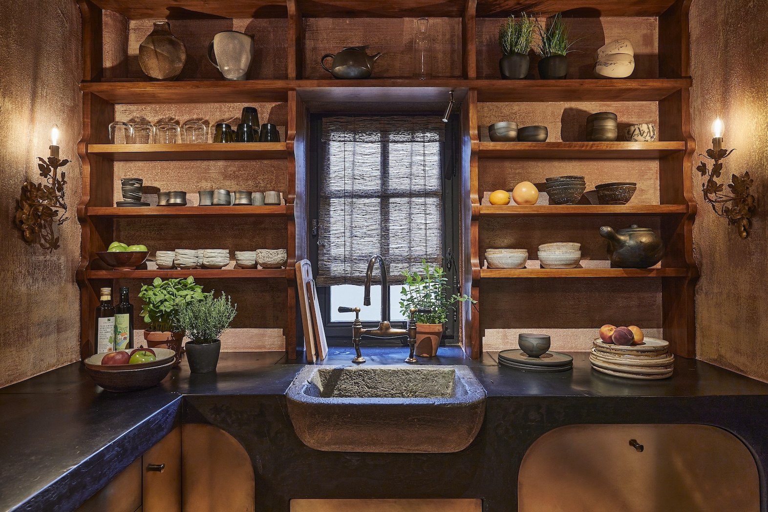
The reclaimed Italian nut wood used for the bar countertop and open shelves adds another layer of history. Wood is often described as warm, but that word can become lazy if we do not explain why. In this kitchen, the wood matters because it softens the harder elements: brass, tile, masonry, and shadowy walls.
Open shelves also reinforce the room’s workshop personality. They suggest that objects are meant to be used, not hidden. In a design studio, that is especially fitting. The kitchen becomes less like a display and more like an active tool. Cups, ceramics, bottles, books, samples, and small objects can all become part of the composition.
That is one reason Belgian interiors often age well. They allow life to participate. A perfectly styled room may photograph beautifully once. A layered room can look interesting every day.
A Kitchen Island Built for Coffee, Clients, and Plans
The kitchen island and bar are not merely decorative. They support the daily rituals of the studio. Van Apers and his team use the space for coffee, quick meetings, and reviewing building plans with clients. That combination gives the kitchen a hybrid function: part hospitality zone, part creative desk, part informal conference room.
This is a smart idea for any creative workplace. Formal meeting rooms can make conversations stiff. A kitchen counter, by contrast, lowers the temperature. People lean in. They point at drawings. They hold cups. They talk like humans rather than agenda items wearing shoes.
For residential design inspiration, the idea also translates beautifully. A home kitchen can include a working counter where laptops, cookbooks, sketches, homework, flowers, and wine glasses coexist. The trick is to design the surface and lighting so the space feels intentional rather than cluttered. In other words, make room for real life, but give real life a good-looking chair.
Why Belgian Kitchen Design Feels Timeless
Belgian kitchen design is not timeless because it ignores trends. It is timeless because it is based on principles that age better than trends: natural materials, muted palettes, craftsmanship, proportion, and texture. These choices do not expire at the end of a design season.
Van Apers’s glam work kitchen is especially compelling because it avoids the two big traps of rustic design. It is not too cute, and it is not too rugged. There are no fake farmhouse signs. No distressed finishes trying too hard to look like they survived a small revolution. Instead, the room uses genuinely old and reclaimed elements, then balances them with precise detailing.
That balance is the secret. The terracotta floor brings age. The brass brings polish. The limewash brings atmosphere. The wood brings tactility. The bar function brings modern usefulness. Remove any one of those ingredients and the recipe changes.
How to Bring This Look Into Your Own Kitchen
1. Start With One Honest Material
You do not need a relocated French farmhouse to borrow from this look, although if you happen to have one in storage, congratulations on your unusual garage situation. Start with one honest material: reclaimed wood shelves, terracotta floor tile, unlacquered brass hardware, natural stone, or limewash walls. Let that material set the tone.
2. Choose Warm, Muted Colors
The Belgian palette favors earthy neutrals, warm grays, chalky browns, clay tones, smoky blues, and soft creams. These colors make textured materials feel richer. Avoid anything too icy or too synthetic. If a color looks like it belongs on a sports drink bottle, it probably does not belong in this kitchen mood.
3. Mix Old and New With Discipline
The Van Apers kitchen works because the old elements are balanced by clean design decisions. If you use antique tiles, pair them with streamlined cabinetry. If you choose brass, let it patina rather than making every surface shiny. If you install open shelves, edit what you display. The goal is collected, not chaotic.
4. Design for Rituals
The best feature of the kitchen may be its daily usefulness. Coffee, conversation, client reviews, and quick planning sessions are built into the layout. Before designing your own kitchen, ask what rituals it should support. Morning espresso? Family breakfast? Recipe testing? Remote work? Homework? Quiet evening snacks eaten directly from the fridge while pretending not to? Design for the truth.
Why This Kitchen Works as Branding
For Joris Van Apers, the glam work kitchen is more than a beautiful room. It is brand storytelling through architecture. Clients entering the space immediately understand the studio’s approach. They see salvage, craftsmanship, atmosphere, and refinement. They experience the materials instead of reading about them in a brochure.
This is an important point for designers, architects, hospitality brands, and creative studios. A workplace should not merely house the brand. It should express it. The kitchen is often the most relaxed room in any building, which makes it a powerful place to communicate values. If the reception area is the handshake, the kitchen is the conversation after everyone stops performing.
In this case, the conversation is clear: old materials can be glamorous, workspaces can be soulful, and practical rooms deserve drama too.
Design Analysis: The Contrast That Creates Magic
The strongest design move in the kitchen is contrast. Not loud contrast, but material contrast. Rough terracotta meets smooth brass. Dark limewash meets warm wood. Historical architecture meets contemporary studio use. Heavy surfaces meet soft light. This layered tension keeps the room from feeling one-note.
Many kitchens fail because every element tries to say the same thing. A modern kitchen becomes too sleek. A rustic kitchen becomes too brown. A luxury kitchen becomes too shiny. Van Apers avoids that by letting materials challenge one another. The brass would feel too polished without the terracotta. The terracotta would feel too rustic without the brass. The limewash ties them together like a very tasteful referee.
The space also respects scale. The bar creates a strong horizontal line, while open shelving adds vertical interest. The curtain partition softens the architecture and provides a sense of reveal. The kitchen feels intimate without feeling cramped, dramatic without feeling staged.
500-Word Experience Notes: Living With the Glam Work Kitchen Idea
Experiencing a kitchen like this is different from simply admiring it in a photo. At first glance, the brass catches your eye. It has that warm metallic glow that makes people instinctively stand a little straighter, as if the room has politely upgraded the dress code. But after a few minutes, the quieter elements begin to take over. You notice the floor. You notice the uneven tones in the terracotta. You notice how the limewashed walls shift as the light changes. The room rewards attention.
That is the most useful lesson for anyone inspired by Joris Van Apers’s Belgian work kitchen: the space is not built for instant impact only. It is built for repeated use. The more time you spend in it, the more details appear. A cup on the counter does not ruin the design. A stack of drawings does not feel like clutter. The room has enough character to absorb daily life.
In a home setting, this approach can make a kitchen feel more forgiving. Real kitchens are messy. They host chopped onions, school bags, late-night tea, grocery receipts, and someone asking where the scissors are even though the scissors have lived in the same drawer since 2018. A Belgian-inspired kitchen handles those moments well because it is not trying to look brand-new every second. Patina is part of the plan.
The experience is also emotional. Natural materials tend to slow people down. Wood invites touch. Terracotta feels grounded. Brass brings warmth. Limewash softens the light. Together, these elements create a room that feels less like a machine for cooking and more like a place for living. That matters because kitchens are no longer single-purpose spaces. They are offices, cafés, family rooms, charging stations, therapy corners, snack theaters, and occasional actual cooking zones.
For a creative workplace, the value is even clearer. A kitchen like this changes how people interact. Clients may feel more relaxed discussing plans at a bar-height counter than across a formal boardroom table. Staff may gather more naturally. Conversations can begin casually and turn into good ideas. The space becomes productive not because it is packed with technology, but because it supports human behavior.
The only caution is maintenance. Materials with character require acceptance. Terracotta may need sealing. Brass will change color. Wood can mark. Limewash may not behave like wipe-clean paint. If you want every surface to remain untouched, this style may test your nervous system. But if you enjoy a room that records time gracefully, the Belgian glam work kitchen offers a liberating idea: beauty does not have to stay perfect to stay beautiful.
That is why the Van Apers kitchen feels so memorable. It is not simply stylish. It is useful, atmospheric, and alive. It proves that a work kitchen can be a gathering place, a design manifesto, and a little daily luxury all at once. Not bad for a room that still has to make coffee.
Conclusion
The glam work kitchen by Joris Van Apers captures the best of Belgian style: quiet luxury, reclaimed materials, old-world texture, and modern function. Its brass bar, terracotta floor, reclaimed wood, and limewashed walls create a room that feels both historic and ready for daily work. More importantly, it shows that kitchens do not need to choose between beauty and usefulness. They can host coffee, clients, plans, conversations, and a healthy amount of admiration.
For homeowners, designers, and creative studios, the takeaway is simple: build with materials that have depth, design for rituals, and let age become part of the aesthetic. A kitchen does not have to be flawless to be glamorous. Sometimes, the most unforgettable rooms are the ones that know how to work hard while looking effortlessly fabulous.