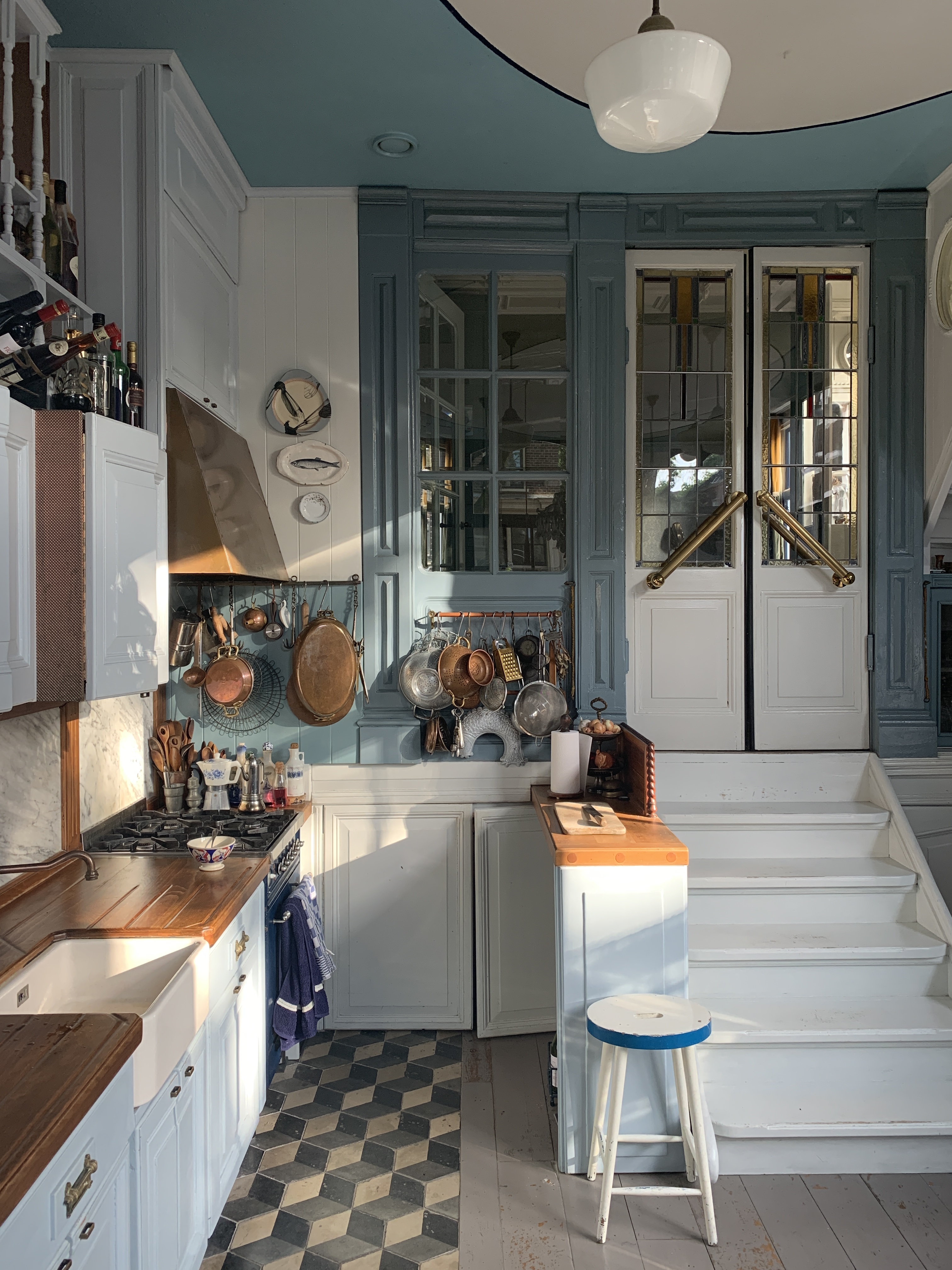
Some kitchens are polished within an inch of their lives. They sparkle, they pose, they look fantastic in photos, and they also give off the unmistakable energy of a room where nobody has ever dropped a wooden spoon. This Amsterdam kitchen is not that kitchen. Thankfully.
This is the kind of blue kitchen that feels collected rather than “completed,” layered rather than showroom-staged, and full of personality without trying too hard. At the center of the story is the old Amsterdam home of stylist, cook, and cookbook author Helma Bongenaar, where a former tavern was transformed into a cook space awash in two pale shades of blue, lined with salvaged cabinets, and filled with beloved objects. The result is playful, practical, and gloriously human. In other words, it has better manners than a trend report and more soul than a catalog.
What makes this kitchen especially interesting is that it does not rely on one big expensive gesture. It works because many smaller decisions pull in the same direction: soft blue cabinetry, hardworking wood counters, open storage, display-worthy collections, generous light, and a cheerful willingness to mix old with older. It is a room that proves a blue kitchen can be calm without being boring, useful without being sterile, and beautiful without behaving like it needs a bodyguard.
A Blue Kitchen That Understands the Assignment
The phrase “blue kitchen” can mean a lot of things. It can mean deep navy drama, coastal brightness, powdery cottage charm, or a moody Scandinavian situation involving expensive stone and a stare-down with your budget. This Amsterdam version chooses a gentler route. The room is painted in two pale shades of blue, a choice tied to Dutch interiors and their relationship with light. That matters because color in a kitchen is never just decorative; it changes how the room feels all day long.
Design publications in the U.S. keep coming back to blue for the same reason homeowners do: it is adaptable. Blue reads as restful, timeless, and unusually easy to pair with other finishes. It can sit happily next to wood, brass, stainless steel, white tile, marble, black accents, and even those inherited oddballs you swore you would donate three years ago. In this kitchen, the pale blue palette softens the architecture and lets the collections, counters, and windows do their thing without visual shouting.
That is the first lesson from this Amsterdam kitchen: blue works best when it is treated less like a stunt and more like a backdrop. The cabinets do not scream, “Look at me, I am a color.” They say, “Come in, put the kettle on, and notice how everything else looks better now.” Frankly, more kitchens should aspire to that level of emotional intelligence.
The Magic of Salvaged Cabinets and Collected Pieces
According to the original house tour, even the cabinets were salvaged. Helma and her husband sourced mismatched units from construction sites and dumpsters, asking if they could take them. That detail does more than add charm. It defines the kitchen’s entire point of view.
Right now, a lot of kitchen advice focuses on custom storage, clean lines, and hiding clutter. That is useful, of course. Nobody dreams of a junk-drawer avalanche. But there is also growing appreciation for spaces that feel warm, flexible, and lived in. This kitchen lands beautifully in that sweet spot. The salvaged cabinetry brings texture and story, while the paint unifies the mismatched pieces into one coherent composition. It is an excellent reminder that a kitchen does not need matching DNA to look intentional.
That approach is also smart from a design perspective. When cabinets come from different origins, painting them the same color helps create continuity. Pale blue is especially forgiving because it softens edges and blends varied door styles more gracefully than a high-contrast dark shade would. If you are working with secondhand cabinetry, inherited furniture, or a mix of old and new storage, color can do a surprising amount of diplomacy. Blue, in this case, acts like the gracious host at a dinner party, making sure everyone gets along.
And then there is the collection factor. A glass-fronted cabinet displays one of Helma’s prized groupings: vintage French coffee bowls in blue-and-white patterns collected over time. That detail is important because it shifts the kitchen away from generic “decor” and toward real identity. Collections do not just fill space. They create rhythm, memory, and visual repetition. They also tell visitors, very politely, that this is a person’s kitchen and not a set built for a mayonnaise commercial.
Storage That Looks Good Because It Actually Works
One of the best details in the room is also one of the simplest: copper rails with S-hooks keep everyday kitchen tools within reach. This is the sort of choice that design people call “functional styling,” but regular people can call “not opening six drawers to find the ladle.” Either way, it works.
American kitchen guidance increasingly emphasizes smart storage that reduces visual clutter while improving daily routines. The most successful kitchens are not the ones with the most cabinets. They are the ones that make daily tasks easier. Wall-mounted rails, open shelves, glass-front storage, and vertical organization all help accomplish that, especially in kitchens where every inch has to earn its keep.
This Amsterdam kitchen uses visible storage in a way that feels relaxed rather than chaotic. The trick is curation. Open storage succeeds when the items on display are either beautiful, useful, or ideally both. Copper rails holding cooking tools make sense because they support the work of the room. Vintage bowls behind glass make sense because they are both collectible and connected to the blue-and-white palette. That balance is what keeps the kitchen from tipping into flea-market panic.
There is a larger lesson here for anyone planning a remodel: do not hide everything by default. A little display space can lighten a kitchen visually, preserve window light, and make the room feel more personal. The goal is not to turn your counters into a yard sale. The goal is to let the right objects remain visible, where they can help both the room and the cook.
Why Wood, Tile, and Blue Make Such a Good Team
The floor is part geometric tile and part worn painted boards, while the countertops are wood with built-in drainboards. That mix gives the room a grounded, slightly patched-together beauty that expensive kitchens often spend a fortune trying to imitate. The surfaces have visual warmth, visible utility, and enough imperfection to feel welcoming.
Blue kitchens nearly always improve when they are paired with something warm. In many U.S. examples, that warmth comes from butcher block, oak, walnut, brass hardware, or woven seating. In this Amsterdam kitchen, the wood counters do a lot of heavy lifting. They keep the pale blue from feeling chilly, echo the room’s age, and reinforce the practical, hardworking spirit of the space.
Tile plays a different role. It adds pattern, durability, and just enough crispness to keep the room from becoming too soft around the edges. American designers regularly pair blue cabinetry with white, gray, or patterned backsplashes because tile helps define the kitchen’s architecture. Here, the floor takes on part of that role. The geometric section introduces visual movement, while the painted boards preserve the room’s patina. Together, they make the kitchen feel assembled over time instead of delivered in boxes on a Tuesday.
If you are translating this look into your own project, the formula is surprisingly practical: use blue for calm, wood for warmth, and tile for structure. It sounds simple because it is. Not easy, exactly, but simple. Like roasting chicken well.
Lighting, Layout, and the Art of Not Blocking the Windows
Light is one of the secret ingredients in every good blue kitchen. Blue can glow beautifully, but it can also turn flat or heavy when a room is badly lit. That is why this Amsterdam kitchen’s oversized windows matter so much. The pale blue paint reflects light instead of swallowing it, and the room avoids overloading the window areas with bulky upper cabinetry.
That decision lines up with broader kitchen guidance: open shelving or lighter visual elements near windows help preserve natural light, especially in compact or narrow kitchens. When daylight is part of the design strategy, a kitchen instantly feels bigger, softer, and more inviting. It also gives collections and materials a chance to look better without the room having to rely on glare and wishful thinking.
Artificial lighting still matters, of course. Good kitchen lighting should layer ambient, task, and accent sources. Under-cabinet lighting remains one of the smartest upgrades for prep areas, while pendants can shape mood and define a dining or island zone. In Helma’s kitchen, the handmade chandelier made of ceramic spoons is not just quirky decoration. It reinforces the room’s humor and identity. A kitchen does not need to be solemn to be well designed. In fact, solemn kitchens are often exhausting.
As for layout, timeless principles still apply. The old work triangle remains useful because it connects the sink, stove, and refrigerator with efficient movement. Even if your kitchen is more open-plan and less textbook, the logic holds: cooking works better when the room supports motion instead of interrupting it. This Amsterdam kitchen appears to respect that practical flow while still allowing space for display, conversation, and visual delight. That balance is harder than it looks.
Collections Included, Personality Guaranteed
Plenty of blue kitchens are beautiful. Fewer are memorable. What makes this one stick in your mind is the willingness to include oddity, history, and humor. Helma’s kitchen has curios on ledges, a spoon chandelier overhead, collected bowls in a cabinet, and enough layered detail to reward a second look. It is more-is-more, yes, but with editing. Every object feels like it belongs to the same story.
That is where many contemporary kitchens lose the plot. In the race toward sleekness, they sometimes become so controlled that they stop resembling the people who live in them. This Amsterdam room offers a more generous idea of beauty. Instead of hiding personality, it frames it. Instead of pretending daily life is messy and therefore shameful, it accepts that lived-in spaces have texture.
For homeowners, this is liberating. You do not need a massive renovation to create a kitchen with presence. You need a strong color story, practical storage, materials with character, and a little courage about what stays visible. The collections do not clutter the room; they humanize it. They also help the blue feel intentional rather than random. Repetition matters. When the bowls echo the cabinets and the metals echo the tools, the room feels composed even when it is full.
What American Homeowners Can Learn From This Amsterdam Kitchen
If this kitchen were translated into an American remodel, the takeaway would not be “copy every detail exactly.” It would be something better: borrow the logic. Choose a shade of blue that works with your natural light. Mix in wood so the room feels warmer and less precious. Use open storage selectively, where it adds access and visual breathing room. Save money where you can by reusing or repurposing cabinetry, then unify everything with paint. Keep enough display space for the objects that actually mean something to you.
Also, let your kitchen have a sense of humor. That might mean vintage lighting, inherited art, a strange ceramic bird, or a row of bowls that make you weirdly happy every time you make toast. A kitchen is not just a utility zone. It is where mornings begin, groceries land, cookies cool, and people lean against the counter to say things like, “I’m not hungry,” while stealing three bites of roasted potatoes. The best kitchens know this and plan accordingly.
Experience: Living With a Blue Kitchen in Amsterdam, Collections and All
Imagine walking into this kitchen early on a gray Amsterdam morning. Outside, the light is soft and low, the kind that drifts in rather than bursts through. Inside, the blue does something almost magical: it catches that light and turns it gentle. Not brighter exactly, not like a ring light for your sourdough starter, but softer and more forgiving. The room feels awake before the coffee is.
That is one of the real experiences of a blue kitchen like this. It changes your mood before it changes your décor. The pale color lowers the temperature of the room emotionally, even when the stove is on and somebody is clattering around looking for a skillet. It makes ordinary rituals feel a little more ceremonial. Washing produce at a wood counter, reaching for a hanging spoon, opening a glass cabinet full of patterned bowlsnone of this is dramatic, but together it becomes atmospheric in the best possible way.
There is also an intimacy to a collected kitchen that pristine spaces rarely achieve. You do not feel like you are borrowing somebody else’s aspirational life. You feel like you are inside a room that has been paying attention. Each shelf, rail, and cabinet door seems to know why it is there. The bowls are not just props. The hooks are not just styling. The painted cabinets are not there to flatter a trend forecast. Everything appears to have earned its place through use, affection, or both.
That is why collections matter so much in a room like this. A kitchen filled with objects gathered over time does not merely look good; it feels inhabited in a deep way. You can sense the history of the bowls, the pleasure of finding a cabinet worth saving, the impulse to keep one odd little lamp because it still makes somebody smile. These details make the kitchen feel less like a project and more like a biography.
And then there is the practical experience, which is easy to underestimate until you spend time in a well-resolved room. Having tools on rails means less hunting and more cooking. Having wood counters under your hands feels warmer and quieter than stone. Having open sightlines near windows means the room never seems to close in on you. Even a visually layered kitchen can feel peaceful when the layout works and the light is good.
There is a social experience here, too. A kitchen like this invites lingering. People do not just pass through it; they settle into it. Someone leans on the counter with a cup of coffee. Someone else notices the spoon chandelier and laughs. A friend opens the glass cabinet and asks where the bowls came from. Suddenly the room is not just where dinner gets made. It is where stories get retold, where the past sneaks into the present through objects and habits, where the whole idea of “home” stops being abstract and starts smelling like onions in butter.
Most of all, a blue kitchen with collections included feels forgiving. It can handle a stack of dishes, a loaf of bread cooling on a board, a bunch of herbs in a jar, or a child’s drawing attached to the fridge with a magnet from a museum shop. It does not panic when life shows up. That may be the greatest luxury of all. Not imported stone. Not custom millwork. Not a faucet with more settings than a spaceship. Just a room that remains beautiful while people are actually living in it.
So yes, this Amsterdam kitchen is lovely in photographs. But its real charm is experiential. It suggests that a well-designed kitchen should do more than impress visitors. It should steady your mornings, support your habits, and give your favorite things somewhere to belong. Blue helps. Salvage helps. Collections help. But the deeper achievement is emotional: the room feels cheerful, capable, and entirely itself. That is harder to buy than cabinets, and much more worth having.
Final Thoughts
The beauty of this blue kitchen in Amsterdam is not just the color, though the color is excellent and deserves a small round of applause. It is the combination of softness and utility, thrift and style, display and discipline. It proves that the most compelling kitchens are not necessarily the newest or the most expensive. They are the ones that turn daily use into part of the design.
If you are planning your own blue kitchen, take the bigger message with you: choose a shade that likes your light, warm it up with wood, make storage earn its keep, and leave room for objects that carry memory. A kitchen should not feel anonymous. It should feel like your life, only a little more organized and significantly better lit.
Note: Body-only HTML, ready for web publishing and cleaned of unnecessary reference artifacts.