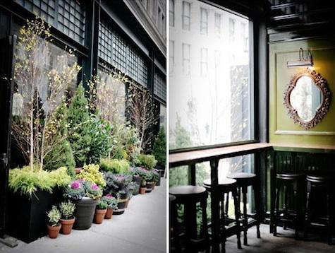
Note: This article discusses The Breslin at the NY Ace Hotel as an influential historical design reference, not as a current restaurant listing. The original Breslin space has since evolved into other restaurant concepts, but its moody palette remains a master class in hospitality color design.
A Restaurant Palette That Walked In Wearing a Velvet Jacket
Some restaurant interiors whisper. The Breslin at the NY Ace Hotel practically leaned across the table, lowered its voice, and said, “Order the lamb burger. Also, admire my woodwork.” Located inside Ace Hotel New York in NoMad, The Breslin became one of those rare spaces where food, paint, lighting, furniture, and attitude all seemed to arrive from the same beautifully disheveled old trunk.
The title “Paints & Palettes: The Breslin at the NY Ace Hotel” sounds like a design-school assignment, but the subject is anything but academic. This was a restaurant that showed how a brave color palette could make a room feel older, richer, warmer, and more memorable than a polite beige dining room ever could. It used glossy black, deep green, dark wood, weathered flooring, vintage art, and low light to create the feeling of an upscale English pub that had spent a long weekend in downtown Manhattan and returned with better shoes.
For interior design lovers, restaurant owners, boutique hotel fans, and anyone currently staring at a paint swatch wondering if “almost black” is too dramatic, The Breslin offers a useful lesson: color is not decoration after the fact. Color is architecture, mood, memory, branding, and stage lighting. Done well, it tells guests where they are before the menu lands.
The Breslin and Ace Hotel New York: A Quick Design Backstory
Ace Hotel New York occupies a historic building in NoMad, a neighborhood known for its collision of old commercial architecture, creative offices, hotels, restaurants, and the kind of lobby culture where someone may be writing a screenplay, editing a podcast, or pretending very convincingly to answer email. Into that setting came The Breslin Bar & Dining Room, created by chef April Bloomfield and restaurateur Ken Friedman, with interiors by Roman and Williams.
Roman and Williams, the design studio founded by Robin Standefer and Stephen Alesch, has long been associated with layered, tactile, cinematic spaces. Their work often feels collected rather than installed. Instead of shiny newness, they favor patina, shadow, weight, history, and objects that appear to have stories. The Breslin fit that language perfectly. It was not trying to look like a showroom. It looked like a place where someone’s eccentric uncle might keep antique mirrors, hunting trophies, excellent ale, and deeply held opinions about potatoes.
The result was a restaurant interior that matched the food: hearty, confident, a little theatrical, and proudly unfussy. The menu leaned into rich British gastropub energy, while the room translated that spirit into color and material. It was not merely a place to eat; it was a setting that made the meal feel more complete.
The Core Palette: Glossy Black, Deep Green, and Old-World Drama
The most famous part of The Breslin’s interior color story is its bold use of glossy black and green. The palette was not bright garden green or cheerful mint. It was closer to hunter green, pea green, and deep pub green: earthy, traditional, and just strange enough to be interesting. Paired with black-painted wood paneling and vintage artwork, the green walls helped the restaurant feel saturated and intimate.
Glossy paint was an especially smart choice. Matte dark colors can disappear into flatness, especially in low light. Gloss gives dark paint movement. It catches reflections from sconces, glassware, polished brass, mirrors, and candles. In a restaurant, where guests move, servers pass, and plates arrive like little theatrical entrances, glossy surfaces create subtle animation. The wall is not just a wall; it becomes part of the evening.
Black, meanwhile, did the heavy lifting. It framed the room, grounded the furniture, and gave the green more confidence. Black can be severe in the wrong context, but at The Breslin it felt clubby and enveloping. It was the visual equivalent of a firm handshake from someone wearing a very good wool coat.
Why the Green Worked
Green is one of the trickiest colors in hospitality design. Too bright and it feels like a salad bar from 1987. Too gray and it looks tired. Too yellow and guests start wondering if the lighting is judging them. The Breslin’s green worked because it felt historical. It suggested libraries, old pubs, painted millwork, billiard rooms, and institutional corridors that had somehow become charming with age.
The color also made the food feel at home. Rich meats, roasted vegetables, dark beer, glossy sauces, and golden fried potatoes all look better against a moody background. A pale, beachy room would have fought the menu. The Breslin’s palette shook hands with it.
Why the Black Worked
Black created contrast and confidence. It made wood tones feel warmer, artwork feel more important, and light feel more intentional. In residential interiors, people often fear black because they imagine it will make a room feel smaller. Sometimes it does. But in hospitality, smaller can mean cozier, more intimate, and more memorable. The Breslin used black not as a void, but as a frame.
Materials That Made the Paint Feel Real
Paint alone does not create atmosphere. It needs partners. At The Breslin, those partners included dark wood, custom weathered flooring, vintage-style art, textured glass, mirrors, upholstery, and lighting that knew better than to shout. The room had a tactile quality that made the palette feel earned.
The floors were especially important. Weathered and tinted wood softened the bold paint choices. Without that aged texture, glossy black and green could have felt too formal or stagey. With worn timber underfoot, the space felt grounded, as if the restaurant had been there longer than it had. That is one of Roman and Williams’ great tricks: making new design feel as though it has inherited a past.
Vintage art and decorative objects also mattered. They broke up the walls and gave the eye places to rest. A strong color palette can become overwhelming if every surface is uninterrupted. The Breslin avoided that by layering objects, frames, panels, and details. The room did not simply say, “Look at my paint.” It said, “Look around. There is probably a story hiding in that corner.”
Lighting: The Unsung Hero of the Breslin Palette
Dark paint needs good lighting the way a great actor needs a spotlight. Without it, all the nuance disappears. At The Breslin, the lighting supported the moody palette by creating pools of warmth rather than flooding the room with brightness. This made the glossy paint glow in pieces. It made glasses sparkle. It gave tables privacy without making guests reach for their phone flashlights like explorers in a cave.
For anyone recreating a Breslin-inspired interior, lighting is non-negotiable. Dark green walls under harsh white LEDs can look medical and unfortunate. Under warm, layered light, they look expensive, mysterious, and deeply intentional. Use sconces, table lamps, pendants, and dimmers. Let light touch the walls instead of attacking them.
How The Breslin Turned Color Into Brand Identity
Many restaurants have nice interiors. Fewer have interiors that become part of their identity. The Breslin’s palette helped make the restaurant instantly recognizable. It was not just a place with good food inside a cool hotel. It was a dark, glossy, green-and-black world.
This is the power of a strong hospitality palette. Guests may forget the exact name of a side dish, but they remember how a room made them feel. They remember the glow on the paneling, the vintage artwork, the bar, the deep shadows, the way the room felt like a private club that had accidentally decided to let everyone in for dinner.
In SEO terms, this is also why design stories like “Paints & Palettes: The Breslin at the NY Ace Hotel” continue to attract readers. People are not only searching for paint colors. They are searching for atmosphere. They want to understand how a palette creates emotion, and The Breslin gives them a deliciously moody case study.
Design Lessons From The Breslin Palette
1. Go Dark With Purpose
Dark colors should not be used because they are trendy. They should support the room’s function. At The Breslin, the dark palette made sense because the restaurant served hearty food, welcomed evening crowds, and lived inside a hotel known for creative, layered interiors. The colors matched the concept.
2. Use Gloss to Add Life
High-gloss finishes are bold, but they bring energy to dark colors. A glossy black door, green wall, or painted panel can reflect light in ways that make a small or dim room feel alive. The trick is preparation. Glossy paint reveals imperfections, so walls and woodwork need careful attention before painting.
3. Balance Drama With Texture
If every surface is polished, a room can feel slick. If every surface is rough, it can feel heavy. The Breslin balanced shine with weathered wood, framed art, textiles, and old-world details. That mix kept the palette from becoming costume-like.
4. Let the Food Influence the Room
A seafood bar, a vegan café, and a meat-centric gastropub should not share the same palette. The Breslin’s colors made sense because they echoed the menu’s richness. The lesson is simple: before choosing paint, imagine the food on the table. If the room and the plate argue, the guest feels it.
5. Make Imperfection Part of the Charm
The best old-world interiors do not feel plastic-wrapped. They allow scuffs, patina, dimness, and eccentricity. The Breslin’s palette felt confident because it did not chase perfect prettiness. It chased mood.
How to Create a Breslin-Inspired Palette at Home
You do not need a restaurant budget or a boutique hotel lobby to borrow ideas from The Breslin. Start small. A powder room, dining nook, home bar, library wall, or entryway can handle dramatic color better than you think. In fact, small rooms often love dark paint because they stop pretending to be large and start becoming memorable.
Begin with a deep green. Look for shades with brown, black, or olive undertones. Avoid anything too neon or grassy. Then pair it with black or near-black trim, doors, shelving, or furniture. Add warm wood to prevent the palette from feeling cold. Brass, aged bronze, leather, linen, and antique frames will help the room feel collected.
For lighting, choose warm bulbs and use more than one source. A single ceiling light will flatten the entire effect. A wall sconce, picture light, table lamp, or candle-style fixture creates layers. If possible, use a dimmer. Your room should have settings: lunch, dinner, late-night conversation, and “I am now dramatically sipping tea while considering my life choices.”
Finally, add art. The Breslin look depends on walls that feel lived with. Vintage portraits, landscapes, old maps, black-and-white photographs, or quirky framed prints can all work. The art does not need to be expensive. It needs to look as if someone chose it for a reason.
Why The Breslin Still Matters in Restaurant Design
The Breslin’s original dining room is no longer the same restaurant environment it once was, but its influence remains useful. It represents a period in New York hospitality when restaurants and hotels became immersive lifestyle spaces. The Ace Hotel lobby was not simply a waiting area. It became a social workspace, a meeting ground, and a cultural signal. The Breslin extended that energy into dining.
Today, many restaurants chase brightness because it photographs easily. White marble, pale oak, cream walls, and plants can look great on a phone screen. But The Breslin reminds designers that not every room needs to behave like a daylight studio. Some rooms are better when they smolder. Some meals want shadow. Some palettes deserve a little courage.
That is the enduring lesson of The Breslin at the NY Ace Hotel: a strong palette can give a restaurant a soul before the first course arrives.
Experience Notes: Living With a Breslin-Inspired Palette
Spending time with a Breslin-inspired palette is a little like getting to know someone who seems intimidating at first but turns out to be funny, generous, and excellent at ordering appetizers. At first glance, deep green and glossy black can feel risky. Many people are trained to think interiors should be light, neutral, and harmless. But once you sit inside a darker palette for more than five minutes, the fear begins to fade. The room starts to feel less like a box and more like a mood.
Imagine walking into a small dining room painted in a deep green with black trim. During the day, the color feels calm and grounded. It does not bounce sunlight around like white paint, but it gives the room a steady, library-like confidence. Wood furniture looks richer. A simple framed print feels more important. Even a slightly messy table looks less like clutter and more like evidence of an interesting life.
At night, the palette changes completely. Turn off the overhead light, switch on a shaded lamp, light a candle, and suddenly the room behaves like a tiny restaurant. Reflections appear on glossy surfaces. Glassware catches small points of light. Shadows collect in the corners. The same space that felt quiet at noon now feels intimate, almost conspiratorial. It is the kind of room where soup tastes better, bread baskets become emotionally significant, and everyone speaks slightly more softly without being asked.
The most enjoyable part of working with this palette is how forgiving it can be when paired with texture. A scratch on a wood table does not ruin the look; it improves it. A vintage chair with imperfect upholstery feels appropriate. A brass candlestick with tarnish becomes a supporting actor. Unlike ultra-minimal interiors, which can panic at the sight of a coffee ring, a Breslin-style room welcomes signs of use. It says, “Yes, people live here. They probably eat well.”
There is also a psychological pleasure in choosing colors that are not trying to please everyone. A dark green dining room will not be everyone’s cup of tea. Good. It is not supposed to be a hotel conference room. It is supposed to have a point of view. That confidence is exactly what made The Breslin memorable. It did not apologize for being moody. It understood that atmosphere is part of hospitality.
For homeowners, renters, or small restaurant operators, the experience teaches patience. Paint a sample first. Watch it in morning light, afternoon shade, and evening lamplight. Add wood, art, and fabric before judging the color alone. Dark palettes are team players. They need supporting materials to show their charm.
In the end, living with a Breslin-inspired palette is not about copying a restaurant. It is about borrowing its courage. It is about creating a space that feels layered, warm, slightly theatrical, and deeply human. And if the room makes you crave crispy potatoes, a strong drink, or a long conversation, congratulations. The palette is doing its job.
Conclusion
The Breslin at the NY Ace Hotel remains a powerful reference point for anyone interested in restaurant interiors, boutique hotel design, and bold paint palettes. Its glossy black and green color scheme showed that dark rooms can be warm, social, and full of life when paired with the right materials, lighting, and attitude.
The restaurant’s design worked because every element supported the same story. The paint, wood, lighting, vintage art, and hearty menu all belonged to one world. That is why The Breslin still matters as a design case study. It proves that color is not just a surface decision. It is a hospitality strategy.
For anyone planning a dining room, bar, café, home library, or dramatic little powder room, The Breslin offers one final piece of advice: do not be afraid of depth. Beige may behave, but black and green know how to tell a story.