Pink rugs have spent far too long trapped in a decorating stereotype involving princess bedrooms, ruffles, and enough floral motifs to alarm a botanical garden. Rose, blush, salmon, coral, dusty pink, and raspberry can look sophisticated, architectural, and surprisingly neutralespecially when paired with graphic patterns and straightforward materials.
A modern pink area rug can warm up gray furniture, soften black accents, brighten dark wood, or rescue a beige room from a lifetime of polite small talk. The key is choosing a design with structure: bold diamonds, measured stripes, color blocks, abstract lines, or intentionally imperfect geometric forms.
The 14 rugs below originated as memorable examples of this less-frilly approach to pink. Some are now archival designs, but each offers a useful blueprint for shopping today. Rather than treating them as a live inventory list, consider them a field guide to what makes a graphic rose-hued rug stylish, versatile, and capable of surviving beyond a passing color trend.
Why Graphic Pink Rugs Work in Grown-Up Interiors
Pink changes dramatically depending on its undertone. A pale blush can behave like warm beige. Dusty rose brings an aged, almost earthy quality. Coral feels energetic without the intensity of true red, while raspberry can provide the same visual depth as burgundy or aubergine.
Pattern further changes how the color is perceived. A solid bubblegum rug may dominate a room, but pink broken up by cream diamonds, rust-colored borders, black lines, or tonal stripes reads as a designed composition rather than a block of sweetness. Graphic geometry gives the eye something to study, which is why an angular pink rug often feels more modern than precious.
Rose hues also mix well with materials already found in many homes. They warm concrete and steel, flatter walnut and oak, and provide contrast against olive, navy, charcoal, forest green, and chocolate brown. Even an all-neutral room benefits from a little pink underfoot. Think of it as beige after an excellent vacation.
14 Graphic, Un-Frilly Rugs in Rose Hues
1. Hand-Knotted Alia Rug: The Bold Diamond
The Hand-Knotted Alia Rug paired a lively pink ground with a repeated diamond motif. Its hand-knotted wool-and-cotton construction gave the simple geometry depth, while the irregularities associated with handmade production kept the pattern from feeling rigid or machine-perfect.
This style works particularly well in a living room with a plain sofa and minimal artwork. The diamond pattern supplies movement, but its repetition is orderly enough to coexist with modern furniture. Because the original was a thicker natural-fiber rug intended for relatively low-traffic spaces, the design is best suited to a bedroom, reading room, or formal sitting area rather than a mudroom where boots arrive carrying half the backyard.
2. Nordic Knots Modern Pink Rug: The Swedish Statement
Inspired by an early-20th-century Swedish design, the Modern Pink Rug demonstrated how unapologetic color can still feel disciplined. Its geometric arrangement and New Zealand wool construction elevated pink from accent color to full architectural statement.
A rug this confident should not be smothered by clutter. Let it sit beneath a simple oak table, a low-profile cream sofa, or a pair of black lounge chairs. Repeat the pink only once or twice elsewhereperhaps in a ceramic bowl or framed printso the room looks connected rather than aggressively coordinated.
3. Ari Block Printed Rug: Relaxed Salmon Geometry
The Ari Block Printed Rug offered a lower-profile approach with a salmon-colored block print on cotton. Knotted fringe and the slight variation of a printed motif gave it an informal, collected appearance.
Cotton flat-weave rugs are useful when you want pattern without heavy visual or physical bulk. They can work beneath a dining table, in a guest bedroom, or layered over a larger jute rug. The salmon tone is especially friendly with tan leather, pale woods, sage green, and off-white walls. A rug pad is important because lightweight cotton has a habit of traveling across the floor as though it has somewhere urgent to be.
4. Ariana Area Rug: Distressed Blush Without the Fuss
The Ariana Area Rug used a flat-woven construction and a hand-distressed finish to make blush pink feel timeworn rather than sugary. Its faded appearance softened the graphic pattern and made the rug easy to place in transitional interiors.
This is the type of rose rug that can bridge old and new furnishings. It would sit comfortably beside an antique chest, a streamlined sectional, or a vintage brass lamp. Distressed patterns are also forgiving in active households because minor discoloration and everyday wear do not immediately announce themselves with a megaphone.
5. Linear Ombre Rug: Rose Color in Motion
West Elm’s Linear Ombre Rug blended jute, cotton, and wool into a reversible design. Instead of relying on a single flat pink, the ombré construction shifted gradually through related tones, creating rhythm without a conventional repeating motif.
An ombré rug is useful in a narrow or visually static room because the directional color movement can make the space feel longer. Position the gradient so the deeper tone anchors the heaviest furniture. The mixed fibers provide both texture and variation, although natural jute is generally better kept away from damp bathrooms or other spaces where mysterious puddles regularly appear.
6. Maharam Merger Rug: Two-Tone Color Intelligence
Designed by Hella Jongerius, the Maharam Merger Rug showed the power of using two related rose hues rather than one predictable pink. Its restrained composition treated color as a material in its own right.
This approach is ideal for minimalist interiors that need warmth but not visual noise. A two-tone rose rug can provide depth beneath sculptural furniture, especially when surrounded by stone, metal, glass, or pale wood. The design also offers a useful decorating lesson: closely related colors create richness without producing the busyness of a multicolor print.
7. Block Shop Mesa Rug: Watercolor Becomes Geometry
Block Shop’s Mesa Rug began with a watercolor sketch before being translated into hand-dyed cotton. That creative process is visible in its softened blocks and imperfect boundaries, which fall somewhere between geometric design and abstract landscape.
The Mesa style suits rooms where you want the floor to feel artistic but not overly formal. Its muted rose palette can connect terracotta planters, linen upholstery, natural wood, and sun-faded textiles. It is a particularly good model for Southwestern, California-casual, and contemporary bohemian spaces that want color without the visual equivalent of shouting across a restaurant.
8. Lazro Printed Rug: Budget-Friendly Graphic Energy
The Lazro Printed Rug proved that a strong pink pattern does not have to arrive with museum-level pricing. Printed rugs can reproduce detailed designs while remaining lighter and more affordable than many hand-knotted alternatives.
This category is practical for dorms, first apartments, home offices, and rooms where your style is still evolving. Look for a low pile, a nonslip backing or rug pad, and a pattern dense enough to disguise ordinary wear. A lower-cost rug also makes it easier to experiment with rose hues before committing to a handwoven investment piece.
9. Nordic Knots Solid Pink/Red Rug: The Power Border
The Solid Pink/Red Rug used a pale pink field framed by saturated red edges. The concept was extremely simple, but the contrasting border gave the rug definition and kept the pastel center from floating away visually.
Bordered rugs are useful for creating a clear zone in open-plan rooms. The darker perimeter can outline a conversation area, dining space, or reading corner without adding a complicated pattern. This pink-and-red combination also demonstrates that neighboring colors can look sophisticated together when one is soft and the other is used sparingly.
10. Revival Samman Rug: Vintage Character in Rose and Red
The one-of-a-kind Samman Rug was hand-knotted in Turkey and brought vintage variation to the roundup. Unlike a new rug with uniform coloring, a vintage piece can include fading, abrash, repairs, and small irregularities that make the surface feel layered and lived-in.
A rose-toned vintage rug is one of the easiest ways to introduce pink into a traditional or eclectic room. Its age and complex pattern prevent the color from reading as juvenile. Pair it with dark wood, worn leather, contemporary art, or a simple linen sofa. The contrast between eras will make the room feel collected rather than purchased during one highly caffeinated Saturday.
11. Vayu Dhurrie Rug: Naturally Inspired Blush
The Vayu Dhurrie Rug was notable for a blush tone associated with natural dyeing using tamarind flowers. Its flat-woven form kept the color light and unfussy, while the handcrafted construction added subtle variation.
Dhurries are generally easy to layer and reposition because they are thinner than pile rugs. A blush dhurrie can soften a black-and-white room, add warmth to a coastal palette, or bring color to a compact apartment without making the floor feel heavy. Use a substantial rug pad beneath it for grip and cushioning.
12. Skona Stripe Woven Rug: Coral Lines That Never Feel Frilly
The Skona Stripe Woven Rug relied on one of decorating’s most dependable patterns: the stripe. In coral, the design felt cheerful and warm, but its linear structure remained clean and practical.
Stripes can visually widen or lengthen a room depending on their direction. Run them across a narrow space to suggest width or lengthwise down a hallway to emphasize movement. Coral stripes are especially effective in kitchens, casual dining areas, kids’ rooms, and beach-inspired interiors where a solid pink rug might feel too formal.
13. Isidora Tufted Rug: Texture as Pattern
The Isidora Tufted Rug paired a pale pink background with a raised cream design. Rather than creating contrast only through color, it used changes in pile height to make the pattern visible.
Textural rugs are valuable in quiet, tonal rooms. From across the room, the Isidora concept appears soft and restrained; up close, the raised surface adds interest. Similar high-low rugs work well beside a bed or in a low-traffic sitting room. They require more careful vacuuming than a flat weave, but they make bare feet feel as though someone finally considered their emotional needs.
14. Bi Yuu Emma Rug: A Full Spectrum of Pink
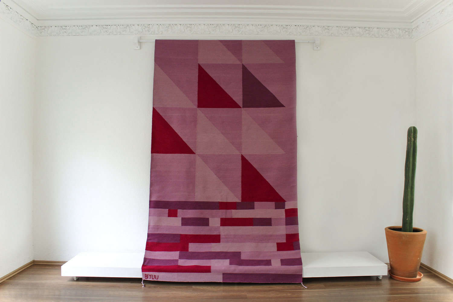
The Emma Rug from Mexican design company Bi Yuu combined multiple pink tones rather than committing to a single shade. This made the rug feel expressive, artistic, and almost atmospheric.
A multitone rug can solve several decorating problems at once. Pale blush connects with neutral upholstery, stronger rose echoes warm wood, and deeper raspberry balances black or navy accents. It also gives you flexibility when selecting pillows, art, and accessories because the supporting palette is already woven into the floor.
How to Choose a Rose-Hued Rug for Your Space
Get the Size Right Before Debating the Shade
An undersized rug can make even beautiful furniture look stranded. In a living room, aim to place at least the front legs of the sofa and chairs on the rug. Larger rooms often benefit from approximately 12 to 24 inches of visible flooring between the rug and the walls, although the exact border depends on the room’s dimensions.
Under a dining table, choose a rug large enough for chairs to remain on the surface when pulled out. In a bedroom, allowing roughly 18 to 24 inches of rug to extend beyond the sides and foot of the bed creates a comfortable landing zone. Measure the intended footprint with painter’s tape before ordering; imagination is talented, but it is notoriously unreliable with eight-by-ten rectangles.
Match the Material to Real Life
Wool is resilient, insulating, and naturally comfortable, making it a strong option for living rooms and bedrooms. It may shed initially and often requires professional cleaning. Cotton rugs are generally lighter and easier to reposition, but they may wear faster in busy areas. Jute provides appealing texture and performs well in dry spaces, while synthetic fibers can offer stain resistance and easier maintenance for homes with pets or children.
Construction matters as much as fiber. Flat weaves slide easily beneath doors and dining chairs. Low-pile rugs are simpler to vacuum. Plush or tufted rugs feel luxurious but hold more dust and crumbsthe archaeological record of every snack eaten nearby.
Choose a Pattern That Balances the Room
If the furniture is mostly solid, a geometric rose rug can become the room’s central pattern. When upholstery, curtains, or wallpaper are already busy, choose a tonal stripe, ombré, simple border, or lightly distressed motif.
Pattern scale should vary. A rug with broad blocks can work beside small checks or narrow stripes, while a detailed vintage pattern looks best with larger, calmer shapes elsewhere. Matching every motif perfectly tends to produce a showroom effect. A room feels more natural when its patterns are related but not identical.
Build a Color Palette Beyond Pink and White
Rose and white can look fresh, but they are only the beginning. For a grounded palette, combine dusty pink with olive green, walnut, cream, and black. For a cooler modern room, use blush with charcoal, navy, pale oak, and brushed metal. Coral works with turquoise, camel, and warm white, while raspberry becomes dramatic beside burgundy, aubergine, and deep brown.
Use the rug as a starting point rather than a strict instruction manual. Pull one minor color into a pillow, lamp, or piece of art, then allow the remaining furnishings to develop naturally. Designers often caution against coordinating every object too precisely because the result can feel staged instead of collected.
Experience-Based Notes: What Living With a Pink Rug Teaches You
The first practical lesson is that pink changes throughout the day. A dusty rose rug may look warm and earthy in morning sunlight, peachier in the afternoon, and deeper under warm evening bulbs. Samples matter. When possible, bring home a swatch or order the smallest available size before committing to a room-dominating rug.
The second lesson is that surrounding colors control whether pink feels sweet, modern, earthy, or dramatic. Place the same blush rug beside white furniture and it becomes light and airy. Add walnut, black steel, and olive upholstery, and it suddenly feels grown-up. Pair it with red lacquer or burgundy velvet, and the room becomes confident enough to order dessert without checking what everyone else is doing.
Pattern also affects how easy the rug is to live with. Tonal geometry, distressed printing, and vintage motifs hide minor stains and tracked-in dust better than a perfectly uniform pale surface. Homes with pets, children, or frequent guests usually benefit from midtone rose, coral, or patterned blush rather than nearly white pink. A dense motif can be forgiving, but it should not be used as an excuse to ignore spills until they qualify for permanent residency.
Routine care is relatively simple when it follows the manufacturer’s instructions. Vacuum with the appropriate height setting, avoid aggressive beater bars on delicate or high-pile rugs, rotate the rug periodically, and blot spills instead of scrubbing them deeper into the fibers. Always test a cleaning solution in an inconspicuous area. Natural dyes, wool, cotton, and mixed-fiber constructions can respond differently to moisture and cleaning products.
A quality rug pad is another small decision with an outsized effect. It reduces slipping, adds comfort, protects hard flooring, and helps prevent premature wear. Pads are especially important beneath lightweight cotton dhurries and runners, which otherwise tend to bunch at precisely the moment someone is carrying hot coffee.
Furniture placement deserves experimentation. Before lifting every chair and sofa, position the rug in the empty room and photograph it from several angles. Try moving it a few inches toward the room’s focal point. Slight adjustments can determine whether a graphic design feels centered or strangely adrift. Once the layout looks balanced, add furniture beginning with the largest piece.
Finally, a rose rug does not require a permanently pink room. It can be the only pink element in the entire space. Graphic patterns, contrasting borders, natural materials, and muted undertones allow the color to act like a warm neutral. That versatility is what makes the best pink rugs worth reconsidering: they are not decorative frosting. They are the foundation.
Conclusion: Pink Rugs With Structure, Not Frills
The most compelling rose-hued rugs succeed because they combine color with discipline. Diamonds, borders, stripes, tonal blocks, ombré effects, and abstract geometry give pink a clear framework. Natural wool adds depth, cotton keeps the look casual, flat weaves offer flexibility, and vintage construction supplies character that no artificially distressed finish can fully duplicate.
Whether your room needs a whisper of blush or a full raspberry declaration, begin with scale, material, and lifestyle requirements. Then choose the pink that complements your existing finishes. A thoughtful rose rug can warm a minimalist room, modernize traditional furniture, or give a neutral interior the personality it has been quietly requesting for years.