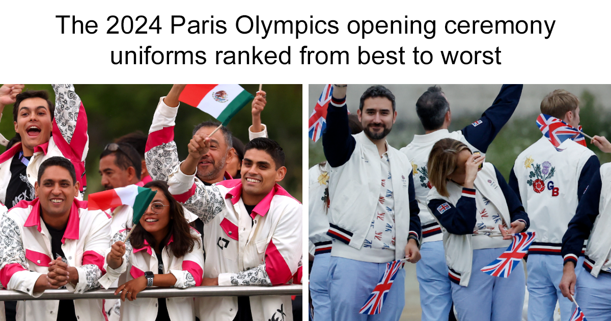
The Olympic opening ceremony is supposed to be about unity, sport, and the emotional sight of athletes entering the world stage. But let’s be honest: for a few glorious hours, it also becomes the world’s most patriotic runway show. At the Paris 2024 Olympic Opening Ceremony, teams did not simply “show up.” They arrived by boat, in the rain, under cameras, with the Eiffel Tower nearby and the fashion capital of the world silently judging every hemline.
That is a lot of pressure for a blazer.
This ranking looks at 26 countries’ Olympic opening ceremony uniforms, moving from the best to the least successful. The criteria are simple: cultural identity, originality, tailoring, visual impact, comfort, ceremony drama, and whether the outfit looked like it belonged on the Olympic stage rather than at a corporate retreat with suspiciously expensive coffee.
Some teams delivered museum-worthy national storytelling. Others played it safe. A few looked like they had been designed by a committee that feared both color and joy. Here is the full fashion scoreboard.
1. Mongolia
Mongolia wins fashion gold without needing a photo finish. Designed by Michel & Amazonka, the uniforms blended traditional Mongolian deel-inspired silhouettes with ornate embroidery, symbolic motifs, structured vests, and a regal color palette. The look felt ceremonial, national, and cinematic all at once.
What made Mongolia’s uniforms unforgettable was their confidence. They did not chase Western tailoring or minimalist trends. Instead, they leaned into heritage, craftsmanship, and storytelling. The result looked like Olympic fashion, historical costume, and high fashion editorial had all agreed to share a perfectly embroidered taxi.
2. Haiti
Haiti’s uniforms, designed by Stella Jean, were among the most meaningful of the ceremony. The looks incorporated artwork by Haitian painter Philippe Dodard, including vivid printed pieces that brought movement, color, and emotional depth to the parade. In a sea of blazers, Haiti offered art you could wear.
The design did not just say “national team.” It said culture, resilience, memory, and imagination. The contrast of traditional references with a fresh fashion silhouette made Haiti one of the most talked-about delegations of the opening ceremony.
3. Chinese Taipei
Chinese Taipei delivered one of the smartest uniforms of the Games. Designed by Justin Chou of JUST IN XX, the look mixed sleek tailoring with Taiwanese craft details and sustainability-minded materials. The palette was quiet, but the meaning was rich.
Traditional craft references, modern fabric innovation, and thoughtful accessories made the uniform feel curated rather than merely styled. This was not loud fashion. It was intelligent fashionthe kind that whispers, then somehow gets the whole room to listen.
4. Philippines
The Philippines arrived with Francis Libiran’s “Sinag” barong, a graceful and patriotic design that combined traditional Filipino dress with contemporary polish. The piña-jusi fabric, embroidery inspired by Pintados warrior markings, and detachable blue-and-red silk sling gave the look elegance and movement.
This was one of the strongest examples of how formalwear can feel modern without abandoning tradition. It was dignified, camera-friendly, and unmistakably Filipino.
5. France
As the host nation, France had no small assignment: look elegant in Paris without looking like it was trying too hard in Paris. Berluti handled the job with midnight-blue tailoring, crisp shirts, scarves, hand-finished details, and polished restraint.
The result was refined and luxurious. Was it the most daring look of the ceremony? No. But it was very French: beautifully cut, quietly confident, and allergic to looking messy. If uniforms could order espresso with perfect pronunciation, this one would.
6. Indonesia
Indonesia’s opening ceremony outfits by Didit Hediprasetyo brought a sharp red-and-white national palette with clean lines and subtle traditional influence. Inspired by national pride and Indonesian cultural references, the designs looked elegant, minimal, and proud.
The women’s look, with a silhouette reminiscent of a kebaya, felt especially graceful. Indonesia succeeded because the uniforms were simple without being empty. They had identity, balance, and excellent visual clarity.
7. Canada
Lululemon’s Team Canada kit leaned into bold red energy, technical comfort, and modern athleisure. The opening ceremony look included a jacquard bomber-style approach with prints inspired by Canada’s art, architecture, and natural landscapes.
It was not the most formal outfit on the Seine, but it felt practical, youthful, and distinctly Canadian. The strength here was wearability. These were uniforms athletes could actually move in, which is useful when your opening ceremony involves boats, weather, and millions of people watching your sleeve decisions.
8. Great Britain
Ben Sherman’s Team GB ceremony wear used a bomber jacket, organic cotton polo, tailored trousers, and a floral motif representing the rose, thistle, daffodil, and shamrock. The idea was strong: bring the four nations of the United Kingdom into one wearable statement.
The uniform felt relaxed but still polished. It had enough heritage to matter and enough modernity to avoid looking like a school assembly. A very solid showing.
9. Australia
Australia’s Sportscraft uniforms brought green-and-gold tradition, blazers, shorts and skirts, Indigenous artwork, and internal details honoring Olympic champions and the Australian Olympians’ Oath. The hidden storytelling was excellent.
Visually, the uniforms were pleasant and clean, though not as dramatic as the best-ranked looks. Some viewers found them a little school-uniform-adjacent, but the thoughtful lining and cultural details pushed Australia higher than a basic blazer ranking would normally allow.
10. Spain
Spain’s Joma uniforms took inspiration from the carnation and the red-and-yellow national palette. The collection mixed sporty pieces with cultural symbolism, creating a bright and approachable Olympic look.
The design worked because it looked cheerful without becoming costume-like. Spain did not reinvent ceremony wear, but the uniform had warmth, color, and national personality.
11. Netherlands
The Netherlands partnered with Denham, bringing Dutch denim culture into the Olympic ceremony conversation. The look was modern, casual, and athlete-friendly, with a contemporary national edge.
It was not as ornate as Mongolia or as artistic as Haiti, but it had a clear point of view. Denim can be risky at an opening ceremony, but for the Netherlands, it felt intentional rather than lazy.
12. Italy
Italy’s athletes were dressed by Giorgio Armani, which sounds like an automatic podium finish. The uniforms carried the sleek restraint associated with the Armani name, emphasizing clean shapes and national polish.
The only reason Italy does not rank higher is that expectations were sky-high. When Italy and Armani appear in the same sentence, viewers expect the fabric equivalent of an opera aria. The look was strong, but not quite unforgettable.
13. Mexico
Mexico’s ceremony uniforms, designed by Marijose Rivera, used a unisex approach with vivid magenta details and references to Mexican identity. The look tried to balance tradition and modernity while moving beyond predictable tourist-postcard visuals.
That ambition deserves credit. The strongest pieces felt fresh and inclusive, though the overall presentation could have used a bit more refinement to compete with the very top tier.
14. Czech Republic
The Czech Republic’s uniforms by Jan Černý and Alpine Pro were divisive in the best Olympic way. The lightweight coat, graphic patterns, and artsy energy made the team stand out instantly.
Some loved the experimental look; others probably blinked twice and asked whether the laundry had gone abstract. But Olympic fashion should take risks, and Czechia certainly did.
15. United States
Team USA wore Ralph Lauren again, with navy blazers, striped Oxford shirts, ties, blue jeans, and cream suede shoes. The outfit was classic Americana with a casual twist, designed to look polished but approachable.
The good news: it was recognizable, well-branded, and very American. The bad news: after so many Olympic collaborations, the formula is starting to feel familiar. The jeans were comfortable and photogenic, but not exactly a design moon landing.
16. South Korea
South Korea’s Musinsa Standard uniforms used powder-blue tailoring, a belted silhouette, and details inspired by Korean ceramic traditions and ceremonial dress. The color choice felt fresh and calm.
This was a thoughtful design with beautiful references, especially in the blazer lining and belt. It ranks mid-list only because the impact from a distance was softer than some of the bolder entries.
17. Japan
Japan’s ASICS official sportswear focused heavily on performance and sustainability, including recycled materials and carbon-footprint transparency for some team kit items. The design direction was clean, athletic, and responsible.
As a fashion statement, however, it was quieter than Japan’s design reputation might suggest. The sustainability angle was admirable, but the ceremony look did not create the same visual spark as the strongest cultural uniforms.
18. Sweden
Sweden’s UNIQLO partnership delivered practical, clean, athlete-centered clothing. It reflected the brand’s reputation for simplicity and function.
The uniforms were easy to like, but hard to remember. Sweden looked organized and comfortable, which is wonderful for travel and slightly less thrilling for a global opening ceremony.
19. Germany
Germany’s Adidas-backed look leaned into sporty practicality and modern teamwear. It was functional, cohesive, and unmistakably athletic.
Still, the opening ceremony is one of the few moments when sportswear can become storytelling. Germany’s look was competent, but it did not fully seize the stage.
20. Jamaica
Jamaica usually owns color better than almost anyone, and the national palette always brings energy. The Paris 2024 teamwear had athletic sharpness and instant recognizability.
For the opening ceremony ranking, though, the look felt more sports-kit-forward than ceremonial. Great colors, strong spirit, but not quite enough formal drama.
21. Ireland
Ireland’s uniforms offered clean national branding and a friendly green identity. They were neat, practical, and easy to wear.
The challenge was memorability. In a ceremony filled with embroidery, art prints, tailored coats, and symbolic accessories, Ireland’s look felt a little too safe.
22. Brazil
Brazil had the advantage of one of the most joyful color palettes in the world. Green, yellow, and blue can carry a lot of visual weight before the tailoring even clocks in.
But the opening ceremony look did not fully capture the expressive potential of Brazilian design. It was pleasant, bright, and patriotic, yet it could have been more adventurous.
23. China
China’s uniforms looked formal, disciplined, and highly coordinated. The presentation was clean and national colors were easy to identify.
However, the design leaned more official than exciting. It looked like a delegation ready for protocol, not necessarily a team ready to steal the fashion conversation.
24. New Zealand
New Zealand’s opening ceremony look was polished and professional, with the kind of understated athletic formality that works reliably on a large team.
Reliability, unfortunately, is not the same as runway magic. The uniform was perfectly acceptable, but in this ranking, acceptable lands near the bottom because Mongolia showed up looking like a national epic.
25. Switzerland
Switzerland’s uniforms were clean, sporty, and red-forward, which fits the national identity. The look was tidy and functional.
But it lacked surprise. Switzerland looked prepared, comfortable, and organizedvery Swiss, in other words. Fashion fireworks were not on the itinerary.
26. India
India’s uniforms by Tarun Tahiliani used saffron, white, and green references from the national flag, with saree and kurta-inspired ceremonial styling. On paper, that should have been a beautiful opportunity.
In practice, the design drew criticism from many viewers who felt it did not fully represent the richness of Indian textile heritage. India has one of the world’s most dazzling fashion traditions, so the final look felt underpowered compared with what could have been possible. Last place does not mean disaster; it means the expectations were enormous, and the outfit did not meet them.
What Makes an Olympic Opening Ceremony Uniform Great?
The best Olympic opening ceremony uniforms do three things at once. First, they identify the country immediately. Second, they make athletes feel proud and comfortable. Third, they give viewers something to remember after 200-plus delegations have passed by.
Mongolia, Haiti, Chinese Taipei, and the Philippines succeeded because their uniforms told stories. They used craft, silhouette, artwork, and cultural references as design language. These were not outfits with a flag slapped on at the end. They were national narratives built from fabric.
The middle-ranked teams generally looked good but played safer. France, Canada, Great Britain, Australia, Spain, and the United States all had credible designs. They were polished, wearable, and coherent. But the Olympic opening ceremony rewards courage. A navy blazer can be handsome; an embroidered deel-inspired ensemble can become legend.
The lower-ranked uniforms often suffered from the same issue: too much practicality, not enough identity. Athletes should absolutely be comfortable, especially during a long ceremony. Still, comfort does not have to mean visual silence. A great uniform can breathe, move, and tell a story at the same time.
Personal Experience: Watching Olympic Uniforms Like a Fashion Sport
Watching the Olympic opening ceremony uniforms has become its own little ritual for many fans. Some people wait for the torch. Some wait for the flag bearers. Some of us wait for the moment a delegation appears and immediately think, “Oh, they understood the assignment.” It is harmless, dramatic, and deeply satisfyingbasically fantasy football for people who care about collars.
The best part is that Olympic fashion invites everyone to become an instant critic. You do not need a fashion degree to know when a uniform feels alive. When Mongolia appeared in those richly embroidered outfits, the reaction was immediate because the design communicated before anyone had to explain it. The look had shape, symbolism, and presence. You could glance at it for two seconds and understand that it carried history.
Haiti created a different kind of emotional response. The uniforms felt personal and artistic, almost like a moving gallery. That is the magic of a strong opening ceremony outfit: it makes viewers curious. People start searching for the artist, the designer, the fabric, the meaning. Suddenly a parade uniform becomes a doorway into a country’s culture.
There is also a practical viewing lesson here. The opening ceremony is not a studio photoshoot. At Paris 2024, athletes dealt with weather, movement, boats, distance, group formation, and broadcast lighting. A design that looks fantastic in a press image may look flat from far away. The strongest uniforms had contrast, silhouette, and details large enough to read on camera.
That is why some simple suits fall behind. They may be beautifully made up close, but television is ruthless. A tiny lining detail is lovely, yet if viewers cannot see it, the emotional impact disappears. On the other hand, a bold jacket, an embroidered panel, a distinctive sash, or a strong color story can survive rain, distance, and a moving camera.
Olympic uniforms also reveal how countries want to present themselves. Some choose heritage. Some choose luxury. Some choose technology. Some choose comfort. The most memorable teams usually combine at least two of those ideas. Chinese Taipei balanced innovation and tradition. The Philippines balanced formal elegance and cultural pride. Canada balanced function and national energy. The United States balanced nostalgia and casual Americana, though perhaps a little too comfortably.
As a viewer, the most enjoyable uniforms are the ones that make athletes look proud rather than merely dressed. That pride is visible. You can see it in how they walk, wave, and hold themselves. A great uniform gives athletes a little extra lift. It says, “You are not just here to compete. You are here to represent everyone watching back home.”
That is why ranking Olympic opening ceremony uniforms is fun but also meaningful. It is not just about who looked expensive. It is about who turned fabric into identity. The best uniforms do not simply decorate the Games; they deepen them. And when a small country with a brilliant design outshines global fashion giants, the Olympics feel a little more magical.
Conclusion
The Paris 2024 Olympic Opening Ceremony proved that national uniforms are far more than matching outfits. They are soft-power statements, cultural introductions, and once-every-four-years fashion auditions. Mongolia dominated with craftsmanship and symbolism. Haiti transformed art into ceremony. Chinese Taipei and the Philippines showed how tradition can feel modern without losing its soul.
The lesson is clear: the best Olympic opening ceremony uniforms are not always the ones with the biggest brand names. They are the ones with the strongest stories. In a global parade where every country gets only a short moment in the spotlight, originality matters. Tailoring matters. Meaning matters most of all.
And yes, sometimes a blazer is just a blazer. But sometimes, with the right embroidery, artwork, fabric, and national pride, a uniform becomes one of the most memorable images of the Games.