Blue is the color that somehow knows how to be dramatic without raising its voice. It can be sapphire-deep, sky-soft, denim-casual, oceanic, icy, royal, spiritual, and slightly mysterioussometimes all before breakfast. From ancient pigments to modern interiors, from rare flowers to blue-and-white porcelain, blue has traveled through science, art, fashion, design, and everyday life like a very stylish passport holder.
This article explores 15 glimpses of blue in the world around us: sapphire, sky, cerulean, indigo, cobalt, ultramarine, navy, turquoise, and the many shades that make blue one of the most beloved colors in human culture. Think of it as a gallery walk, a nature lesson, a design guide, and a tiny love letter to the color that makes oceans look endless and old jeans look like old friends.
Why Blue Captures Our Attention
Blue has a rare gift: it feels both close and infinite. The blue mug on your desk feels cozy, but the blue sky above you feels like the universe left the ceiling open. In design, blue often suggests trust, clarity, cleanliness, calm, and depth. In art, it can create distance, holiness, melancholy, luxury, or atmosphere. In nature, it is surprisingly uncommon as a true pigment, which makes blue flowers, birds, butterflies, and gems feel almost magical.
But blue is not one personality. Navy is responsible and buttoned-up. Turquoise has beach-vacation energy and probably owns a straw hat. Cerulean is airy and optimistic. Sapphire is glamorous. Indigo is moody, historic, and excellent at making denim look better with age. That flexibility is why blue appears everywhere from religious paintings and porcelain bowls to brand logos, bathroom walls, fashion staples, and late-afternoon shadows.
15 Glimpses of Sapphire, Sky, and Cerulean All Over
1. The Sky: Blue’s Most Famous Billboard
The sky is probably the first blue most of us ever notice. Its color comes from the way sunlight interacts with Earth’s atmosphere. Shorter blue wavelengths scatter more than longer red wavelengths, so blue light reaches our eyes from many directions. That is the simple science behind a very poetic daily event: the sky looks blue, and suddenly the whole world seems open for business.
Sky blue works beautifully in interiors and branding because it carries that same sense of openness. A pale blue bedroom can feel breathable. A sky-blue shirt feels approachable. A light cerulean accent can make a small room feel less like a closet and more like a decision you made on purpose.
2. The Ocean: Not Just Reflecting the Sky
A common myth says the ocean is blue only because it reflects the sky. Nice try, myth. The ocean’s color is also shaped by the way water absorbs red wavelengths and leaves more blue visible to the eye. Sediments, algae, depth, weather, and light angle can shift the sea toward green, gray, teal, or even reddish tones. That is why tropical water can look like liquid glass while stormy water looks like it has been reading serious literature.
Ocean blue is powerful in design because it combines calm with movement. Use deep blue for drama, pale aqua for freshness, and teal for a space that wants to feel energetic without yelling.
3. Sapphire: Blue With a Jewelry Budget
Sapphire belongs to the mineral family corundum, and while sapphires can appear in several colors, blue sapphire remains the celebrity of the group. Its tones can range from greenish blue to violetish blue, with the most prized stones often described as rich, deep, and velvety. Some sapphires even change color under different lighting, because apparently being beautiful in one mood was not enough.
As a design idea, sapphire blue signals elegance. It works well in velvet sofas, eveningwear, tile accents, stationery, and jewelry-inspired palettes. Pair it with cream for sophistication, brass for warmth, or charcoal for a modern, moody look.
4. Ultramarine: The Luxury Blue of Art History
Before synthetic pigments made brilliant blues easier to obtain, ultramarine was made from lapis lazuli, a semiprecious stone historically mined in Afghanistan. It was so precious that artists and patrons treated it like visual treasure. In Western art, ultramarine was famously reserved for important subjects, including the Virgin Mary’s robe.
Ultramarine is not just “blue.” It is blue with a biography. It carries the weight of trade routes, sacred art, mineral grinding, patron contracts, and the kind of artistic drama that makes a paint tube feel like a tiny opera.
5. Egyptian Blue: Ancient Chemistry, Still Glowing With Genius
Egyptian blue is often described as one of the earliest synthetic pigments. Ancient makers created it through a controlled process involving mineral ingredients and heat. The result was a luminous blue used in objects, wall paintings, and decorative arts. Long before modern paint aisles gave us names like “Weekend by the Lake” and “Moody Blueberry,” ancient craftspeople were already engineering color with astonishing skill.
This glimpse matters because blue is not only aesthetic. It is technological. Every blue pigment tells a story about chemistry, trade, experimentation, and the human refusal to accept a dull wall when a dazzling one might be possible.
6. Prussian Blue: The Accident That Changed the Palette
Prussian blue emerged in the early 18th century and became one of the first modern synthetic blue pigments. It offered artists and printers a powerful, more affordable alternative to costly mineral blues. Its arrival helped expand the use of blue in illustrations, maps, books, paintings, and decorative materials.
There is a lesson here for creators: sometimes innovation arrives because someone is trying to solve a practical problem. The glamorous result may begin as a studio inconvenience. In other words, even color history has a “well, that was unexpected” chapter.
7. Indigo: The Blue That Wears In, Not Out
Indigo is both a plant-based dye tradition and a color identity. It appears in textiles across many cultures and remains strongly associated with denim. The magic of indigo-dyed fabric is that it changes with use. Your jeans fade at the knees, pockets, seams, and thighs, creating a map of your habits. Denim does not merely age; it collects evidence.
In home styling, indigo brings handmade warmth. Think block-printed pillows, shibori-inspired patterns, woven throws, or a single indigo chair in a neutral room. It adds depth without feeling too formal.
8. Cobalt Blue: The Ceramic Classic
Cobalt blue helped shape one of the world’s most influential ceramic traditions: blue-and-white porcelain. In China, porcelain painted with cobalt blue under a transparent glaze became especially important after the 14th century, influencing global taste and trade. The style traveled widely and inspired ceramics across Islamic, European, Korean, Japanese, and other artistic traditions.
Cobalt blue is crisp, graphic, and timeless. A cobalt vase on a white shelf can look traditional, coastal, modern, or grandmother-approved, depending on what you put next to it. That is range.
9. Blue Flowers: Rare, Romantic, and Botanically Complicated
True blue is relatively rare in flowers. Many blossoms we call blue are actually violet, purple, or lavender-adjacent. Creating blue in petals involves complicated chemistry, including pigments, acidity, cell structure, and light interaction. This rarity is part of why blue flowers such as delphiniums, morning glories, hydrangeas, and certain irises feel special.
In gardens, blue flowers create visual distance and coolness. They pair beautifully with white, silver, pale yellow, and soft pink. Add a cluster near a path or patio, and suddenly the garden has a calmer rhythm.
10. Blue in Birds and Butterflies: Structure, Not Paint
Many vivid blues in animals do not come from blue pigment. Instead, microscopic structures scatter light in ways that make feathers, wings, or skin appear blue. That is why a blue morpho butterfly or a blue jay can look electric without being “painted” blue in the simple sense.
This is blue as architecture. Nature builds tiny structures that manipulate light, proving once again that the universe has better design software than the rest of us.
11. Blue Hour: The Photographer’s Favorite Mood Swing
Blue hour happens before sunrise or after sunset, when the sun is below the horizon and the sky fills with soft blue light. Photographers love it because it creates atmosphere without the harsh contrast of midday. City lights glow warmly against cool air. Buildings look cinematic. Even a parking lot can briefly pretend it is in an indie film.
For visual storytelling, blue hour suggests transition. It is not day, not night, but that beautiful in-between when ordinary objects gain emotional lighting.
12. Navy Blue: The Responsible Adult of the Color Wheel
Navy blue is the shade that owns a calendar, pays bills on time, and somehow still looks good at dinner. It is widely used in uniforms, business clothing, logos, and formal interiors because it suggests dependability without the severity of black.
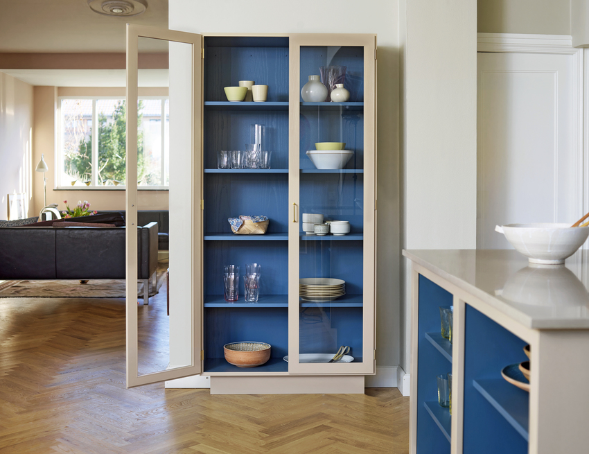
In decor, navy creates structure. A navy wall can anchor a bedroom. Navy cabinets can make a kitchen feel polished. Navy typography on a white website feels clean and trustworthy. The trick is balance: add warm wood, brass, cream, rattan, or soft textiles so navy does not turn the room into a submarine meeting room.
13. Cerulean: The Airy Blue That Lightens Everything
Cerulean sits in that bright, clear family of blues associated with sky, freshness, and air. It is less formal than navy and less tropical than turquoise. Cerulean is excellent for spaces that need optimism: breakfast nooks, creative studios, kids’ rooms, packaging, summer clothing, and breezy website accents.
Use cerulean when you want blue to feel bright rather than serious. It is the color equivalent of opening the windows and pretending the inbox does not exist for five minutes.
14. Blue in Interiors: Calm, Clean, and Surprisingly Flexible
Interior designers often use blue because it can shift mood depending on depth and undertone. Powder blue feels soft. Slate blue feels grounded. Teal feels lively. Navy feels tailored. Blue bathrooms often read as clean and spa-like, while blue bedrooms can feel restful. Still, color psychology is not a magic spell. A shade that relaxes one person may feel chilly to another, so context matters.
The safest strategy is to test blue in real light. Morning light, afternoon light, and artificial light can change the color dramatically. A paint swatch that looks like “peaceful coastal cottage” at noon may become “sad office printer” at night. Always sample first.
15. Blue in Digital Life: The Color of Links, Trust, and Clicks
Blue became deeply embedded in digital design because it offers strong readability and long-standing associations with links, navigation, and reliability. Many brands use blue to communicate stability, technology, intelligence, or service. From app icons to website buttons, blue often acts like a friendly guide saying, “Click here; nothing weird will happen.”
For SEO and user experience, blue can be especially useful when it improves clarity. Links should be easy to spot, buttons should contrast with the background, and accent colors should help users move through a page. Pretty color is nice. Pretty color that also helps people find what they need is better.
How to Use Blue Without Making Everything Look Like a Dental Office
Blue is versatile, but too much of one flat shade can feel cold. The solution is layering. Combine several blues with different textures: matte navy walls, glossy cobalt ceramics, soft denim upholstery, pale blue linen, or a sapphire glass vase. Texture keeps blue from becoming one-note.
Blue also works best with thoughtful companions. White makes blue crisp. Cream makes it warmer. Tan and wood tones make it natural. Brass and gold make it elegant. Coral adds energy. Green makes it botanical. Gray makes it modern, though too much gray-blue can start looking emotionally unavailable.
Experience Notes: Living With Blue in the Real World
The best way to understand blue is not only to study it but to notice where it quietly improves everyday life. Walk outside early in the morning and watch the pale blue sky slowly gain confidence. It starts almost gray, then becomes soft, then clear, then bright enough to make you squint and reconsider your relationship with sunglasses. That daily transition is a reminder that blue is not static. It changes with time, weather, and mood.
Inside the home, blue has a different kind of influence. A navy throw blanket on a beige sofa can make the whole room feel more intentional, as if someone with excellent taste casually stopped by and fixed things. A blue ceramic bowl on a kitchen counter can make lemons look brighter. A powder-blue bathroom wall can make a rushed morning feel slightly less chaotic. Blue does not solve life’s problems, but it can make the room where you face them feel more civilized.
In clothing, blue is almost unbeatable. Denim is the obvious example because it belongs everywhere: school runs, coffee shops, road trips, casual Fridays, and those mysterious errands where you leave the house for one thing and return with five. A dark denim jacket, a chambray shirt, or a navy sweater can be worn repeatedly without feeling boring. Blue is practical, but it rarely looks lazy.
Travel also has a way of making blue unforgettable. The blue of an ocean from an airplane window is different from the blue at the shoreline. Mountain shadows turn blue in the distance. City skylines become blue during evening hour, especially when glass buildings catch the last light. Even hotel pools have their own theatrical blue, usually promising relaxation while a child nearby performs a cannonball with the confidence of a tiny Olympic athlete.
Blue can also shape memory. Many people remember a blue front door, a blue bicycle, a blue notebook, a blue dress, or the blue tiles in a family kitchen. These objects become emotional bookmarks. They prove that color is never only decoration. It becomes attached to routines, places, people, and seasons. The right shade can bring back a summer, a room, a vacation, or a version of yourself you had almost forgotten.
For creative work, blue is especially useful because it gives the mind space. A blue mood board can feel expansive. A blue notebook can make planning feel calm. A blue website palette can help readers stay focused. Whether you are decorating a room, choosing an outfit, photographing a city, planting a garden, or designing a brand, blue offers a rare combination: beauty, clarity, and emotional range. It can whisper, shimmer, anchor, cool, deepen, brighten, and occasionally steal the entire show.
Conclusion: Blue Is Everywhere Because It Earned the Space
Blue has lasted because it keeps finding new ways to matter. It is scientific in the sky, mysterious in the sea, rare in flowers, structural in butterfly wings, luxurious in sapphire, historic in ultramarine, practical in denim, and timeless in porcelain. It can calm a bedroom, sharpen a logo, elevate a painting, or turn a plain bowl into the best-looking object on the table.
The beauty of blue is that it never belongs to just one world. It moves between nature, art, fashion, interiors, technology, and memory. Sapphire, sky, cerulean, cobalt, indigo, navy, and ultramarine are not merely shades; they are moods with passports. And wherever blue appears, it brings a little depth with itplus the occasional reminder that the universe has excellent taste.